Sunrun is the leading American solar-energy company, which produces the highest quality solar panels. The company was established in 2007 and its main specialty is that it not only directly sells its products but also offers a lease option to their customers.
Meaning and history
The Sunrun logo has the name “Brilliant home”, which is the main value of the company — creating a perfect environmentally-friendly house across the globe.
The brand’s bright visual identity is composed of a wordmark and an emblem on its left. Both are placed into a light blue rectangle with an “Introducing the Brilliant Home” tagline.
Before 2012
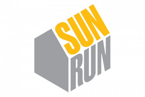
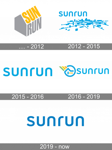
The original logo looked like a house with a grey front, a yellow word ‘SUN’ for the roof, and a grey word ‘RUN’ for the wall.
2012 – 2015
Then, they adopted a logo that was completely blue and consisted of a wordmark and something that looked like a panorama of a city in little detail (lines and blocks mostly). The word would usually hover somewhere above. It used simplistic, rounded letters this time, and they were lowercase.
2015 – 2016
From 2015 on, they decided to only use the wordmark.
2016 – 2019
In 2016, they added an emblem. It was a blue circle that ended in a house-like shape inside the figure itself. There were three more shapes: a blue ‘door’ and ‘windows’ of yellow and orange. The lines of orange, yellow and green respectively also emanated outwards from the roof.
2019 – Today
The wordmark in all lowercase lettering is executed in a rounded sans-serif typeface, where all the lines are smooth and soft. It creates a balanced and kind feeling.
The Sunrun emblem is a circular image, which curves like the “at” sign and forms a silhouette of the roof, the three diagonal lines of different colors are coming out of the roof, symbolizing the solar energy, which is friendly and powerful.
The white and blue combination of the brand’s logo looks fresh and crispy, evoking a sense of professionalism and authority.


