Pemex is a Mexican public company operating in the oil and gas sector as well as in the petrochemical industry. It was founded in 1938 in the city of Mexico by Lazaro Cardenas, who served as the President of Mexico from 1934 to 1940. Cardenas created the company by nationalizing the country’s oil industry and through the expropriation of all Mexican and foreign oil firms operating at that time in Mexico. In almost 80 years since its creation, Pemex managed to become one of the world largest oil producers. By 2014, the company reached the 36th line in the Global 500 list of enterprises published by Fortune. Its year turnover in 2013 was at the level of 125 billion US dollars.
Meaning and history
Pemex is among the largest oil companies in the world. It was founded more than 80 years ago and has experienced many ups and downs throughout its existence.
In 1938, Mexican President Lázaro Cárdenas nationalized the country’s oil industry with the support of the oil workers’ union,7 which staged a months-long strike. Every year, March 18 is celebrated as a national holiday. In June of that year, the national oil company Pemex was established, absorbing the assets of foreign companies operating in Mexico.
In 1958 Pemex’s status was enshrined in a special law that sharply limited the role of foreign and private companies and contractors in oil production. Since the second half of the 1970s, Pemex began exporting oil and petroleum products to the United States, Canada, and several European and Latin American countries.
The prolonged fall in hydrocarbon prices in 2015 made the performance of the organization founded in 1938 one of the worst in its history. However, Pemex has managed to persevere.
In 2021, the Mexican oil company discovered a giant oil field in the state of Tabasco with reserves of 1-2 billion barrels of oil. Petróleos Mexicanos (Pemex) continues exploration in the country, although a few years ago the Mexican oil industry was planned to “put an end” to it. Mexico’s national oil company continues to increase exploration and production of oil
At the end of January 2023, Mexican authorities reported that Pemex’s revenues had fallen by 70% due to falling oil prices. In early February, the company changed its management, its new head was Jose Antonio Gonzalez Anaya.
Today Pemex operates 6 oil refineries and 41 oil refineries and chemical plants. The company’s products are the basis for the production of fertilizers, synthetic leather, dyes, plastics, and other products.
What is PEMEX?
PEMEX is Mexico’s largest oil exploration, production, and marketing company. It was nationalized by the state in 1938. The name of the company is derived from “Petróleos Mexicanos” (“Mexican Petroleum”).
1938
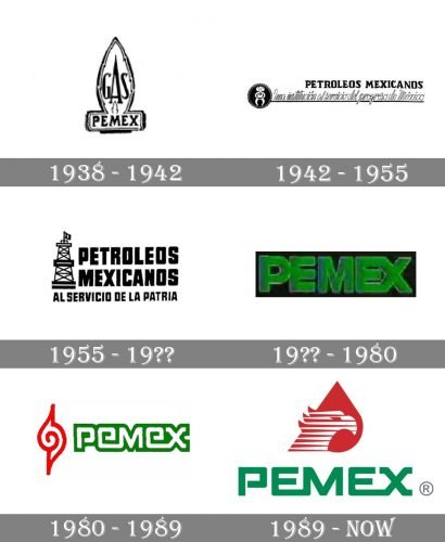
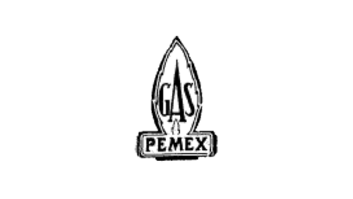
The original Pemex logo was a pretty intricate one. There was a stylized flame housing the word “Gas” in its upper part and the word “Pemex” in its lower part.
1942
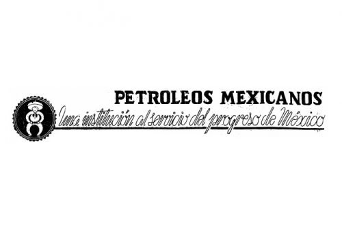
While the second logo was completely different, it looked even more cluttered. In addition to the lettering “Petroleos Mexicanos,” the design contained the writing “Una institution al servicio del progreso de Mexico.” The text was hardly legible, which seems pretty natural, taking into consideration its length.
1955
The updated version was simpler and better legible. There was a tower with a flag. Next to it, the writing “Petroleos Mexicanos” and “Al servicio de la patrio” could be seen.
1960 – 1970s
The design grew by far more minimalistic. There was now nothing but the word “Pemex” in bold green letters. The wordmark was placed inside a black rectangle.
1981
The black background disappeared leaving only the lettering “Pemex.” This time, it was white with green trim. Some of the glyphs merged with each other forming ligatures. Also, a red emblem appeared. In the center, it had a spiral.
1989
The spiral emblem transformed into a red drop with a bird’s head. The lettering “Pemex” grew cleaner, which made the Pemex logo better legible. The white inscription in a bold green outline was replaced by the sleek green logotype, which had a modernized typeface, yet with the recognizable curved tails of the bars in the “X”. The bird with the red drop has become a corporate symbol and stayed with the company for decades.
Font and color
The strong and even brutal lettering from the Pemex visual identity is written in a custom sans-serif typeface with geometric shapes of the letters, square lines, and slightly softened angles. The inscription has several unique details, such as an open contour of the “P”, and the elongated bottom bars of both “E”s, which merge into the neighboring letter. The “X” is another signifier of the brand, with its bent ends, it looks like a chain link. The custom typeface of the brand’s logo is close to such basic fonts as TT Lakes Neue Expanded Black and Elephantmen Greater Bold, but with some lines modified.
The green and red color palette of the logo stands for growth and progress, and the thin white details add a sense of loyalty and transparency, along with passion and determination.


