The logo of the Russian aircraft manufacturer JSC Sukhoi Company is meaningful, minimalistic, and dynamic. During its more than 81-year history, it has gone through over four updates.
Meaning and history
Sukhoi is a holding company comprising Russia’s leading design bureaus and serial aircraft factories, the core business of which includes the full cycle of aircraft engineering operations, from design to after-sales support. The SU combat aircraft are in the forefront of the global armament market and form the backbone of Russian front-line aviation and tactical aviation of many countries in the world. The company is the largest Russian supplier of aircraft for export.
The company was established in 1939 and named after its founder, Pavel Sukhoi, who is a very significant figure in the Russian aircraft segment. Sukhoi Civil Aircraft Company is currently developing the Sukhoi Superjet 100 family of regional aircraft.
What is Sukhoi?
Sukhoi is a Russian company engaged in the development, production, marketing, flight personnel training, after-sales service, including the supply of spare parts and equipment for military and civil aircraft. Russia’s largest aviation holding company is named after one of the founders of Soviet jet and supersonic aviation, aircraft designer Pavel Sukhoi.
Older emblems
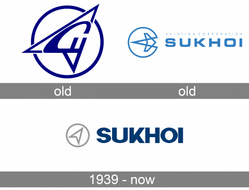
You can come across an older version where there were additional details on the aircraft and the circle was smaller than the aircraft.
Another version featured the aircraft flying backward (to the left). You can also come across a logo depicting a stylized arrow and shapes looking like a Native American headdress.
1939 – Today
The current Sukhoi logo can be given both in Russian and in English (there is a version in each of the languages). Both versions have the same structure. They combine a silver emblem with a dark blue wordmark. The palette differs a little.
In the Russian logo, the emblem appears somewhat lighter, while the shade of blue is brighter.
Symbol
The silver symbol is made up of a circle housing a stylized aircraft, which looks like an arrow. The aircraft is heading up and to the right, which adds some dynamism.
Font and Color
The heavy uppercase lettering from the primary logo of Sukhoi Company is set in an extra-bold geometric sans-serif typeface with stable sharp gets written in clean distinctive lines with straight cuts of the ends. The closest fonts to the one, used in this insignia, are, probably, Neue Metamask Black, or NS Mudolf Sans Clean.
As for the color palette of the Sukhoi visual identity, it is based on calm and dark shade of blue and light gray, which make up a very serious image, full of confidence and stability. The color scheme of the logo evokes a sense of reliability and trustworthiness.


