Strepsils is a brand of the most sold sore throat medications in the world. The brand was introduced in 1950 and launched the today’s popular lozenges in 1958. Strepsils is manufactured by Reckitt Benckiser since 2006.
Meaning and history

Strepsils is a brand of sore throat products owned by Reckitt Benckiser and developed by Boots. Strepsils first appeared in the UK in the 1980s and today is the global market leader in throat pain and discomfort medications. The Strepsils brand is the choice of millions of people around the world when treating a sore throat. From throat-relieving ingredients to triple-action anti-inflammatory pills to help you fight sore, swollen, and inflamed throats.
Reckitt Benckiser is a world leader in the home cleaning products and a leading manufacturer of health and personal care products. Reckitt Benckiser brands are well known to consumers all over the globe, they are Dosia, Vanish, Calgon, Calgonit, Tiret, Harpic, Cillit, Veet, Clearasil, Strepsils, Nurofen, Air Wick.
What is Strepsils?
Strepsils is an original medicine manufactured by Reckitt Benckiser Healthcare International Ltd. in the United Kingdom. It is a combined antibacterial and antifungal drug used in ENT and dentistry. Several types of Strepsils are available on the pharmaceutical market. Each of them is supplemented with a specific component to obtain a more effective therapeutic effect in various diseases of the mouth and throat.
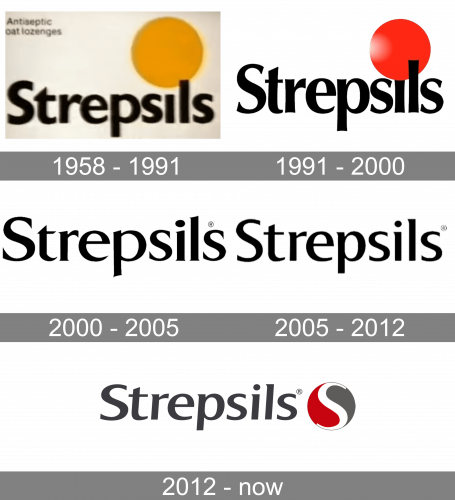
1958 – 1991

Strepsils originally had a yellow circle painted over the letter ‘I’ instead of a dot. The rest of the word was, just like now, a rather usual sans-serif style, even if somewhat bolder and thicker than now.
1991 – 2000

In 1991, much of the text became sharper and more pointed. The letters also resemble a serif font now, with all the little notches here and there. The circle also became red, bigger and received some illumination onto its left side.
2000 – 2005

In 2000, the text became more basic than ever. It was now just a relatively thin serif lettering with a lot of pleasant, sharp details. The big red circle was removed in favor of the usual black dot.
2005 – 2012

The 2005 variation is mostly the same as the one from 2000, except the font is different in several places.
2012 – Today
The Strepsils logo is a great representative of its time. It’s strict and modest, as the pharmaceutical logo has to be, yet modern and recognizable all over the world.
It’s bold clean typeface executed in black is complemented by a brand’s graphic icon. The Strepsils icon is a red and grey circle, divided into two parts by a white letter S.
The Strepsils logo combines geometric shapes without resting mobility or lightness, resulting to be elegant and fresh. It represents a unity of a modern logo with a traditional one, due to its classic yet bright color scheme and it’s bold yet simple typeface.
Font and Color
The bold classy lettering from the primary Strepsils logo is set in an elegant font with sharp playful ends of the lines. The closest typefaces to the one, used in this insignia, are, probably, Mart Semi Bold, or Rabelais Bold, with some minor modifications of the characters’ contours.
As for the color palette of the Strepsils visual identity, it is based on a strict and serious combination of gray and red, with white accents in the emblem. Gray is a color, associated with professionalism and confidence, while red here not only symbolized the pain in the throat, by also shows the strength of the brand, and white tops it all up with a fleur of loyalty and reliability.


