Strasbourg is the name of a French football club, based in the Alsace region. The club, nicknamed “Les Coureurs”, which means “The Racers”, plays in the Ligue 1 and has Thierry Laurey as the head coach.
Meaning and history
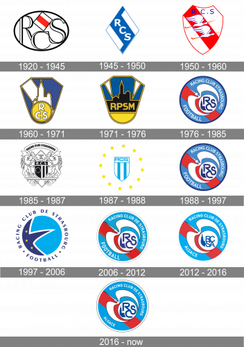
The visuals identity of the football club from Alsace is bright, modern, and very stylish. Since 1997 the club has been using a circular shape for its badge, but the logo we all know today is completely different from the original version, though the sleek lines and bright colors are what connects and unites all the emblems of the club.
1920 — 1945
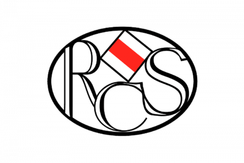
Their original logo is an oval shape with letter ‘R’, ‘C’ and ‘S’ inside. The second one is not as tall to accommodate for a flag of white and red stripes above it. Except for this bit, the logo was fully black-and-white.
1945 — 1950
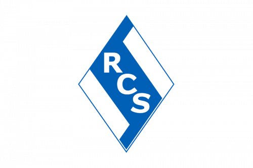
In 1945, they instead adopted a rhomb shape as their emblem. It was largely blue with white strips on the sides. This created a diagonal blue stripe where the acronym ‘RCS’ was located.
1950 — 1960
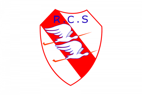
The ’50 logo depicts a shield with diagonal stripes of white, red and white inside. Its center was occupied by two vaguely detailed heron birds, while directly above them was the usual acronym, except in dark blue this time.
1960 — 1971
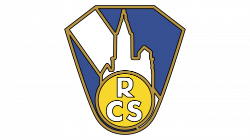
In 1960, they adopted a blue diamond shape with a white stripe going diagonally across it. In the middle, there was also a silhouette of the Strasbourg Cathedral. All of these images were outlined in gold. The base was occupied with a circle, where the ‘RCS’ acronym was put – this time, in two lines.
1971 — 1976
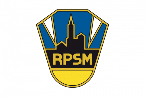
In 1971, the logo was modified instead into a symbol with a black Cathedral, two strips of white and a black plaque instead of a circle. The plaque still said the name, but in yellow letters and now as ‘RPSM’.
1976 — 1985
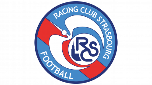
In 1976, the logo was turned into a turquoise circle with a red stripe going through it. The center was occupied by an illustrative image of a white heron, whose wings encircled a little circle. In it, a white background held the blue images of the Cathedral and the ‘RCS’ acronym. The edges were occupied by the name parts (‘Racing Club Strasbourg’ and ‘Football’).
1985 — 1987
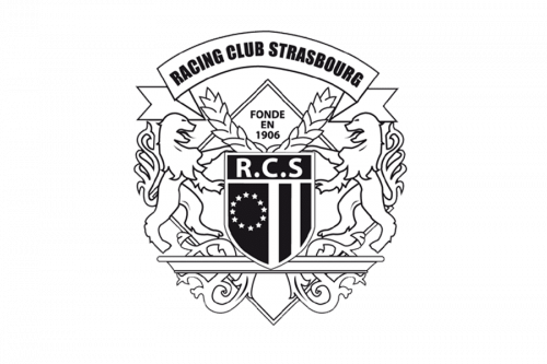
The logo was a more elaborate coat of arms design for some time. It depicted a shield with a circle of stars on it and the acronym ‘RCS’, written in the top. Two lions supported this shield. There were also some laurel ornaments, ‘Racing Club Strasbourg’ propped up on a banner of sorts above and the ‘fonde en 1906’ bit in the background.
1987 — 1988
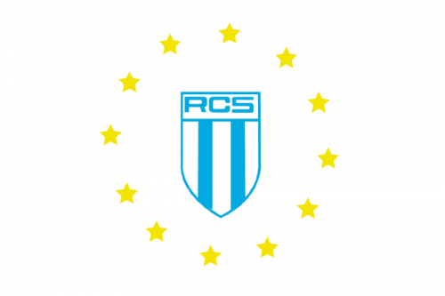
This is actually the same shield design, except colored white and turquoise. The stripes that were on the far right previously are now aligned near the center. The star composition now encircles the shield, instead of being inside it.
1988 — 1997

This is the same emblem as the one they adopted in 1976, no changes.
1997 — 2006

The emblem, designed for the club in 1997 boasted a solid bright blue circle with the part of the Star in deep blue and white outline, placed on the left side of the badge. The Star featured smooth sleek lines and had three smaller stars in yellow on it, placed along the circle’s perimeter.
The wordmark “Racing Club de Strasbourg. Football” was located around the emblem, replacing the frame. The dark blue inscription in all capitals was executed in a bold modern sans-serif typeface and perfectly balanced the star on the circle.
The two shades of the blue, yellow, and white color palette of the logo represented the reliable and loyal football club, showed its energy and willingness to win.
2006 — 2012
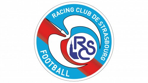
The logo was redesigned in 2006, bringing a completely new approach to the club’s visual identity design, and a new, patriotic color palette.
The solid bright blue circle remained as the emblem’s background, but now it contained a thick red diagonal line in gradient shades, coming through it. On the line, the white smaller circle was placed, and a stylized image of a flying bird, also in white, with a thin black outline.
The bird was flying up left and had its beak elongated and sharpened. As for the white circle, it comprised the RCS monogram executed in sleek bold lines, colored blue, and a solid blue tower silhouette, symbolizing the city of Strasbourg.
The main wordmark in white was located around the perimeter of the badge, from the inside. It was executed in a clean sans-serif typeface. The “Football” part on the bottom of the emblem was slightly enlarged.
2012 — 2016
In 2012 the club’s name was changed to Racing Club de Strasbourg Alsace, which was reflected in the redesigned emblem of the team.
The composition of the logo remained the same, just a few modifications were made — the red stripe now features plain color, with no gradient shades. And the monogram inside the white circle gained one more letter, and now boasts “RCSA” in a stricter and cleaner sans-serif typeface.
Another significant change was made to the main wordmark, where the word “Football” was replaced by “Alsace”, written one the same style and size as on the previous version, but looking lighter and crispier.
The blue, red, and white color palette of the Strasbourg’s club logo is a celebration of France and its national flag, it also represents the team as a powerful and passionate one, with a progressive approach to the game and a lot of energy.
2016 — Today
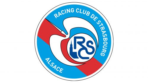
The design the identical, except there’s now an additional ring of white around the emblem.


