The full name of the sports club commonly known as VfB Stuttgart is Verein für Bewegungsspiele Stuttgart 1893 e. V.
While the VfB Stuttgart logo has gone through around ten modifications, it has always preserved the shield shape. Also, the stylized antlers and the lettering “VfB” could be seen on the logo for most of its history.
Meaning and history
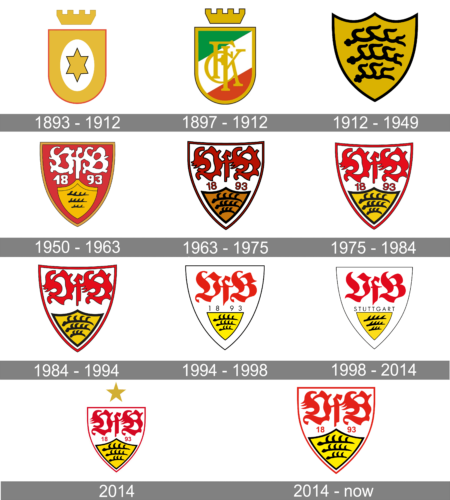
FV “Stuttgart” was founded in the prestigious district of Bad Cannstatt on September 9, 1893, as a student rugby team. In 1912, almost twenty years later, the club began to play football. Since the field was not suitable for football games, the club merged with the Crown Club Cannstatt (Kronen-Klub Cannstatt). The name was changed to VFB Stuttgart 1893. The real success also came even later when Robert Schlins came to the post of the head in the 50s. Under his leadership, the team won four trophies. It surely did not stop there and had numerous other achievements.
What is VfB Stuttgart?
VfB Stuttgart is a renowned German sports club, primarily known for its football division. Based in Stuttgart, Baden-Württemberg, the club was founded in 1893. They have a decorated history in German football, including multiple Bundesliga titles and DFB-Pokal victories. Renowned for their youth academy, VfB Stuttgart is a significant contributor to German football, both in terms of talent development and competitive spirit.
1893 — 1912
The club’s history can be traced back to 1893, when Stuttgarter Fußballverein was founded at the Zum Becher hotel.
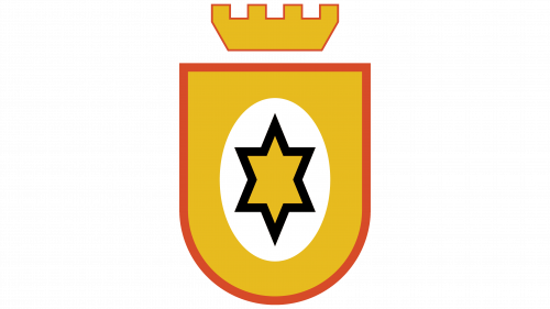
The original logo was a simplified shield with a rounded lower part and a crown above. Inside, there was a six-pointed star in gold with black trim. The star was placed inside a white ellipse.
Black and gold are the official colors of Stuttgart and the state of Baden-Württemberg.
1897 – 1912
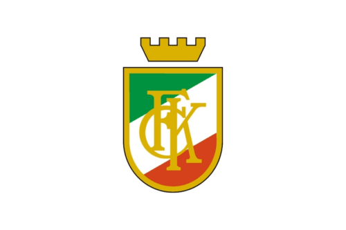
Although the club preserved the shield shape and crown above it, the center of the emblem now looked completely different. The three diagonal stripes hinted at the flag of Italy. The red outline around the shield and crown was replaced by a thin black one. The shield also had a thicker golden border. The center of the emblem was now a golden monogram that consisted of overlapping letters “CFK”. The inscription looked elegant thanks to the serifs and color choice, taking the whole emblem to the next level.
1912 — 1949
Stuttgarter FV merged with Kronen-Club to form Cannstatt Verein für Bewegungsspiele Stuttgart.
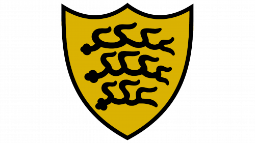
The shape of the shield grew more complicated. The lower part adopted an angle. At the top, there were now two curves.
Inside the gold shield, there were three black antlers. The antlers were known as the symbol of the royal House of Württemberg as far back as in the 13th century.
What does the royal house have to do with the sports club? About three miles from VfB’s stadium, there are the ruins of their eponymous castle. Taking this into consideration, the fact that the club opted for this theme as the core of the logo looks pretty natural.
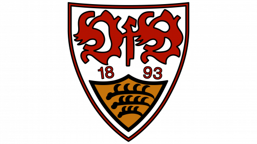
1950 — 1963
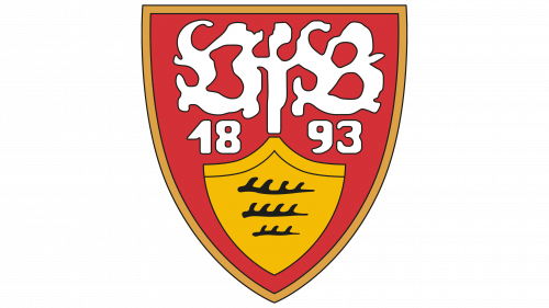
The gold shield with the black antlers grew smaller. It was placed inside a larger red shield and occupied its lower part. Above, there was the lettering “VfB” in old Germanic calligraphy. The writing was hardly legible and looked more like an abstract emblem. Yet, as the club was familiar to almost everyone in its country, it could afford to use such an illegible logo.
The year 1893 was given in a much more clean and readable type.
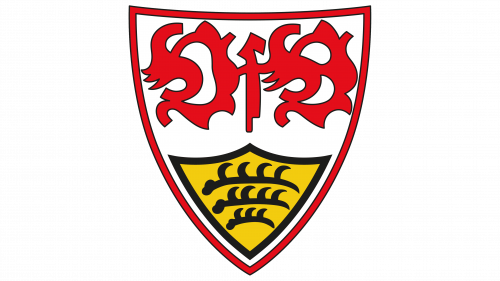
1963 — 1975
The red filling disappeared – now the shield was white. The name of the club and the year were colored red, to stand out over the white background.
There was a slight shift in the palette – both the red and the gold grew darker, which made them look “older.”
1975 — 1984
The shades of the colors were modified once again. This time, they grew lighter.
1984 — 1994
The year, when the club was founded, disappeared from the VfB Stuttgart logo leaving it cleaner and less cluttered (if it was possible at all for a design using an old Germanic script).
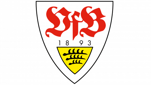
1994 — 1998
The designers slightly simplified the lettering. Of course, it was still hardly possible to figure out the name of the club unless you already knew it. And yet, the shape of the letters grew more minimalist, and at least you could see that they were real letters, not just an abstract image.
The year returned but looked smaller now. It also appeared a little out of place due to the modern shape of the characters.
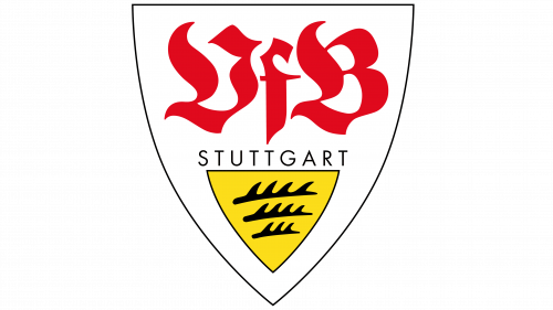
1998 — 2014
The “VfB” part was tweaked once again growing lighter and more transparent. The curls were a little simplified. Instead of the year, the word “Stuttgart” was now used, again in a modern font that didn’t fit. The antlers grew simpler and more dynamic.
2014
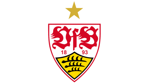
Looks like the authors of the logo gave up any attempt to make the design cleaner, more minimalist, and modern.
Instead, they returned closer to the club’s heritage, both in the shape of the “VFB” and the anglers. Not only the year returned but even the gold star from the original 1893 logo. It now had but five points, though.
2014 — Today
Font
The VfB Stuttgart logo is based on an intricate old Germanic script.
Color
The combination of black and gold, the colors of Stuttgart and the state of Baden-Württemberg, has been used to establish the link with the location where the sports club is based.


