Stranger Things is the name of a Netflix tv-show, which was launched in 2016, and by today has four seasons and 32 episodes released. The show tells a story of a fictional American town, where several supernatural events occur.
Meaning and history
Stranger Things was a revelation in 2016 and continues to be one of the most interesting TV shows to date. Stranger Things is enjoyed equally by critics and viewers of all ages. The series was praised not only for its directing, meticulously recreated 80’s atmosphere, and excellent acting but also for its unique visual identity, about the history of which we will talk a little later.
What are Stranger Things?
Stranger Things is a Netflix project, released in 2016, and consists of four seasons. The plot of the show is built around the fictional American city, where each of the citizens has one or another supernatural ability.
The creators
The show runners for the insanely popular series were the brothers’ Ross and Matt Duffer, who had only one movie under their belt before, “The Lurkers,” as well as scripts for several episodes of the series “The Pines.” So, “Stranger Things” could well be called a lucky ticket for the filmmakers.
In producing the first season of Stranger Things, the Duffer brothers tried to imagine what would have happened if Steven Spielberg had undertaken to screen Stephen King. The script for the series sometimes had to be worked on impromptu – coming up with it on the fly with the other members of the team.
The plot
There is a one-year gap between each season of the Stranger Things series, but the protagonists are still the same. The project tells a story of a group of teenagers. The first season takes viewers to 1983, the small town of Hawkins, Indiana. A boy goes missing in town under mysterious circumstances. The local police chief, his mother, and a brave team of high school friends begin the search for him. And they also encounter a strange bald girl who at first can not say a word. Only over time will it become known that the girl has telepathic abilities and she escaped from a top-secret government laboratory. As a bonus, some unpleasant company pops up after her from a parallel reality in the form of a monster, a Demogorgon.
The history of the Stranger Things Logo
It’s no secret that the show’s creators, the Duffer brothers, drew inspiration from Stephen King’s work, and originally Stranger Things was intended to be a remake of It. In the end, the concept had to be revised and the show became an independent and very bright representative of “school horror” without losing the atmosphere of King’s novels.
The logo was based on the covers of books from the heyday of the King of Horrors, such as Skeleton Team, It, The Skinny One, and The Pet Cemetery.
All in all, about 20 design variations were created until the choice settled on the most unique and harmonious one. However,it later underwent a series of cosmetic changes, until the final result, which we can observe today, was presented.
The authors of the Stranger Thing sseries have even published a short video in which they talked about the process of creating an old-school logo. It turns out that it was quite a time-consuming process of choosing a font and fine-tuning it. They even had to go through mountains of covers and posters of books, movies, and music albums from the 1970s and 1980s.
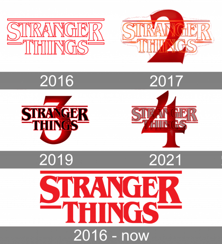
For each season the logo was modified in one main thing — the number was added to the iconic red wordmark, and each time it was set in one style, supporting the concept.
2016 (Season 1)
The Stranger Things logo, introduced in 2016, featured a bold two-leveled inscription in the uppercase, executed in a strongly contoured serif typeface, in red. The lettering was accompanied by one long horizontal line, covering it on top, and two short ones on the sides from the “Things”, underlining two enlarged letters of the “Stranger”, “S” and “R”.when set against a black background, the contours of the Stranger Things badge got set in neon, with the blurred edges of the lines in a slightly lighter shade of red.
2017 (Season 2)
With the release of the second season of Stranger Things, the new logo was introduced in 2017. It was the same style of the lettering, but executed in gradient lines, from orange to red, and accompanied by a bold dark red-to-black numeral “2”, enlarged and placed on the background of the logo. Despite the change of the contours’ color to a more vivid orange one; the whole mood of the badge didn’t get lighter, and the drama level was still as high as in the original version.
2019 (Season 3)
The logo for the Stranger Things 3 saw the light in 2019. It was executed in the same style as the two previous versions, but with the bodies of the letters turned black, and outlined in red. The inscription was overlapping the enlarged numeral “3” set in red-to-black gradient shades and featured sharp clean lines of the contours.
2021 (Season 4)
For the fourth part of the Netflix project, the new badge was created in 2021. The lettering in the recognizable contoured serif fit gained a transparent gray shade and was now set on a background with the enlarged numeral “4”, which repeated the color palette of the “3” from the previous logo but had its lines drawn more elegantly, with curved and sharp angles.
2016 – Today
The Stranger Things logo, which has been used by the project since its launch in 2016, is based on the sharp and elegant two-leveled inscription, set in a custom Benguiat typeface, with three additional horizontal lines, set above the top level of the badge and on the sides from it. The official badge of the project is usually set in plain flat red, against a black orwhite background, and sometimes is stylized as a red brine banner.
The inspiration behind the symbol
In an interview, Matt and Ross Duffer claimed that the type used in the title sequence was a “super important” element of the show. Why did the Duffer Brothers and designers from Imaginary Forces opt for this font?
According to Michelle Dougherty, the representative of Imaginary Forces, it was supposed to be a combination of a Stephen King novel font and a title sequence of Alien. The Duffer brothers sent 15 novels by Stephen King to the design studio so that the authors of the logo could capture the style of the book covers. Interestingly, the same type was featured in a series of books for kids called Choose Your Adventure.
Description of the emblem
In what way was the ITC Benguiat type customized for the Stranger Things logo?
If you take a look at the initial letters, “S” and “T,” you’ll notice their style is somewhat different. The “S” from the original font is slightly thinner and has an extended left end. Also, its top serif has been adjusted to fit the serif on the following letter. The initial “T” on the logo, in its turn, has less elaborate and delicate serifs than on the original font.
You’ll also notice the way the letter “A” merges with the “R” and “N.” The “N” and “G” in bothwords are also closer than they are supposed to be. Probably the authors of the title sequence needed to make the text somewhat more compact, which was also the reason why the “G” has been slightly cut on the left. The middle serif on the “G” and the top serif on the final “S” has been slightly reshaped, too – on the logo, they look more solid. The same can be said about the middle and the lowest serifs on the “E.”
Additionally, all the glyphs have been stretched vertically.
Font
The logo is based on the ITC Benguiat font. It’s a decorative serif type developed by New York typographer Ed Benguiat and published by the International Typeface Corporation in 1977. By the way, the ITC Benguiat type, in its turn, was inspired by fonts of the Art Nouveau era.
As the author of the font later explained in an interview, he hadn’t put any specific meaning or symbolism into his creation. He said he was just trying to make a type that would be “pretty and legible.” Also, it hadn’t been his idea to name the font after himself. It was the president of the type foundry who suggested it.
Colors
The red gradient used on the black background makes the lettering look a bit like the red neon bars of a Motel sign. This dramatic shade of red in contrast with black brilliantly depicts the inspiration of the series authors, which they took from Stephen King’s works. Red here is not about passion or romance, but about mystery and danger, a hypnotizing plot of the series, and a deep impression on you get after watching it.
What font is the Stranger Things logo?
The heavy uppercase lettering on the Stranger Things logo is set in sleek and classy serif fontsthatlook pretty close to such typefaces as ITC Benguiat Condensed Bold, or Royale Imogen Bold, but with the characters refined and narrowed.
What color is the Stranger Things logo?
The bright and powerful logo of the Stranger Things tv-show is set in a classic red against a white background. Red is the color of passion and strength, which also represents dynamics and danger, action and progress.
What is the Stranger Things logo based on?
The Stranger Things logo is based on the name of the tv-show, which is accompanied by two horizontal lines, set in the same shade of red, and featuring a medium thickness, balancing the softened heavy contours of the characters.
Is the Stranger Things logo copyrighted?
The Stranger Things logo is based on the lettering, executed in a commercial typeface, which is available online, so the logo does not meet the threshold of originality needed for copyright protection, and can be freely used. Although Stranger Things itself is a trademark, owned by Netflix.


