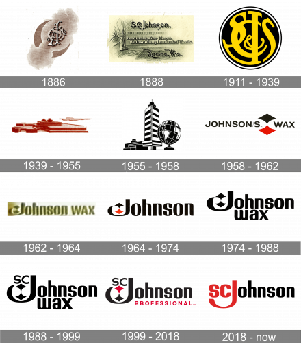
S.C. Johnson is a brand of chemical household supplies, established in 1886 in the United States. The company has several subsidiaries, which operate across the globe and take the leading positions on the global market.
Meaning and history
SC Johnson is a family-owned American company, which today is the world leader among manufacturers of home care products and household chemicals.SC Johnson has been making household chemicals for more than a century, and the company is now run by the same family that founded it.
The history of S.C. Johnson began in 1886 with the purchase by Samuel Curtis Johnson of a parquet manufacturer. The company was renamed “Johnson’s Prepared Paste Wax Company” and from that time the history of the world-famous family business began. Today the company is run by the fifth generation of the family – Herbert Fisk Johnson III.
What is SC Johnson?
SC Johnson is an American company engaged in the production of household chemicals. The company was founded in the United States in 1886 and is named after its founder. The most famous products of the company are various detergents.
1886

The initial logo depicted the company’s initials written one over the other in Gothic letters. These were put in the middle of a wisp of cloud, as well as encircled by a crescent moon image.
1888
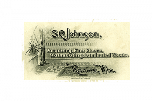
The next logo was a sort of rectangular brochure depicting the interior of some Southern villa. The company’s name was written above in the elegant letters. The middle was occupied by a list of the company’s products, while the very bottom contained the firm’s address at the time.
1911 – 1939

The 1911 emblem was a black circle with yellow letters inside. These were the initials again, except there were now 2 letters ‘S’ instead of one.
1939 – 1955

In 1939, they simply started using the image of their head office – a big red building shaped like a number of layered blocks. Besides that, they also added a random cloud on the right.
1955 – 1958

In the 50s, the brand also used their building as an emblem, except at a different angle and with the newly-built tower and a globe. Everything was black-and-white.
1958 – 1962

In 1958, they introduced the company’s name as the new emblem’s centerpiece. It said ‘Johnson’s Wax’ in capital, black letters. However, the two words were separated by the imagery that looked like two warped, mirrored diamonds (the car suits) of black and red.
1962 – 1964

In 1962, they just wrote the same thing, except at a more elegant font and with golden letters.
1964 – 1974

The 1964 logo is simply the word ‘Johnson’ as written in the previous design, except with black letters. In the turn created by the first letter’s tail, they also placed the old diamond composition, but in a smaller scale.
1974 – 1988

In 1974, they turned the entire logo black and added the word ‘Wax’ in the same style right below the main word.
1988 – 1999

The next logo was given the letter ‘SC’ right above the diamonds, and was otherwise the same.
1999 – 2018

In 1999, the upper diamond was painted red again. Moreover, they replaced the ‘Wax’ bit with the word ‘Professional’. It was using a more basic, red font than the big word.
2018 – Today
The S.C. Johnson logo is composed of a wordmark with a tagline. The enlarged letter “J” of the inscription is the only decorative element of the company’s visual identity.
The S. C. Johnson nameplate is visually split into two parts — the red one, composed of capital letters, and the black one with only lowercase lettering. Both parts are executed in a smooth and cold sans-serif typeface with its lines curved.
The capitals “S” and “C” are drawn in red and placed above the red “J”, which is the biggest letter of the logo. It looks like a nest for the two letters and is the brightest element of the logotype.
“A family company at work for a better world” tagline is placed under the lowercase part of the nameplate and uses black color for its simple sans-serif lettering, which perfectly balances the color palette.
The black and red color combination of the S. C. Johnson logo is traditional and powerful. Reflecting patriot and strength of the company, red and black duo evokes a sense of professionalism and stability.
Font and Color
The bold and slightly narrowed lettering from the primary SC Johnson logo is set in a fancy sans-serif font with sleek contours of the letters and softened angles of the bars. The closest fonts to the one, used in this insignia, are, probably, Murat Grotesque Alt 45 Bold, or Dance Routine Regular, but with some slight modifications of the contours.
As for the color palette of the SC Johnson visual identity, it is based on a powerful combination of red and black, which represents the confidence, reliability, and professionalism of the brand, and makes its badge timeless and always actual.


