 Stony Brook Seawolves Logo PNG
The previous athletic logo of Stony Brook University in Stony Brook, New York, played with the “seawolf” theme, while the current one is pure typography.
Meaning and history
The Stony Brook Seawolves, a dynamic emblem of athletic vigor, originated from the energetic campus of Stony Brook University in New York. This spirited moniker, adopted by the university’s athletic teams, encapsulates the essence of determination and competitiveness characteristic of the institution. Since its inception, the Seawolves have navigated through an eventful journey marked by significant milestones.
In the tapestry of their achievements, the Seawolves have etched their name in the annals of collegiate sports through exceptional performances in basketball, soccer, and lacrosse. These triumphs are not mere athletic feats but emblematic of the university’s commitment to sporting excellence. They have consistently showcased skill and resilience, earning accolades that resonate beyond the boundaries of the campus. This legacy of success is further enriched by the infusion of elite coaching and athletic talent, which has bolstered their standing in the realm of college sports.
In the current epoch, the Stony Brook Seawolves stand as a paragon of athletic distinction. Their stature in the world of collegiate sports is a harmonious blend of historical success and an unwavering dedication to excellence. Embracing the ethos of nurturing emerging talent and fostering a culture of spirited competition, the Seawolves continue to captivate and motivate a diverse audience, extending their influence beyond the university’s confines.
What is Stony Brook Seawolves?
Stony Brook Seawolves is the name of a college athletic program from the Stony Brook University in New York. The program consists of 17 men’s and women’s teams in various sports disciplines and is most known for its men’s football team. The program plays in NCAA Division I.
1998 – 2007

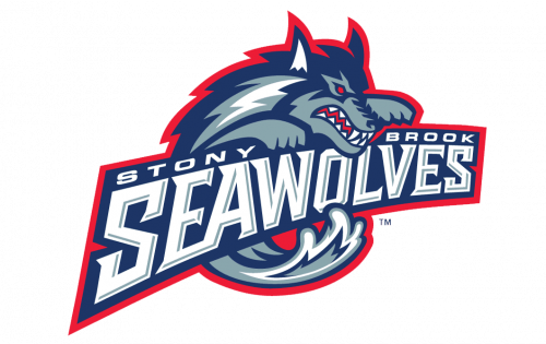
The Seawolves logo, used by the club from 1998 to 2007, was very bright and or tame. The blue, gray, and Ted combination of colors made the straight and sharp lines of the graphical part and the logotype look powerful and energetic. The logo, which was placed a bit diagonally, featured a graphical image of the Wolf, placed above the dark blue banner in a thick red frame, with a light gray and white lettering written on it in two-level. The upper level featured “Stony Brook” inscription in an extended sans-serif typeface, and the bottom — an enlarged “Seawolves” in a boldly stylized font with a light and dark gray and blue shades.
2008 – Today
The current Stony Brook Seawolves logo has been in use since 2008. Here, there are the block “S” and “B” positioned one above the other. Although they overlap slightly, this does not damage legibility in any way. The palette is dominated by red with white and light blue trim.
Stony Brook Seawolves Colors
STONY BROOK RED
PANTONE: PMS 187
HEX COLOR: #990000;
RGB: (153, 0, 0)
CMYK: (5, 100, 71, 22)
MIDNIGHT BLUE
HEX COLOR: #16243E;
RGB: (22, 36, 62)
CMYK: (94, 82, 47, 52)
STONY BROOK GREY
PANTONE: PMS 420
HEX COLOR: #828282;
RGB: (130, 130, 130)
CMYK: (18, 14, 14, 38)


