StoneX Group Inc. is a Fortune 100 company that works in commercial hedging, securities, physical commodities, global payments, foreign exchange, as well as CES. The company gives access to around 40 derivatives exchanges and around 175 foreign exchange markets serving over 32,000 clients. It is headquartered in New York.
Meaning and history
To get an insight into the StoneX logo, it would be interesting to try and establish its connection with what the company does and what it stands for. Also, we’ll compare it with the visual brand identity of its predecessor, INTL FCStone, to look for possible links and inspiration.
Let’s first tell a couple of words about the company’s history. You could be surprised to find out that the company with such a modern brand identity started as far back as 1924. Originally, it was a door-to-door egg wholesaler. Within a few years, it became a butter and egg broker and adopted the name Saul Stone and Company. Saul Stone was a Russian emigrant, who came to Chicago in an attempt to escape persecution.
What is StoneX?
StoneX is a financial services organization connecting its clients to the global markets ecosystem using various institutional-grade platforms for the purpose. The company employs over 2,900 workers. In 2021, it was ranked No. 58 on the Fortune 500 list.
His company turned out to be rather successful. Decades of growth and expansion were awaiting it. Eventually, it merged with Farmer’s Commodity Corporation. As a result, FCStone Group, Inc. was formed. In 2007, it went public.
Following a series of acquisitions, FCStone Group, Inc. was rebranded as StoneX Group Inc. in 2020.
2020 – present
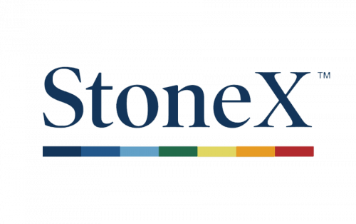
Some of the associations that can appear when you take a cursory glance at the StoneX logo are “a reliable business with a modern touch” and “diversity.” The first association comes from the wordmark. The letters are of a dark and muted shade of blue with a pronounced gray undertone. This is a rather business-like color.
Also, we can see a rather traditional typeface, where glyphs have a regular shape and proportions. The serifs and the way the line goes from thick to thin even make it look somewhat dated. The choice of such a font is a subtle way to allude to the company’s rich history.
The modern touch comes from the capitalized final glyph and the fact that this glyph is the “X.” When the company began a century ago, such a denial of grammar was uncommon, to put it mildly. Even today, it gives a futuristic nuance. Take, for instance, SpaceX, an aerospace manufacturer founded by Elon Musk.
Now, where does the “diversity” association come from? This is what you can perceive from the horizontal line positioned below the wordmark. It combines the seven colors of the rainbow. Interestingly, they start not from red but from blue. In other words, they follow each other in a way that is opposite to its original one. This helps to make the design calmer, because the cool and more muted colors come first.
The last logo of the predecessor of StoneX, the company INTL FCStone, looked pretty similar. Here, there is also a wordmark in grayish blue with a multicolored line below. However, the combinations of colors and the hues are a little different here. The type is slightly more modern, with heavier serifs. Interestingly, before this logo, INTL FCStone used another one, which was more similar to that of StoneX.
Colors and fonts
All the colors in the palette are subdued, with a pronounced gray tint. This keeps the StoneX logo from being noisy, which could be possible, considering the diversity of the palette. The choice of typeface connotes heritage.


