Starz is the name of an American pay-per-view cable television channel that airs new movies and series. The tv-channel, owned by Lionsgate Group, was established in 1994 under the name Encore. Today, the channel does not only broadcast famous tv-shows but is also engaged in the production of its own series. The most famous and new series on Starz TV is Black Sails, Spartacus: Blood and Sand, Da Vinci’s Demons, and Power.
Meaning and history

One of the most popular cable tv-channels in the USA, Starz, started broadcasting in February 1994. It broadcasts around the clock and is available to its viewers in both standard and HDTV formats. According to some estimates, its audience is more than 20 million people. Until 2005 the channel had an exclamation mark in its name, then it was rebranded.
The channel is pay-per-view, offering its subscribers big movie novelties and TV series. Not all of Starz’s television projects are of their own production. In fact, the channel started working in this field only a few years ago but has already succeeded and released several really significant products.
1994 – 2005
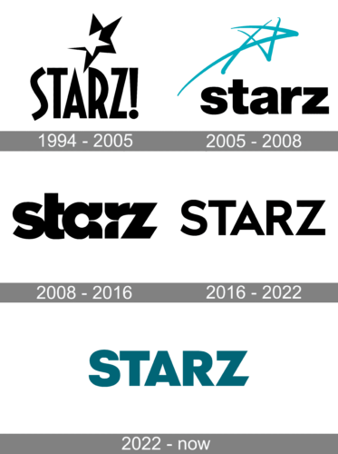
The very first Starz logo was introduced in 1994 when there was an exclamation sign in the naming. It was the most complicated and overloaded logo among all versions. The only simple thing here was the color palette — black and white. The uppercase logotype in a modern sans-serif logotype, followed by the exclamation sign, was placed under a graphical element, composed of two stars — a bigger black one and a smaller white, overlapping it on the left.
2005 – 2008
The first redesign happened in 2005 after the exclamation was removed from the naming of the channel. The new logo featured a bold sans-serif inscription in the lowercase, set in black, and a hand-drawn five-pointed star with the elongated tail spread to the bottom left. The star was executed in a calm turquoise shade, a color of creativity and imagination.
2008 – 2016
In 2008 the new Starz logo was designed by Troika Design Group. It was a monochrome logotype in the lowercase, executed in a bold Sans-serif typeface with full-shaped letters, which were placed close to each other. The space between the “A” and the “R” was stylized as a thin white four-pointed star and looked beautiful and sophisticated. This badge stayed with the channel for long eight years.
2016 – 2022

In 2016 the company decides to go minimalist and undergoes another redesign. The new emblem features a simple uppercase wordmark in a medium-thick Sans-serif typeface with clean contours and straight cuts. This version was designed by the same bureau, Troika Design Group, and it looks completely different from the option, offered by the team earlier.
2022 – Today
Font and color
The bold and sharp Starz logotype in the uppercase uses a modern and strong sans-serif typeface, which is similar to Radikal Bold, a font with sharp lines and angles and a very powerful character. It looks progressive and creative, along with the sense of confidence and stability in its contours.
The black and white color palette of the Starz visual identity works well with the channel’s variety of tv-shows and series. It is always appropriate, elegant and strong, and can be placed on absolutely any background, from plain bright or dark colors to imaginary ornaments and designs.


