Staples is the name of one of the largest office supply chains in the U.S.A. The company, established in 1986 in Massachusetts, is involved in selling office equipment, supplies, and all kinds of office products, along with office and data technology.
Meaning and history

Staples was established in the middle of the 1980s by Thomas Stemberg, who had previously had a good experience as a top manager in the grocery industry, decided to apply it to a new field. Since the opening of the first store in Brighton, Massachusetts, and by today, Staples has undergone all stages of turning a small business into one of the most successful companies in its segment.
Today Staples is the world’s leading provider of office products and services, which has earned itself an excellent reputation for many years of excellent work with corporate and individual clients in the United States, and internationally. Among the products offered by the company, you will find not only office supplies but also computer equipment, electronics, office furniture. In addition, the company provides computer and office equipment repair, printing, and copying services.
What is Staples?
Staples is the American company-provider of office supplies, which was established by Thomas Stemberg in 1986. Today the colony has more than a thousand stores across the USA and Canada, and also works internationally via its online store.
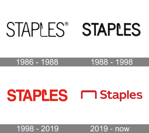
In terms of visual identity, Staples has always been very modern and minimalistic. The first two logos of the company were fully text-based, with one letter being interestingly stylized, but after the redesign of 2019, the emblem went out of the inscription and got its place on the left from the lettering.
1986 – 1988

The initial Staples logo was introduced in 1986 and stayed unchanged for almost half a decade. It was very cool and progressive for its times insignia, executed in a strict black-on-white color palette. The logo boasted a bold and massive uppercase logotype in a slightly narrowed sans-serif typeface with contours of the letters touching each others’ corners. The letter “L” was stylized as a paper clip, which was placed vertically on its side with the right angle, and had the upper side bent inside. The simplicity of the logo and its “direct” symbolism did a great job in making the company recognizable.
1988 – 1998

The company did not make any drastic changes to its logo. In fact, they simply made the strokes thicker and the letters just a bit shorter. This modification created an image of a stronger and more trustworthy company. Somehow, the logo also looked more professional.
1998 – 2019
The redesign of 1994 kept the concept of the original badge but switched the typeface of the logotype and, what is more important, it’s the color palette. The black insignias became scarlet-red, making the whole badge look more powerful and stylish. As for the typeface, it was still a bold sans-serif, but with the letters in their full shape, and with a bit of space in between, so now the contours were not touching each other. As for the stylized “L”, it was still the same paper clip, but due to the change of the font, it became more stable and smooth.
2019 – Today
The design of the Staples logo was significantly changed in 2019, although the color palette remained untouched. The new badge is composed of an emblem, depicting a paper clip placed horizontally and making a king of a square arch with rounded angles, followed by a title case inscription in a wide bold sans-serif typeface. The logo can be seen in two options: red on white, and white on a solid red banner. The new badge looks more traditional but also evokes a sense of stability and professionalism.
What font is the Staples logo?
The bold and confident title case lettering from the primary Staples badge is set in a traditional and elegant sans-serif typeface, which is pretty close to such fonts as Helvetica Neue Bold, or Without Sans SemiBold, with some minor modifications, such a slightly curved tail of the letter “A”.
Did Staples change their logo?
Throughout the years (since the beginning of the 1980s), there were three logos created for Staples. The last redesign was held by the company in 2019, with the uppercase logotype replaced by a title case one, and the graphical element moved from the inside of the inscription to its left.
Why did Staples change their logo?
As any other modern company, which has been in the market for long, Staples decided to change it logo in order to reflect its progressiveness and ability to change with the needs and interests of its customers. Moreover, the company keeps expanding the assortments of the products, hence the simpler the logo — the larger the field the brand covers.
What is the Staples new name?
The Staples brand, owned by the company , producing office supply goods, has never been changed since the day of its foundation, in the 1980s. But we are, probably, talking about the Staples Center in Los Angeles, which was renamed to Crypto Com Arena in 2021.


