Whole Foods is an American chain of eco-grocery stores, offering a wide selection of organic and natural products. The company was established in 1980 and today headquarters in Texas with more than 500 stores nationwide and almost ten in the United Kingdom. The brand was acquired by Amazon in 2017.
Brand Overview
Whole Foods Market is the leading American chain of natural foods supermarkets, which operates across the United States, Canada, and the UK. Established in 1980 by John Mackey and Renee Lawson Hardy, the company is getting more and more popular, as well as its assortment — bigger.
The range of the products, that can be found in the supermarkets, includes fruits and vegetables, meat, fish and seafood, eggs and dairy products, bread, snacks and frozen foods, prepared foods, and beverages, including wine and beer.
The company also created its own line of products, where they produce branded items under such categories as pasta, butter, teas, and vinegar. All the products are of the highest quality and made of natural ingredients.
Some of the supermarkets have juice bars and cafes, where everyone can enjoy organic foods and drinks.
After the acquisition of the company by Amazon, it was able to expand its market, offering online shopping for the customers and fast and safe delivery of the products. It is possible to purchase through the Whole Foods website or right in the Amazon application. When ordering online there are also such sections as Sales and Amazon Prime Members Deals, where the high-quality products are available with good discounts.
or pay bills.
Meaning and history
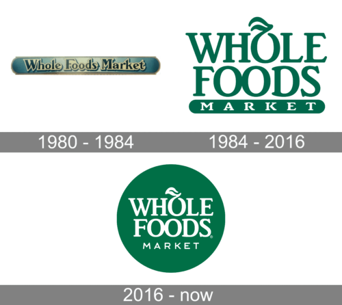
The visual identity of the company was redesigned only once, in 2016, but kept all the main principles and color palette of the original version. Its traditional logo is composed of a wordmark with a delicate emblem inside, and perfectly reflects the company’s essence and profile.
What are Whole Foods?
Whole Foods is an American supermarket chain; which was established in 1980 and today has over 500 locations across the country. The chain is specialized in bio and natural grocery products, along with pharmacy items, beverages, and even flowers.
1980 – 1984
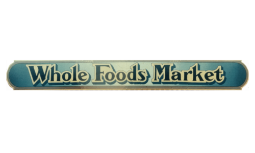
The original logo of the grocery chain was designed the same yet the company was established, in 1980. It featured a sharp serif font for the “Whole Foods Market” inscription. The letters were a dark blue color and had a light beige background that repeated their shape. This inscription was placed on an elongated rectangle with rounded ends and had a shadow behind it. This base had a blue and beige gradient with a light brown border. The logo turned out quite detailed and polished.
1984 – 2016
The logo was composed of a sleek bold wordmark set in two levels and the word “Market” in all capitals placed on a thick green underline.
The emblem of the store is a stylized letter “O” in “Whole”, which looks like fruit with the leaf, waving to the left. It looks simple and delicate, yet very elegant and recognizable.
The green and white color palette of the visual identity is a reflection of freshness and growth, the colors also symbolize reliability and success, letting the customers know, that here they can find the best products of the highest quality.
2016 – Today
The original logo wasn’t changed much, only slightly modified in 2016. The typeface of the inscription was replaced by a more confident one, while the whole logo now is color red white and placed on a rounded green background.
The word “Market” is now placed right under the wordmark without any additional lines and details. The leaf of the “O” gained a smoother and sleeker shape, and now the letter started resembling a fruit even more. It can be seen as an apple or a peach.
Font
The main wordmark is executed in a bold and elegant serif typeface, which is very similar to Brighton Com Bold, but with the letter “F” modified — one vertical serif is added to its horizontal bar.
The strong and sophisticated classy inscription is balanced by a light and modern “Market” tagline in all capitals, which is written in a light and clean sans-serif typeface, which is pretty close to Lawyer Gothic but with some letters modernized.
The nameplate is perfectly balanced and two typefaces ideally suit each other, adding modernity to classics and fundamental approach to progressiveness.


