Sports Illustrated is the name of an American monthly magazine, which was established in 1954. One of the most reputable sports editorials in the world, today the magazine has Chris Stone as its editorial director and is published by theMaven.
Meaning and history
Sports Illustrated in its today’s state was founded in 1954, but the predecessor of the famous editorial was created in 1936 by Stuart Scheftel. It came out once a month but lasted only two years. The original editorial was devoted to golf, tennis, and skiing. Stewart eventually sold it to Dell Publications. The new format covered mainly baseball, basketball, and boxing.
The American magazine has been reporting on important aspects of sports for many years. For the most part of its history, Sports Illustrated has been the most reputable magazine in its segment. Until 2015, the magazine was released weekly. Today, the company has had to adjust to the modern world, gradually shifting to digital content, with a print version coming out once a month.
What is Sports Illustrated?
Sports Illustrated is the name of the iconic sports magazine, which was established in the USA in 1954. During its early years, it was a weekly magazine, but today the editorial switched to digital format, with its printed version coming out every month.
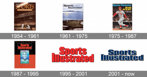
In terms of visual identity, the sports magazine has always been open to experiments and tried several logo designs throughout its long history. Although, all of them were fully text-based.
1954 – 1961
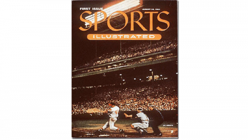
The original Sports Illustrated logo was introduced with the first cover of the magazine, published in 1954. The logotype stayed unchanged for almost seven years. It was a two-leveled composition with the enlarged “Sports” part in all capitals set directly on the cover photo, and the solid horizontally stretched banner under it, with white “Illustrated” in small caps on it. The banner had its sides rounded.
1961 – 1975
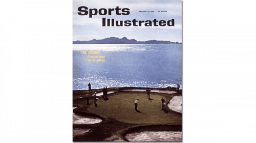
In 1961 the editorial goes more minimalist and strict. The orange and white logo turns black, and now both parts of the magazine’s name are executed in one style: bold sans-serif lettering in the title case. Although, the “Sports” part is still a little bit bigger than the “Illustrated” one.
1975 – 1987
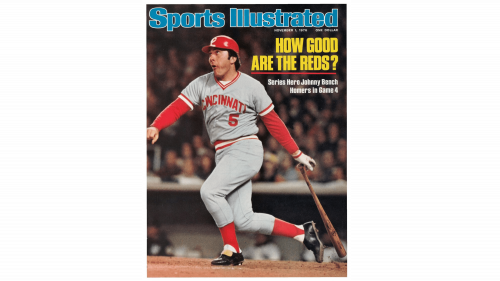
The redesign of 1975 brought color to the Sports Illustrated logotype. Now the extra bold inscription was written in one line, with its massive intense-turquoise letters outlined in white and set directly on the cover photo, with no framing or background. The typeface of the wordmark was pretty close to the previous version, but with the letters emboldened and placed closer to each other, touching the outlines.
1987 – 1995
In 1987 the two parts of the magazine’s name were set in two levels and framed into a horizontally oriented rectangular. The new Scarlett-red color palette of the logo made it look powerful and eye-catching. As for the typeface of the wordmark, it was slightly refined, with the letters getting a bit more narrow and tall. The difference in heights of the first “I” and two “L”s in “Illustrated” got more visible now. As for the framing, it was quite thin and features white color, for a better contrast with the background.
1995 – 2001
The red color remained untouched with the redesign of the Sports Illustrated visual identity in 1995. Although now the logotype was unframed but had a thin black outline and a delicate black shadow behind every letter. The typeface was slightly modified again, making the bars of the letters thicker, and the space between them — thinner. The contours of most letters were refined, with the horizontal lines shortened.
2001 – Today
The redesign of 2001 introduced another version of the Sports Illustrated badge, in a fresh dark-blue and white color palette, where blue was used for the bodies of the letters, and white — for their thick outlines. The typeface was modernized, with the letters being horizontally stretched and shadowed. The new logotype looks professional and modern, evoking a sense of expertise and excellence.


