Created in 1939 by pulp-magazine publisher Martin Goodman, Marvel Comics expanded very fast until it began to be referred to as one of the “big two” publishers in the comic industry. This is where such superhero teams as the Avengers, the X-Men, and the Fantastic Four were born.
Meaning and history
The company was started as Timely Publications. It was only in June 1961 that the first comic book with the Marvel Comics logo was published. In fact, there were two books: Journey into Mystery #69 and Patsy Walker #95.
What is Marvel Comics
Marvel Comics is a media and entertainment company known for introducing a long succession of superheroes, including Spider-Man, Iron Man, and Black Widow, to name just a few. The brand is part of Marvel Worldwide Inc., which, in its turn, belongs to Marvel Entertainment owned by the Disney Company.
1939 – 1951 (Timely Comics)
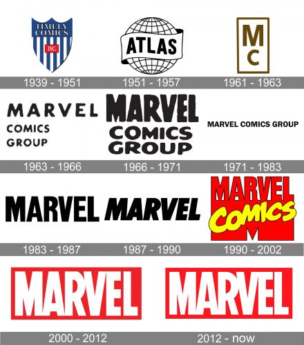
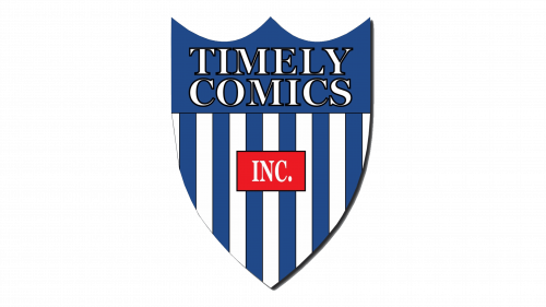
The logo used during the following twelve years was based on a shield shape divided into two fields. The top field was solid blue and housed the lettering “Timely Comics” in white. The field below combined vertical stripes in blue and white. Here, the central place was occupied by the word “Inc.” inside a red rectangle.
1946
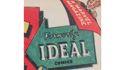
The first atlas Comics logo was created in 1946, and featured a colorful geometric composition with the thick green arrow printing to the left and a bit down, and overlapping a red rectangle with smaller yellow ones. The three-leveled “Formerly Ideal Comics” inscription was set in three different styles in black and white. The upper lines was executed in an outlined smooth cursive, the middle one — in the uppercase of a shadowed geometric serif, and the bottom was written in smooth rounded sans-serif capitals.
1951 – 1957 (Atlas Comics)
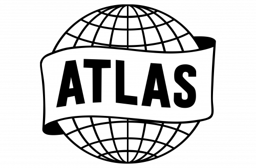
Martin Goodman, the founder of the company, started to use a different brand identity for the comics in November 1951. The covers of these comics featured a globe logo with the word “Atlas” written on a banner. The logo belonged to the Atlas News Company, which was a newsstand distribution company also owned by Goodman.
1961 – 1963 (Marvel Comics)
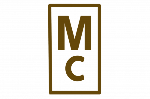
The original logo was utterly straightforward featuring the letters “M” and “C” positioned one above the other. The “C” was smaller than the “M.” The glyphs were placed inside a rectangular frame.
1963 – 1966
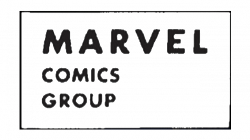
This one contained more information. The abbreviation was replaced by the lettering “Marvel Comics Group,” which was once again placed inside a rectangular frame. The lower right-hand angle was free because the words were aligned to the left. This created a feeling of imbalance and resulted in a slightly awkward design.
1966 – 1971
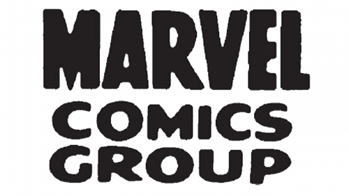
The update resulted in a more professional logo. The frame was gone. The text was centered, which gave the structure the balance it had lacked. The glyphs grew bolder, which added some weight to the wordmark.
1971 – 1983
The type became lighter and cleaner with all the three words positioned within a single line.
1983 – 1987
The words “Comics Group” were dropped, due to which the main word in the company name received all the attention. It didn’t look bolder than in the 1966 logo, but the shapes were cleaner, which resulted in better legibility.
1987 – 1990
The glyphs were italicized adding some dynamism.
1990 – 2002
The era of the red and yellow Marvel Comics logo started. The majority of the space was taken up by a stout, heavy “M.” Its top was formed by the word “Marvel,” also in red. Right across the lower half of the letter, the word “Comics” was written in a casual script.
2000 – 2012
Once again, the logo was reduced to a single word. It was given in large white letters, which were placed inside a red square. The proportions of the glyphs were similar to the 1983 logo, but their shapes were somewhat different.
2012 – present
The design went through a subtle update, which was performed by Rian Hughes. It is hard to notice the differences even with a side-by-side comparison. Some of the most obvious ones are the link at the top of “V” and “E” and the shortened space between the “E” and “L.”
Colors and font
The red color draws your attention to the Marvel Comics logo. The glyphs are positioned very close to each other, which results in a feeling that there’s a lack of free space.


