

![]() Sporting Logo PNG
Sporting Logo PNG
Sporting is the name of one of the most successful Portuguese football clubs which was established in 1906. Today the club, nicknamed “Lions” (or “Leōes” in Portuguese) is managed by Frederico Varandas and has Ruben Amorim as the head coach.
Meaning and history
![]()
When you think of Sporting FC, the lion rampant is one of the first things to come in mind. This symbol has been with the club like forever since the very first logo was created for them in the 1900s. As well as the iconic green and white color palette, which symbolizes life, growth, and progress.
1907 — 1913
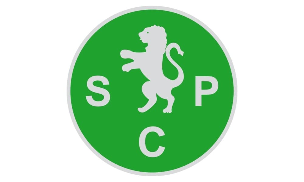
The very first emblem for the Portuguese club was designed in a very minimalist yet bright style. It was a green circle with a solver gray lion rampant in the middle and “SCP” letters in bold sans-serif around the animal contour. It was clean, laconic, and remarkable.
1913 — 1930
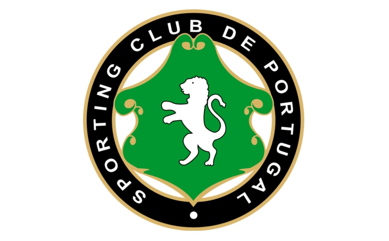
In 1913 the lion becomes white and is being placed on a green shield with smooth curved contours. The shield is enclosed in a black circular frame, where the “Sporting Club de Portugal” inscription in all capitals was written in white.
1930 — 1945
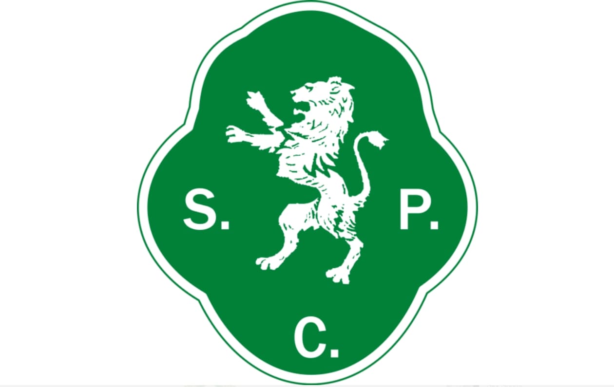
The redesign of 1930 takes the circular frame away, and the smooth elegant medallion in green with a white outline comes out. The lion is also drawn in white and placed in the center of the badge, with “S. C. P.” Letters placed around it.
1945 — 2001
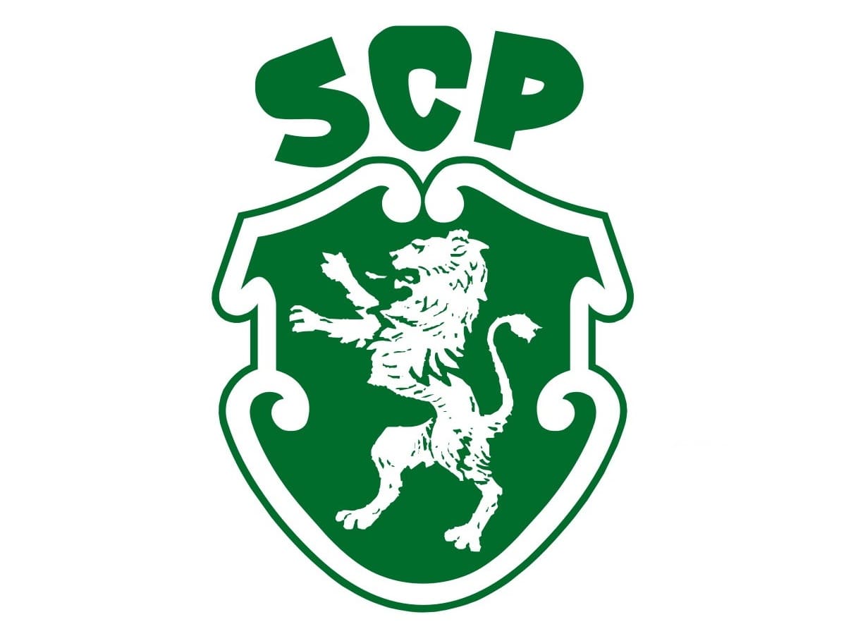
In 1945 the new logo was designed for the famous club, and it is still in use today, along with another one, created at the beginning of the 2000s. The lion on the medallion was enlarged and the lettering was removed from the green background. The badge itself gained a thicker white outline and started looking more elegant and professional.
The “SCP” inscription was now placed above the crest, colored in the same green shade as the crest body. The capital letters of the wordmark are executed in a custom bold sans-serif with smooth angles and distinct cuts.
For the club’s 50th anniversary the emblem was enclosed in green and gold. circular frame with an inscription, and outlined with a laurel wreath.
2001 — 2011
![]()
They introduced a new logo in 2001, but it’s exactly the same as the one they adopted in 2011. The ‘SCP’ part is missing and the color scheme is brighter, though.
2011 — Today
![]()
Another logo, which the club uses today, was created in 2001 and is a modernized version of the lion crest. The yellow lion rampant on a green shield with a white outline is placed inside a bigger shield, which featured a green and white horizontal stripes pattern. The “Sporting Portugal” inscription in white is placed inside the shield, while the green “SCP” letters are written above it.
Sporting Colors
GREEN
PANTONE: PMS 3415 C
HEX: #008057
RGB: (0, 128, 87)
CMYK: (88, 26, 80, 12)
GOLD
PANTONE: PMS 123 C
HEX: #F3C242
RGB: (243, 194, 66)
CMYK: (4, 24, 87, 0)
WHITE
HEX: #FFFFFF
RGB: (255, 255, 255)
CMYK: (0, 0, 0, 0)


