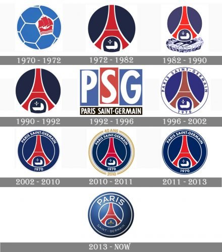
The earliest Paris Saint-Germain logo was introduced in 1970, when the club was founded and remained its primary symbol for two playing seasons. The emblem was built around a stylized depiction of a football, which was given in blue with white seams. There was also a red vessel, which was used as a symbol of Paris. The same logo was adopted by Paris FC, as they were one club at the time.
Meaning and history
Despite its nine redesigns, the visual identity of one of the most awarded European football clubs has always been based on one color palette and the bright symbol, which is strongly associated with Paris — Tour Eiffel. Throughout the club’s history, there were only two versions of the badge designed without this architectural gem on them, and it was at the very beginning of the PSG history, in the 1979s, and later in the 1990s, when the club decided to go more minimalist.
What is PSG?
PSG is an abbreviation for Paris Saint-Germaine, an area in Paris, which game a name to one of the most famous French football clubs. The professional football club was established in 1970, and today has Parc Ses Princes as its home arena and Christophe Galtier as the head coach. The club plays in Ligue 1, the highest tierfootball league in France.
1970 — 1972
The very first visual identity design of the Paris Saint-Germain football club was introduced in 1970 and featured a light blue football with a hexagonal pattern and white thin lines separating the segments from each other. One of the hexagons was colored white and had a bold red image of a clipper on it.
1972 — 1982
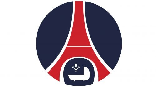
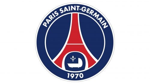
The redesign of 1972 brought PSG a logo we still can see today in a bit modified version. The dark blue solid circle had a stylized red Eiffel Tower with a white outline on it. Under the tower, on a smaller blue circle, there was a white cradle and a small fleur-de-lys symbol. It was a celebration of King Louis XIV, who was born in Saint-Germain Des Pres.
1982 — 1990
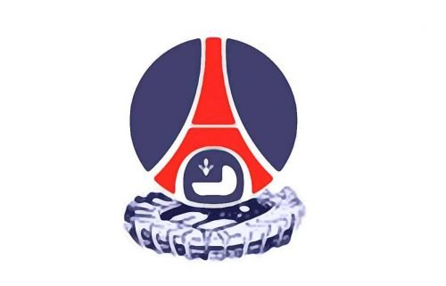
In 1982 the color palette of the PSG logo was slightly evolved, by adding a brighter shade of blue, which looked more vivid and delightful.
1990 — 1992
At the beginning of the 1990s, the club started using the logo version created in 1972, not changing it and keeping all the elements and colors in its places.
1992 — 1996
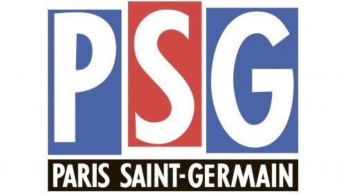
The redesign of 1992 brought a completely different logo version to the Parisian football club. It was a composition, formed by three vertical rectangles, in blue and red, which white letters “PSG” on them. The black horizontally stretched banner was placed under the emblem and had a white sans-serif “Paris Saint-Germain” lettering on it.
1996 — 2002
The logo from 1972 was slightly modified in 1996, by adding a wide white frame with a full wordmark and slightly changing the color palette to a brighter one. The lettering around the badge’s perimeter was executed in all capital letters of a bold sans-serif typeface, which was well-balanced and looked solid and professional.
2002 — 2010
The white frame became blue in 2002, along with the blue lettering turning white and two thin circular outlines. The contours of the Eiffel Tower and the cradle were refined. The fleur-de-lys symbol was redrawn with more elegance and became visible now.
2010 — 2011
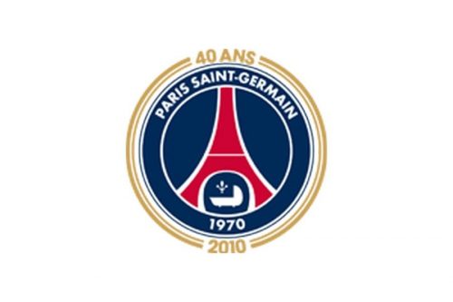
To celebrate the 40th anniversary of the football club, the logo was enclosed in a double gold frame with the “40 and” inscription on top, and “2010” datemark in the bottom.
2011 — 2013
After the celebration, PSG comes back to the previous version of its logo, a blue and white circular badge with the sleek and modern representation of the main symbol of Paris, the Tour Eiffel.
2013 — Today
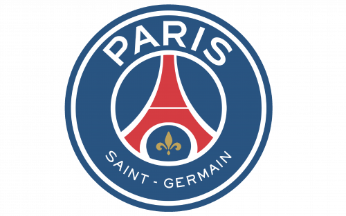
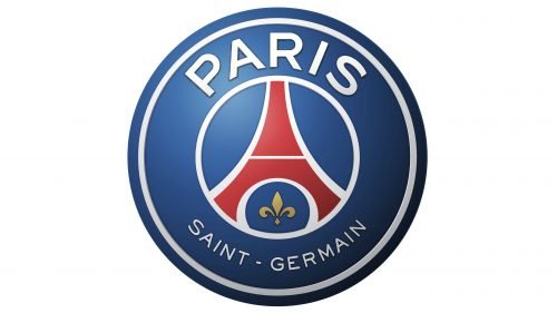
The redesign of 2013 removes the cradle from the PSG visual identity and widens the frame. The color palette was elevated to a calmer yet lighter combination of blue, white, and red, and the wordmark was now split into two parts, with an enlarged “Paris” rl arched along the upper part of the badge and a small “Saint-Germain” on the bottom. The elegant gold fleet-de-lye is now the only element, placed in a smaller blue circle under the Eiffel Tower. There is also a secondary version of the logo, executed in gradient shades, which looks sleek and voluminous.
Font
According to some sources, the club uses a custom font, which was developed by an international typographic studio Babel Font. Bill Corporate or Sweet Sans can be mentioned among similar-looking types.
Color
The choice of colors has remained basically the same since the club was incepted in 1970. Blue and red have always dominated the logo, with white as a secondary color. However, the shade of blue hasn’t stayed the same, it varied from the clean, bright color of the original logo to the dark, almost black shade of the following version. The current PSG logo features a rather neutral and pleasant for the eye shade, which is neither too light nor too dark. In addition to blue, red, and white, there’s also gold color.
Paris Saint-Germain Colors
BLUE
HEX COLOR: #004170;
RGB: (1, 66, 106)
PANTONE: PMS 7694 C
CMYK: (100, 57, 9, 52)
WHITE
HEX COLOR: #FFFFFF;
RGB: (255, 255, 255)
CMYK: (0, 0, 0, 0)
RED
HEX COLOR: #DA291C;
RGB: (218, 41, 28)
PANTONE: PMS 485 C
CMYK: (0, 95, 100, 0)
GOLD
HEX COLOR: #CEAB5D;
RGB: (218, 41, 28)
PANTONE: PMS 7407 C
CMYK: (20, 30, 75, 0)


