SpongeBob SquarePants Logo PNG
SpongeBob SquarePants is an animated comedy TV series. Its countries of origin are the US and South Korea (animation). The series was created for Nickelodeon by Stephen Hillenburg, animator and marine science educator.
Meaning and history
SpongeBob SquarePants is Nickelodeon’s longest-running and most legendary animated series, which began in 1999, and to date has produced over 270 episodes and even a full-length movie.
Ten years before its release, SpongeBob was a character in the comic book Tidal Zone. The comic strip was created in 1989 by an employee of the California Oceanology Institute to tell children who came on field trips to the institute what animals lived at the bottom of the ocean. The employee was Steven Hillenberg, the creator of the animated series SpongeBob SquarePants.
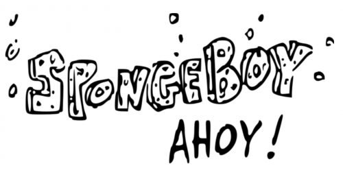
Interestingly, Stephen originally named the character SpongeBoy, but the name had to be dropped when it turned out that the name was patented by a mop production company.
What is SpongeBob SquarePants?
SpongeBob SquarePants is the name of one of the most famous animated tv-shows in history, which was created at the end of the 1990s by marine scientist Stephen Hillenburg. The shows premiered on Nickelodeon in 1999, and by today 13 seasons of almost 300 episodes have been released.
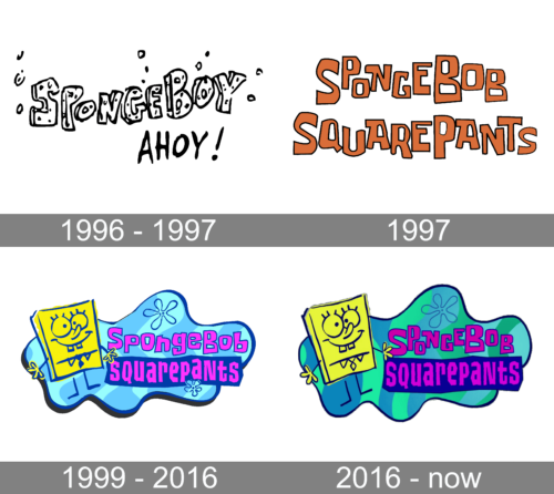
1996 – 1997 (Concept logo)
The original name, which was used during the early development stage, was SpongeBoy Ahoy! Interestingly, the concept logo already played with the “sponge letters” approach. All the glyphs forming the first word in the name of the series looked as if they were made out of sponge (like in the current SpongeBob SquarePants logo).
Yet, while the style was the same, the details of the shape were different.
1997

The original version of the pilot episode featured a different emblem. To begin with, it sported the new name “SpongeBob SquarePants.” While the letters did not have the dots, like in the previous version, they still had something “spongy” about them. The reason for this was that the “sponge” there was already introduced by the depiction of the cartoon character himself, so to repeat it in the lettering was unnecessary.
1999 – 2016
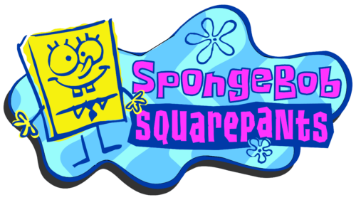
On the whole, the emblem became simpler, easier-to-grasp and to reproduce.
The “sponge” design disappeared altogether. A bright and sweet shade of purple (close to fuchsia) replaced the brownish red of the previous palette. The “flower” from the old logo grew more prominent. Another important improvement was that the letters grew better legible.
This version has been nicknamed “The Colored DoodleBob.”
2016 – Today
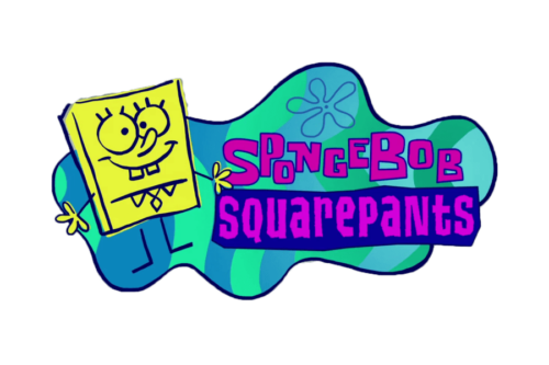
It is basically the same logo, with a couple of updates. The colors have grown brighter, which is especially noticeable in the case of the fuchsia lettering.
The shape of the glyphs has grown slightly more squarish to better fit the shape of SpongeBob. Also, the letters were capitalized. The outline of the flower was made lighter (so as not to steal the limelight).
This version is used in full-screen episodes.
Merchandise logo
This one is simpler than the main SpongeBob SquarePants logo. The character himself has disappeared. While the original version (introduced in 1999) featured flat letters, they were replaced by spongy ones in 2008.
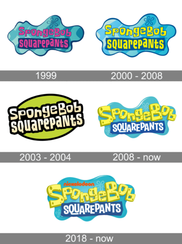
Meaning and history
1999
2000 – 2008
2003 – 2004
2008 – Today
2018 – Today
Font and Color
The bright and eye-catching logo of the SpongeBob SquarePants animated series features two levels of lettering; with the upper line set in a custom unique hand-drawn font, and the bottom line executed in a stylish sans-serif typeface, which looks pretty close to Malamondo Expanded Regular, but with the contours of some characters slightly modified.
As for the color palette of the SpongeBob SquarePants visual identity, it is composed of yellow and blue, with white as an additional color. The blue is represented here in two shades: a very light one, and a smooth dark hue, which adds a sense of professionalism and reliability. As for the yellow, it reflects the color of the main animation’s character and adds a sense of happiness and joy to the badge.


