Sony SAB is the name of an Indian pay-per-view comedy channel owned by Sony Pictures Networks and specializing in comedy shows. The channel was established at the end of the 1990s under the name SAB TV.
Meaning and history
The channel was launched in 1999 as a Hindi-language comedy channel. In 2005, SAB TV was acquired by Sony Pictures Networks and renamed Sony SAB, with a new focus on general entertainment. After only a short time under the new concept, Sony SAB evolved first into a youth channel and, in 2008, into a universal network broadcasting in Hindi, but still with a focus on Indian comedies.
What is Sony SAB?
Sony SAB is a pay-per-view channel, owned by Sony, with comedy content available in Hindi, and broadcasted all over India. The channel was established in 1999 as SAB TV and got its name changed to Sony SAB in 2005.
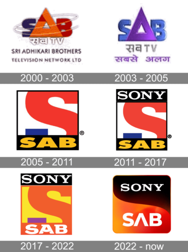
In terms of visual identity, the Sony SAB history can be divided into two periods: the initial one, from the establishment of the channel, up to 2005, and the modern one, which started in 2005 and lasts until today. And still, there is one thing in common in all the channel’s badges created throughout the years — they are all bright.
2000 – 2003
The very first logo was created for SAB TV in 2000 and stayed untouched for three years. It was a stylized “SAB” lettering with the enlarged triangular “A”, set in intense orange and blue color palette above the contoured inscription in Hindi. The whole emblem was accompanied by a two-leveled sans-serif inscription with the name of the tv channel in English.
2003 – 2005
The redesign of 2003 changed the color palette of the SAB TV logo to blue and purple, removed the English lettering, and made the “SAB” wordmark three-dimensional. Now the surface of the three geometric letters gained gloss and volume, while the two bottom lines, consisting of the lettering in Hindi, were set in flat elegant lines.
2005 – 2011
The concept of the SAB TV logo was changed in 2005 when the channel was acquired by SET India. The new badge featured a square shape with a white background and black framing, an enlarged red and blue letter “S”, and the bold yellow “SAB” written across the emboldened bottom line of the square framing. The logo looked very bright and co rodent and stayed untouched until 2011.
2011 – 2017
The redesign of 2011 was held under the curating of the Steinbranding design bureau. The elements on the logo were refined and balanced, with the upper line of the black framing also emboldened and decorated by an elegant white uppercase “Sony” logotype in the corporate serif typeface. The white wordmark was accompanied by a very thin horizontal white line under it.
2017 – 2022
The color palette of the Sony SAB logo was changed in 2017, with the bottom line of the lettering getting a new custom typeface with smooth lines and a very friendly mood. Now the background of the square badge is set in yellow, with the “S” drawn in orange and purple. The upper black banner on the frame remained untouched, with the white uppercase “Sony” written across it, while the side and the bottom bars of the square are now drawn in orange, and the “SAB” lettering — is also in white.
2022 – Today
The redesign of 2022 has created a more dramatic version of the Sony SAB logo, switching the color palette and softening the contours of some elements. Now the square had its angles rounded, and the body divided by a wavy line into two segments — black and orange, with deep and smooth gradients. The top, black part of the badge features the white uppercase Sony insignia in the corporate font, while the geometric white “SAB” is set at the bottom, with the horizontal bar of the “A” erased.
Font and color
The bold custom lettering from the Sony SAB official badge is set in a bold and smooth sans-serif typeface, with the stylized letter “A”, having its horizontal bar arched from the center, and resembling a friendly smile. As for the overall shape of the characters in the “SAB” part of the lettering, it is executed in a font, which is pretty close to FP København Extra Black, but with the glyphs slightly extended and modified.
As for the color palette of the Sony SAB visual identity, it is set in a combination of yellow and orange, with gray bite, black and purple details, creating a strong contrast and adding modernity and progressiveness to the overall design concept of the channel’s logo.


