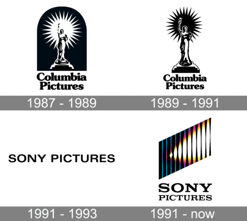
Sony Pictures is a film production company, which was established in 1987 in the United States under the name “Columbia Pictures”. The company’s franchise includes one of the most famous movies across the globe, such as Charlie’s Angels, Jumanji, Karate Kid, and many others.
Meaning and history

Sony Pictures’ visual identity is a graphical interpretation of growth and progress. Executed in a minimalist strict style it is instantly recognizable all over the globe and looks powerful and stable.
1987 – 1989
1989 – 1991
1991 – 1993

The very first logo of Sony Pictures, which was created in 1991, stayed with the company for only two years and featured a very modest and minimalist inscription in black, which was usually placed on a white background. The sans-serif inscription boasted clean bold lines and had enough space between the letters for the logo to look light neat and confident.
1991 – Today
The logo, composed of a wordmark with an emblem above it, was designed in 1991. Its first versions featured a more colorful palette, which was resembling a torchlight, being a continuation of the Columbia Pictures iconic emblem.
The current Sony Pictures emblem features a strong monochrome composition, consisting of a laconic emblem with two levels of the nameplate under it.
The wordmark in an elegant serif typeface features all the letters capitalized and perfectly balanced. Its smooth lines are accompanied by a geometric icon.
The Sony Pictures emblem is composed of elements of vertical lines, which are parallel to each other and allocated diagonally growing upright. The thickness of the lines changes from left to fight, symbolizing progress and development.


