Snapple is a company situated in Texas, USA. They’re known for their high-quality juices, iced teas, water, and lemonades, all notable for healthy ingredients they’re produced of, and a variety of tastes. Their products are primarily marketed towards school teenagers, as their campaigns are often carried via school performers, TV shows, and other pop-culture influencing platforms. One of their features is so-called ‘Real Facts’, written in their inner part of their bottle caps. They describe some facts about the outside world.
Meaning and history
Snapple dates back to 1972, when Leonard Marsh, Hyman Golden, and Arnold Greenberg, established Unadulterated Food Products in New York. Initially, it was a venture project meant to supply healthy products stores. But the founders weren’t interested in this business, and they operated their own projects.
However, at the end of the 70s, the trio had created a carbonated apple juice formula, which would soon lead to the company’s new name, Snapple. In 1987, they manufactured their first tea. In the further years, they made new tastes of their products, such as lemon, raspberry, and others.
During the 90s, they conducted marketing campaigns involving sports players, TV shows, advertisements, social media influencers, and other tools. They’ve also developed their slogan – ‘Made from the Best Stuff on Earth’. All this resulted in a mass spread of Snapple beverages across all major cities of the country and signing deals with distributors.
What is Snapple?
Snapple is a soft drinks brand, founded in 1972, and now headquartered in Plano, Texas. They manufacture iced tea bottles, lemonades, juices of many tastes. A notable feature of their products is that they write ‘Real Facts’ on the inside of the bottle caps. The company was previously known as Unadulterated Food Products. Throughout its history, the company marketed its products primarily among teenagers, using TV shows, advertisements, and others.
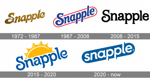
1972 – 1987
Their first insignia is the golden-colored nameplate, which is tilted a bit. The word has a handwritten typeface with unconnected letters. ‘S’ has a rounded lower tail
1987 – 2008
The next logotype was the blue name in a thin red rectangular frame with rounded corners. The first ‘s’ was so big that it punched a hole in a ceiling. Its lower tail was also cut off a bit. The ‘l’ did the same thing. There is also a version with a smiling sun above the whole logotype.
2008 – 2015
Then, they just wrote the word without any background. The name was now not italicized, as previously, and its color was black.
2015 – 2020
The 2015 nameplate is the similar as the 2008 one, but it’s tilted, and it has a located centrally above. There is variation with capitalized ‘all natural’ inscription written on the sun.
2020 – today
One more redesign, which happened in December 2020, depicted the name incorporated in a rectangle
Font
This 2020 version of the name had a lowercase sans-serif typeface with inconsequent gaps in the space among the letters. Actually, there were three major reinventions of the script scheme: this one, the 2008 version, and the 2015 renovation.
The original 1972 typeface was handwritten. It had separate characters with tiny gaps in between. The only exception was the ‘l’ and ‘e’ symbols, merged to one another. The ‘s’ character had a lower tail rounded and elongated.
In 2008, the name caption had received prominent serifs. The ‘s’ letter had a rounded lower part as before, but it wasn’t that long. The ‘e’ sign had a rounded tip as well.
Finally, in the 2015 text plate, the letters were drawn with simple rounded tips. Some letters, such as ‘s’ and ‘e’, were written spirally using one stroke.
Color
As for the coloring, so the brand designers changed it even more often than the scripts. If the first signboard had a golden coloring, so the next 1987 logo had a red frame with dark blue word inside. Then, they painted the word black for the 2008 logo and again blue for the 2015 one, adding the yellow sun in the composition. The modern 2020 version depicts the white word incorporated in a dark blue rectangle.


