Tipos Extraliga, a prominent sports league, stands as a testament to the thriving world of professional ice hockey in Slovakia. Owned by the Slovak Ice Hockey Federation, this league has carved a niche in the heart of Europe’s hockey scene. Central to its operations are the numerous ice rinks scattered across Slovakia, where teams compete fiercely for the coveted championship title. This league has become a focal point for showcasing emerging talents and seasoned professionals alike, contributing significantly to the country’s sports culture.
Meaning and history
Founded in 1993, following the dissolution of Czechoslovakia, Tipos Extraliga was established by the newly formed Slovak Ice Hockey Federation. This inception marked a new era in Slovak sports, fostering a strong local hockey culture. The league’s main achievements include nurturing local talent, many of whom have ascended to international fame in the NHL and other global arenas. Moreover, the Extraliga has been instrumental in enhancing the competitiveness of the Slovak national team on the world stage. Currently, Tipos Extraliga stands as a beacon of professional hockey in Slovakia, continuing to expand its influence and popularity, and playing a vital role in the country’s sports narrative.
What is Tipos Extraliga?
Tipos Extraliga represents the pinnacle of professional ice hockey in Slovakia. It’s a league where skill, passion, and national pride converge on the ice, showcasing some of the finest hockey talents in Europe. The league’s significant role in nurturing local and international hockey stars underlines its importance in the global sports arena.
2006 – 2010
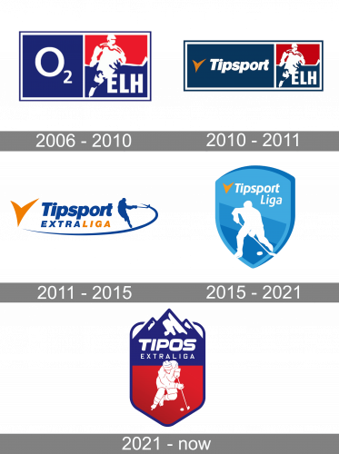
The 2006 logo is a rectangular figure, divided into two equal squares. The left one is fully blue and has ‘O2’ written on it in white. The other is red in the top, divided in two by an image of a hockey player (and their club, in particular). The silhouette is fully white, and there’s also an ‘ELH’ acronym of the same color in the corner.
2010 – 2011
The 2010 logo is a similar design, except the left section is much wider. It now occupies the logo of the sponsor, Tipsport. Also, the blue throughout the emblem became darker.
2011 – 2015
The old logo (2011-2014) featured the previous name of the league, Extraliga. The Slovak Extraliga logo featured a player in blue hitting a puck with a hockey stick. You could clearly see the long “tail” behind the puck. The “tail” went around the lettering “Tipsport Extraliga,” which was given in dark blue and orange. To the left, there was a large orange tick.
2015 – 2021
The Slovak Tipsport Liga logo that was adopted in 2015 features a white outline of a hockey player inside a blue shield. Above the player, the lettering “Tipsport Liga” in white can be seen next to an orange tick. There’re three shades of blue on the shield giving the emblem some dimension.
2021 – Today
This design is also a shield, but one with rounder edges and a thick blue outline. The insides are mostly red, with a blue bit above that extends into the mountain imagery. That’s where the name of the League – ‘Tipos Extraliga’ – is placed. The center of the shield entire is given over to a white figure of a hockey player.


