Dove Chocolate is a renowned brand specializing in premium chocolates and confectionery products. Currently, they offer a range of chocolates, including bars, promises, and other treats, winning the hearts of many with their smooth texture and rich flavor. Their primary markets span the globe, with a significant presence in the USA, Europe, and parts of Asia. The brand is a subsidiary of Mars Incorporated, a global conglomerate in the food industry. Dove’s commitment to quality and its innovative approach has solidified its position as a top-tier chocolate brand.
Meaning and history
Dove Chocolate boasts a rich history, spanning several decades. Its origin can be traced back to 1956 when Leo Stefanos, a Greek-American, founded “Dove Candies & Ice Cream” in Chicago. Stefanos’s primary aim was to produce exquisite chocolates that people would savor, resulting in the iconic Dove Bar, which initially started as an ice cream treat but soon garnered immense popularity.
As the years passed, the brand’s fame soared, not just for its ice cream, but also for its chocolates. Dove’s unique silky-smooth texture became its hallmark, setting it apart from competitors.
The pivotal moment in Dove’s journey came in the 1980s when Mars Incorporated, a global name in the food industry, recognized its potential and acquired it. This acquisition was a game-changer for Dove. Under Mars’s stewardship, Dove expanded its product line, introducing the much-loved Dove Promises and expanding its reach to new markets globally.
Throughout its history, Dove has shown an unwavering commitment to quality. The brand sources high-grade cocoa beans, ensuring that every chocolate piece lives up to the Dove legacy of richness and quality. Over time, Dove also embraced sustainability, making sure their cocoa sourcing was ethical and beneficial for the communities involved.
Innovation has been another constant for Dove. Whether it’s introducing new flavors, incorporating fillings, or venturing into dark and white chocolates, Dove has always been at the forefront of the chocolate evolution.
In conclusion, Dove Chocolate’s journey from a small Chicago-based shop to an international brand under Mars Incorporated is a testament to its quality, innovation, and the enduring love people have for its products. Its legacy is one of passion for chocolate and a dedication to delivering the best to chocolate aficionados around the world.
1956 – 2003
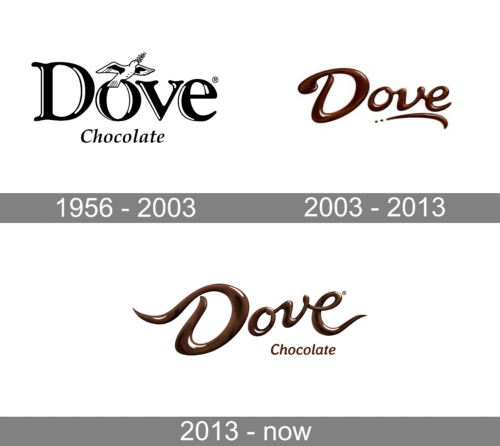
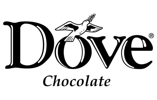
The emblem displays the word “Dove” in a bold, stylized font with black contours. The capital “D” has a unique curvature, while the “o” stands out due to an intricately illustrated dove in mid-flight, clasping an olive branch with its beak. This bird represents peace and purity, adding an element of grace to the design. The word “Chocolate” is inscribed below in a more subdued, classic typeface, providing clarity about the brand’s specialization. The design concludes with a registered trademark symbol (®) neatly positioned adjacent to the letter “e” in “Dove.” Overall, the monochromatic color scheme and artistic nuances evoke a sense of timeless elegance, underscoring the brand’s premium appeal.
2003 – 2013
The logo showcases the word “Dove” rendered in a luxurious, fluid script reminiscent of melted chocolate. The initial “D” has an elongated, graceful curve, adding a touch of elegance. The letters flow seamlessly, with each character adorned in a rich, lustrous brown hue, evoking the velvety texture of premium chocolate. The word concludes with a flourish that curls beneath it, further emphasizing the brand’s sophisticated charm. Three small, chocolate-like droplets are positioned just beneath the concluding ‘e’, suggesting a decadent, melt-in-your-mouth experience. The overall impression is one of opulence, purity, and indulgence, perfectly encapsulating the brand’s ethos.
2013 – Today
The logo showcases an artistic representation of the word “Dove.” The typography elegantly flows like molten chocolate, with swirls and curves reminiscent of luscious chocolate ribbons. The letters seem to have a velvety texture, portraying a creamy consistency. Positioned beneath the flowing script is the word “Chocolate” in a simpler, more understated font, serving as a clear indication of the brand’s primary product. The entire design conveys a sense of luxury and indulgence, reflecting the brand’s commitment to quality and richness. The ® symbol, indicating a registered trademark, is subtly placed to the top-right of the last letter. The color palette primarily consists of rich chocolate browns, emphasizing the brand’s core product.


