Sierra Entertainment is the name of a company, engaged in video games production. It was established at the end of the 1970s in the USA and ceased all operations in the 2000s, although was still remembered by many as the founder of the graphic-adventure video games, and got its second birth in 2014.
Meaning and history
Sierra Entertainment, created by Roberta and Ken Williams, is not just the name of a company, that once existed. It is a truly iconic and legendary name, which is strongly connected to all the video games in the adventure genre, as Sierra basically established it. The quests, developed by Sierra are still played by millions of people across the globe, even though by today they are already older than most of the gamers.
1980 – 1982
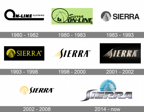
The very first Sierra Entertainment logo was created in 1980, just a few months after the company’s establishment, with its first months under the name “On-Line Systems”. It was a bold black logotype in the uppercase with the “On-Line” part written in a modest massive sans-serif with extra thick lines and slanted letters, followed by a lightweight “Systems” in the uppercase. The most recognizable element here was the letter “O” enlarged, opened in its contour, and having the line elongated and underlining the whole logotype.
1980 – 1983
The company changed its name to Sierra On-Line in 1980, and the new logo was used along with the original one for a couple of years. It was the same idea — the “O” with the elongated tail underlining the whole inscription, — but in a different execution. First of all, now the black lettering was set on a light-lime background. Secondly, the typeface of the “On-Line” was switched to a more modern and stable, and the elegant cursive “Sierra” was now written above it. And the last thing, the “O”, which was now written in thinner line, had an image with a mountain and two trees in its negative space.
1983 – 1993
The name of the company was officially changed to Sierra in 1982, but the new logo was only created a few months later, in 1983. It was a cool and powerful monochrome badge, with the black logotype set on the left from the graphical emblem and placed on a horizontally oriented white rectangular banner. The logotype was set in the uppercase of a massive and bold sans-serif typeface, which looked confident and masculine. As for the graphical part, it featured a circular composition with the black and white image of a mountain on it, drawn with a horizontally striped pattern.
1993 – 1998
The redesign of 1993 kept the composition of 1983, but changed the color palette of the Sierra badge and slightly refined the contours of the elements. The color of the rectangular badge turned solid black, while the emblem and the logotype were now executed in yellow. The emblem remained the same but looked more distinctive in the new palette. As for the lettering, it was still set in all capitals but got its typeface changed to an elegant serif font with smooth lines and sharp long serifs. There were several color palettes used for the Sierra logo during these years, but the typeface and the emblem always remained the same.
1998 – 2000
The redesign of 1998 introduced a refreshed contemporary Sierra badge, with the emblem turning abstract and the lettering — sharp and sleek. It was an uppercase italicized inscription in black narrowed letters with fancy futuristic contours. The striped mountain emblem was replaced by four yellow diagonal rays coming off the letter “S” to the bottom left corner of the badge. The rays featured different lengths and sharp ends, adding edginess and style to the overall composition and celebrating the history of the company, showing the affiliation to its initial emblem and its roots.
2001 – 2002
In 2001 the Sierra logo was redesigned in a three-dimensional way. The color palette was simplified to just two shades: plain black for the background and rose-gold for the inscription and the graphical details. The logotype was set in gradients and had its surface glossy and metallic. It was turned now slightly, which added more volume and motion to the badge. This was the last logo for the “Sierra” era of the company. A few months later it gets renamed Sierra Entertainment.
2002 – 2008
With the redesign of 2002, the iconic circular mountain emblem was brought back to the Sierra Entertainment visual identity. It was now placed on the left from the bold black logotype from the previous versions. The emblem was executed in light yellow and white, and the whole composition was set on a white background. This mix of elements, from the old and new logo versions, was a brilliant way to show the value of the company’s history and its readiness to move forward and progress. Depending on the needs, the logo could be seen in black and yellow, black on white, or white on black color schemes.
2014 – Today
After the reincarnation of the company, the new logo was introduced in 2014. The circular medallion with the mountain was rethought and now executed in gradient blue, set above the silver bold lettering, and extended horizontally. As for the logotype, it features a massive geometric sans-serif typeface for its metallic gradient letters, with the “S” keeping the idea of the previous badge: elongated, vertically stretched, and with the ends of the line sharpened.


