Showtime is a pay cable and satellite television channel that was launched in the United States in 1976, and today is owned by CBS. It has at various times aired the popular series Californication, Masters of Horror, Homeland, Dexter, Twin Peaks (2017) and Billions.
Meaning and history
Showtime is an American premium-segment television channel. The channel was launched by Viacom on July 1, 1976, in California, based on cable networks owned by the Times-Mirror. And if in the first two years, the channel had no more than 60 thousand subscribers, in 1978 Showtime reached the national level.
In its nearly 50 years of existence, Showtime has produced a huge number of cool TV series, many of which have become iconic. Among the most famous projects of the channel are Dexter, The Borgias, The Tudors, Homeland, and Californication.
At the end of 2022, it was revealed that Showtime will be integrated into Paramount+. It’s pretty hard for a TV channel to compete with streaming service giants like Netflix and HBO. As a result of the changes, Showtime dropped the series “Three Women” with Shailene Woodley, and also shut down “American Gigolo” and “Let Me In” after their debut seasons.
What is Showtime?
Showtime is the name of an American cable channel owned by CBS Corporation, which has been giving viewers colorful series since the middle of the 1970s, from “Dexter’ to “Ray Donovan”. The Showtime channel primarily broadcasts movies and television series of its production.
In terms of visual identity, Showtime prefers stability. The idea of its logo, realized by Chermayeff & Geismar bureaux back in 1997, still works today, and the progressive logo fits into the design of social networks, applications, and other corporate attributes of the company.
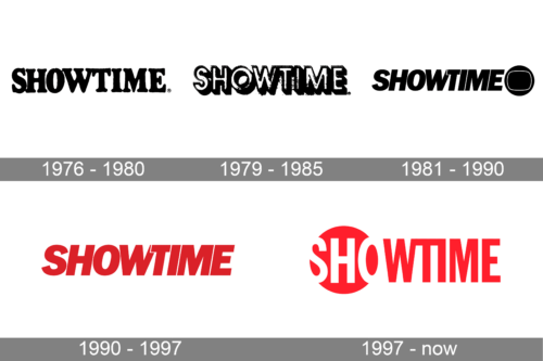
1976 – 1980
The original logo of the Showtime channel was created in 1976, by the launch of the project. It was a very simple idea — the bold black logotype was written in the capital characters of a massive serif typeface against a plain white background. This version of the design stayed with the channel for a bit less than four years.
1979 – 1985
Another version of the Showtime logo was created in 1979 and looked more complicated than the previous badge of the channel, even though was also executed in a black-and-white color palette. It was a voluminous inscription in an outlined sans-serif typeface, with the capital letters of the wordmark shadowed. This badge was mainly used for the channel’s promos.
1981 – 1990
The new design concept was brought to the Showtime logo at the beginning of the 1980s. The lettering was rewritten in a new typeface, Franklin Gothic Italic, with the horizontal bar of the “T” overlapping the upper part of the “W”. On the right of the inscription, a minimalistic graphical element was set — a solid black circle with a thin white contour of a TV screen on it.
1990 – 1997
The redesign of 1990 has removed the graphical emblem from the primary Showtime logo, yet the inscription has kept its style and typeface. What was more important was that the company decided to adopt a new official color palette — the plain black characters turned bright red. The new shade has made the simple wordmark look more powerful and progressive.
1997 – Today
The logo, introduced in 1997 was created by the famous Chermayeff & Geismar design bureaux. The designers were inspired by the logo of 1981, but have managed to modify it into something super simple yet modern. They have placed the first three letters of the channel name in a circle, making it feel like they are in the beam of a spotlight, creating a good metaphor for television. The other letters were set on a plain white background. The whole wordmark was rewritten in a narrowed geometric sans-serif typeface.
Font and color
The stable geometric lettering from the Showtime logo is set in the uppercase of a modern sans-serif typeface, Franklin Gothic Extra Condensed. The letters feature thick lines, straight cuts, and distinctive contours.
As for the color palette of Showtime visual identity, there are two options: black and white — which looks professional and stable, and red and white — a representation of passion, energy, and progressiveness.


