One of the most known South African rugby union teams, the Sharks have a fun and memorable logo, which has stayed with the team since it was officially founded.
Meaning and history
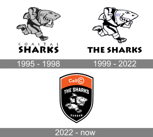
While formally, the Sharks were established in 1995, we should also pay attention to the logo used by its predecessor, the provincial Natal rugby team the Banana Boys. That’s because the link with the Banana Boys can be traced even in the logo design.
The Natal Rugby Union logo was dominated by black. You could see a pair of white horses jumping. Below the horses, there was an abstract white pattern. Below the pattern, the word “Rugby” in white was placed.
1995 — 1998
For a comparatively short period between the original and current logos, the team used another emblem. In terms of the shape, it looked very much like the current one. There was also a running shark holding a rugby ball. The lettering below read “Natal Sharks,” though, and the background was greyish blue.
The Sharks logo adopted in 1995 features an anthropomorphized shark. The creature is dressed as a rugby player. In fact, he’s in the middle of the match, running ahead with a rugby ball in his hand. The shark is showing its teeth and has a peculiar expression on its muzzle showing it’s not going to let someone else hold the ball. The creature is, in fact, the team’s mascot called Sharkie.
Below the picture, you can see the name of the team in white.
1999 — 2022
If you compare the Natal Rugby Union emblem with the current logo, you will be surprised by how similar they look. Although the elegant and soft style of the old design is far from the cartoonish and somewhat aggressive mood of the current logo, the combination of colors creates a very distinctive link.
Similar to its predecessor, the Sharks crest is dominated by black, while the wordmark and the pictorial part of the emblem are given in white. Even the position of the elements has preserved: the picture is placed below the emblem. Although the type is different, with larger letters, it’s still a simple sans serif, like on the original logo.
2022 – Today
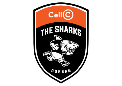
The team now had a truly professional badge in the form of a shield. Although it looked nothing like the previous logos, there was a familiar shark character. It was placed on the dark portion of the shield with “The Sharks” arching above it and “Durban” printed in smaller font below. The upper portion had an orange banner with “Cell C”, their sponsor name, printed across. The orange color made the logo look energetic and enthusiastic, while the dark blue gave it a professional touch.
Colors
The Sharks logo is dominated by black, with smaller patches of white.
Font
Although the typography may appear pretty generic, at first glance, you will spot a couple of interesting details if you take a closer look. For instance, the diagonal bars on the “K” and the “R” are somewhat wider on the ends than they are at the point where they start. The “A” is pretty wide, while the “S’s” have a playful “dancing” shape.


