

![]() Wests Tigers Logo PNG
Wests Tigers Logo PNG
The brand identity of the Australian rugby league football team the Wests Tigers was inspired by those of the Balmain Tigers and the Western Suburbs Magpies. This is only natural taking into consideration the club itself was formed as the result of the merger of the two clubs.
The team is comparatively young (about 20 years old), so it’s hardly a surprise the logo has gone through only one subtle modification.
Meaning and history
![]()
The team was created as a joint-venture club between the Balmain Tigers and the Western Suburbs Magpies in late 1999.
What are Wests Tigers?
Wests Tigers is the name of a professional rugby club from Australia, which was established in 1999. Today the club competes in the National Rugby League and plays its games in three arenas: CommBank Stadium, Leichhardt Oval, and Campbelltown Stadium. Tim Sheens is the West Tigers’ head coach.
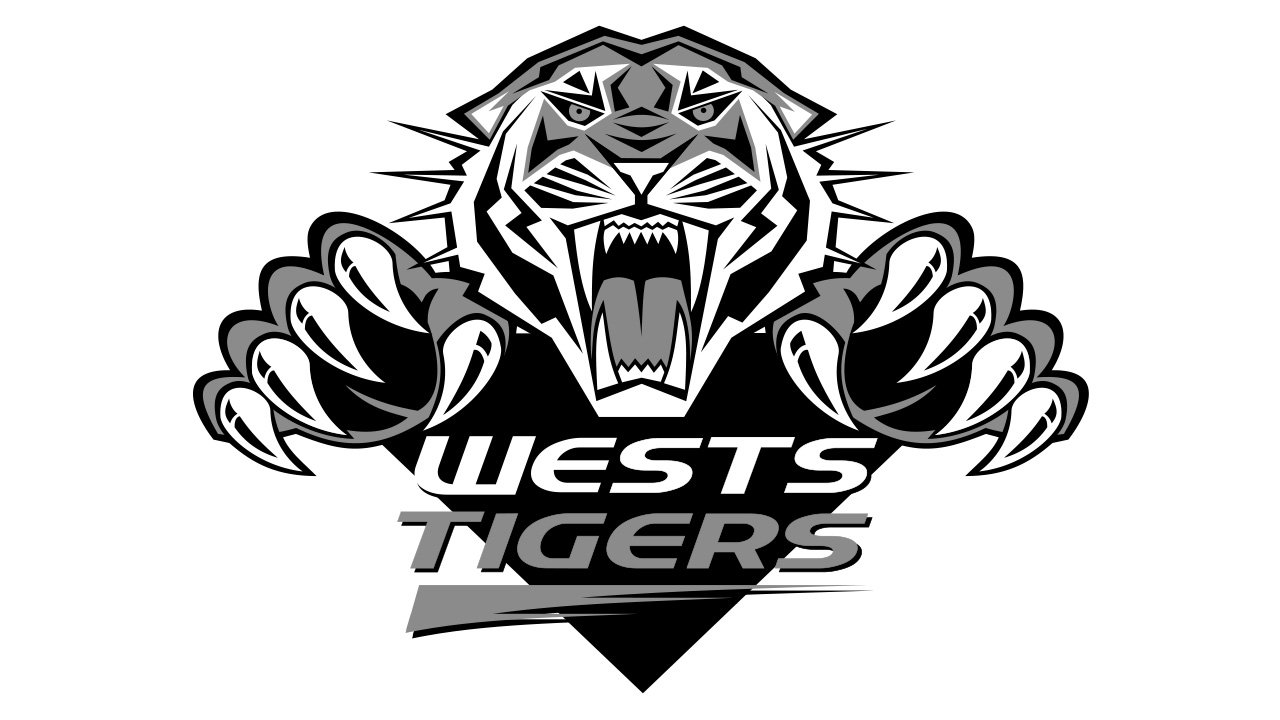
2000 — 2005
![]()
The West Tigers logo features a fierce, aggressive tiger. The animal is leaping forward with its mouth open. You can clearly see the white fangs and the exaggerated sharp claws.
While the tiger was inspired by that from the Balmain Tigers logo, in fact, it’s a completely different animal. On the source emblem, the tiger looked by far more realistic. It was more of a picture than a real logo. By contrast, the Wests Tigers crest features a more stylized depiction. The designer has managed to reflect the ferocious charm of the wild animal with fewer strokes. As a result, the logo is slightly cleaner than that of its predecessor.
Another important part of the logo is the black “V” below the tiger. This design element, in its turn, is supposed to remind of the shield of the other partner, the Western Suburbs Magpies.
Over the “V,” you can see the name of the club, which is given in two lines. The word “Wests” is white and features smaller letters, while the word “Tigers” is given in large and highly stylized glyphs. The most distinctive of them is probably the “T,” which has a triangle for the vertical bar. The orange stroke under the word “Tigers” adds some more implied motion to the already rather dynamic crest.
2005 — Today
![]()
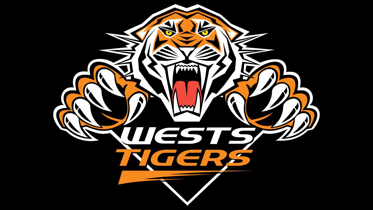
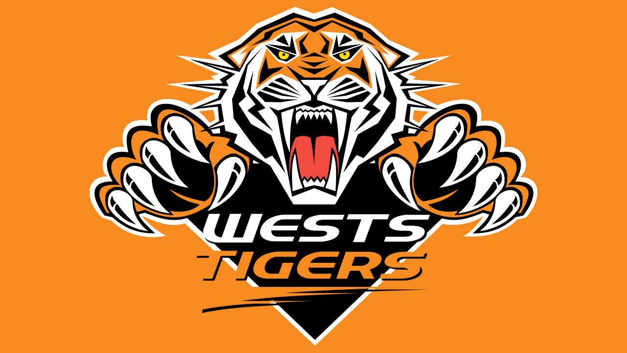
The only notable update took place in 2005. The tiger remained virtually the same, only the wordmark was tweaked. The word “Wests” now became larger, while the word “Tigers” diminished. Taking into consideration the original size of the words, the result of this transformation was that both of them were now of the same height. This move seems to convey the idea that both the clubs of the partnership are equally important.
![]()
On November 2, 2018, the Wests Tigers launched the 20th-anniversary logo.
2021 — Today
![]()
The redesign of 2021 modernized the Wests Tigers logo and made it look more contemporary and progressive. Although the orange, black and white Tiger remained the main element of the club’s visual identity, its contours were changed and lines got bolder and shorter. The paws with claws were removed from the badge, so only the head was left. As for the lettering, it is now written on a white background and has no underline or additional framing. Both lines of the inscription are executed in a bold custom sans-serif typeface, with some of the conners a bit elongated and pointed, resembling the tigers’ claws.
Colors
The black and white on the Wests Tigers logo and jerseys come from the brand identity of the Western Suburbs Magpies, while the black and gold were inspired by the Balmain Tigers’ uniform.


