Sesame Workshop is the name of a non-profit organization, which specializes in creating multimedia content for kids. The organization was established in 1968 and today it operates globally, producing some very popular educational programs on TV.
Meaning and history
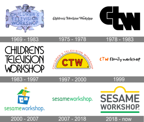
The Sesame Workshop visual identity is based on the logo of Sesame Street, which is very well known by kids and parents from all over the globe. So there was no need to look for something else, as the popularity of the main show is the best advertising for the educational organization.
The Sesame Workshop logo is composed of lettering, set in two levels and written in one style, and a simple yet colorful framing, repeating the street-sign. Probably the most famous address for all the children, Sesame Street, Gabe to the Workshop its iconic yellow and green colors.
The wordmark in medium gray is written in all capital letters using the mid-weight rounded sans-serif typeface, which is very similar to DIN Next Pro Rounded Medium and Nota Rounded Bold fonts with their smooth lines and edges.
The “Sesame” part of the nameplate is enlarged in order to be the same lengths with the “Workshop” lower level.
1969 – 1983
1975 – 1978
1978 – 1983
1983 – 1997
1997 – 2000
1999
2000 – 2007
The very first logo for Sesame Workshop was created in 2000 and featured a pretty modest yet bright composition of a lightweight smooth sans-serif inscription in green and blue lowercase letters, placed under a geometric emblem, depicting an abstract house formed by several elements in blue, green and yellow.
2007 – 2018
The redesign of 2007 simplified the Sesame Workshop logo to a single wordmark, which was executed in the same typeface as the one from the previous version, though featured a different color palette — the two words of the insignia were written in two different shades of green, a color of growth and development.
2018 – Today
The Sesame Workshop logo is very simple and modest, pointing on its educational, and not entertaining focus, it still looks friendly and playful due to the details of the Sesame Street visual identity. And its gray, green and yellow color palette is a reflection of growth and progress along with professionalism and a high level of its content.


