Selena Quintanilla was one of the most selling Latin singers of the 1980s, who was shot in 1995, at the age of 23. Selena was also a songwriter and a model, she released five musical albums and has four movies in her filmography.
Meaning and history
Unfortunately for everyone, the life of Selena Quintanilla was very short, so was her music career. And, of course, the mariachi and R’n’B singer didn’t have much time for visual identity redesigns, so there was only one official logo created for her in 1989.
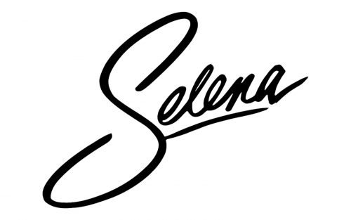
The logo of the Latin singer was composed of her name executed in a handwritten cursive with the first “S” enlarged and the remaining part of the mane underlined.
The wordmark was placed slightly diagonally, which added a sense of movement and energy, reflecting the vivid style of the music and passion of the singer.
The official color palette of Selena’s logo was monochrome, yet the inscription looked great in any shade due to its balanced smooth shapes and lines and visible simplicity of the composition.
As the logo looked like the singer’s signature, it made her fans feel some kind of connection and buying Selena’s albums, they felt like it was signed especially for them.
The logo of Selena Quintanilla looks modern and actual even today, 25 years after the singer’s death, because it is a brilliant example of timeless and sophisticated visual identity design, which doesn’t need many decorations and bright colors to be stylish and remarkable. A truly amazing example of what the logo should be.


