Seat is the name of the most famous Spanish automobile marque, which was established in 1950 by Instituto Nacional de Industria. Today the brand, owned by Volkswagen Group, distributes its cars all over Europe and also has its offices in Latin America and the Middle East.
Meaning and history
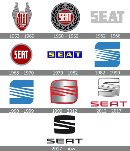
The Seat visual identity history can be split into two main periods — the first l, started in 1953, which can be called “Fiat influence”, and the modern one started in 1982 when the Spanish brand finally showed its individuality and uniqueness.
1953 – 1960
The very first logo for Seat was introduced in 1953 and boasted an ornate badge, where the traditional crest in a dark gray outline and red background was placed between two gray wings, coming out of the gray oval and spread up. The wordmark, consisting of two parts, was written on a crest, set in three levels, with “Seat” enlarged, and “Licencia Fiat” placed on the bottom, under a thick gray line.
1960 – 1962
In 1960 the new logo was created — a rounded glossy badge with a red background and a thick silver outline with leaves ornament. The main wordmark was now colored white, while the tagline was in silver. It was a simple year’s very elegant and recognizable emblem.
1962 – 1968
The monochrome logotype was designed in 1962 and stayed with the marque for another six years. It was an extra-bold black inscription, where all the letters were set on a thin horizontal line.
1968 – 1970
In 1968 the brand simplified its logo from 1969 — the flat red circle in a gray outline boasts a bold white “Seat” lettering. No taglines and ornaments, the badge was all about minimalism and color contrast.
1970 – 1982
The logo from 1970 featured a bold yellow inscription, where each letter was placed on a separate square in electric-blue. This logo was used by the company for a decade and represented energy, progress, and confidence.
1982 – 1990
The new era of the Seat visual identity started in 1982. A symbol that is instantly recognizable today was introduced. A thick stylized letter “S”, where the diagonal bar was composed of several white and blue lines with pointed ends, symbolized speed, movement, and development.
1990 – 1999
The number of diagonal lines was reduced in 1990. Three white and four blue elements became thicker, which added solidness and power to the whole badge. The color palette and contours of the “S” remained untouched.
1999 – 2012
In 1999 the badge became silver and was placed on a red background. The number of stripes was reduced again, and now there were two red lines. The wordmark appeared on the logo, executed in custom sans serif, and written in red under the emblem.
2012 – 2017
The redesign of 2012 made the Seat logo stricter and sharper. Now the letter “S” was diagonally split into two parts by one white line. The three-dimensional emblem was executed in gradient silver and complemented by a red wordmark, which changed its typeface and became thinner and more futuristic.
2017 – Today
The monochrome palette was adopted by the brand in 2017. The clean black emblem is placed above the black sans-serif inscription on a white background. Flat and laconic, but truly powerful and stylish.
Font and color
The custom Seat logotype is executed in an elegant yet modern sans-serif typeface, which is probably based on one of such fonts as Bitsumishi Pro Medium or Controller Expanded Four, but with its contours modified, and some of the angles sharpened.
The color palette of the Seat badge has had many different versions throughout the long brand’s history, so it would be fair to say, that they tried everything before coming to monochrome. The black and white combination is a great reflection of the confidence and reliability of the company, which is strong today and not afraid to move into tomorrow.


