Seagate is an American brand of data storage solutions development company. It was founded in 1978 by Al Shugart, and was named after its founder. Today it operates worldwide and is one of the leading companies on the market.
Meaning and history
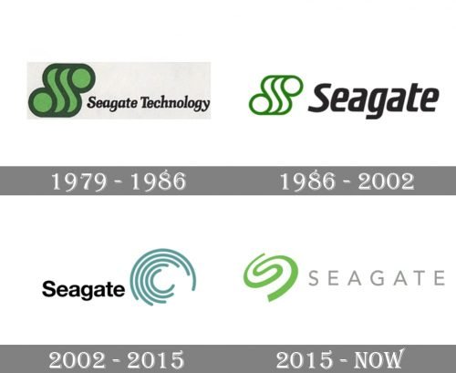
The visual identity of Seagate has had three major redesigns throughout the company’s history, but there was one thing that has never been changed — its iconic green color palette, which makes the brand’s logo stand out in the list of competitors. Evoking a sense of growth and success.
What is Seagate?
Seagate is a name of a computer technology company, which was established in the united states in 1979, and is engaged in activities connected to data storage. Today the company, which produces hard disks and solid-state drives, has its products available for sale worldwide.
1979 – 1986
The original Seagate logo was introduced in 1979 and boasted a sleek and playful green emblem placed on the right from the elegant and traditional inscription. The “Seagate Technology” in a bold serif cursive looked delicate and feminine despite the thickness of its lines. The iconic green emblem was a stylized letter “S”, extended and having its green body split by darker lines into two smooth horizontals and two circles.
1986 – 2002
The color palette was switched to a lighter one and the shortened “Seagate” wordmark was enlarged in 1986. The iconic emblem now featured a white body with green lines, and the inscription – a modern italicized sans/serif typeface with smooth bold lines. Its rounded angles and softened shapes perfectly balanced the wavy contours of the emblem, making the logo whole and harmonized.
2002 – 2015
The new emblem for Seagate was designed in 2002, along with the new color palette. Bright green was replaced with a sea shade, and the “S” emblem — with a circular abstract structure, composed of several arched lines of different lengths, which created a shape resembling a sea-wave.
As for the wordmark, it was also rewritten, and now featured a bold yet simple Helvetica typeface, which is timeless and strong.
2015 – Today
The redesign of 2015 brought a new emblem to the Seagate visual identity, and it is a mix of two previous versions. The stylized letter “S” in bright grass-green color is composed of two arches, smoothly connected between each other. Placed slightly diagonally, the emblem evokes a sense of movements, as if it was appearing from the depth. The logotype is now set in all capitals of a modern yet neat sans-serif typeface, using a light gray color and having a lot of space between the letters, to make the look crispy and lightweight.
The emblem

The Seagate emblem is a reflection of how the brand sees our world. It is vibrant and moving, progressive and innovative.
The icon is composed of a curved line, resembling the silhouette of the letter “S” and at the same time the infinity sign. According to the brand, the emblem also represents data, which is important to keep.
It is executed in light green, the color of life and harmony, and this adds dynamics, energy and a very light feeling to the logo.
The wordmark
The all-caps wordmark is executed in simple typeface with clean fine lines. The light gray color of the lettering adds elegance and finesse to the logo.
It is simple and strict, yet fresh, evoking calm and comfort feeling. The wordmark shows the brand as stable and trustworthy, which are the most important characteristics for any technological company.


