The 13 varsity teams competing at Southeast Missouri State University in Cape Girardeau, Missouri, play at the NCAA Division I level.
Meaning and history
The foundation of SEMO Redhawks, the esteemed athletic division of Southeast Missouri State University, dates back to the university’s early years. This inception marked the beginning of a rich tradition in collegiate sports under the NCAA umbrella. As the years progressed, the Redhawks carved out a name for themselves with notable triumphs, particularly shining in football, basketball, and gymnastics. Their crowning achievements include clinching multiple titles in the Ohio Valley Conference, a testament to their athletic prowess and strategic excellence. Currently, the Redhawks stand as a beacon of competitive spirit in NCAA Division I sports, consistently demonstrating remarkable performances and upholding a legacy of athletic distinction.
What is SEMO Redhawks?
The SEMO Redhawks represent the athletic vigor and competitive spirit of Southeast Missouri State University in NCAA Division I. They encompass a range of sports teams, celebrated for their dynamic and spirited participation in collegiate competitions, embodying the essence of sportsmanship and athletic excellence.
1989 – 2004
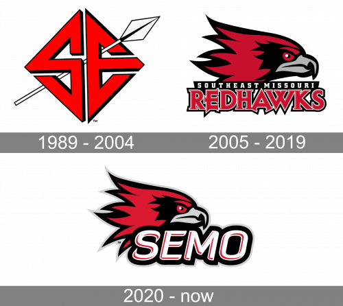
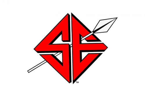 When in 1989 the teams introduced their new Southeast Missouri State Redhawks logo, some people were probably surprised that there was not a single trace of a hawk of any kind. However, there was a nod to the Native American theme – a spear going through the large letters “S” and “E.”
2005 – 2019
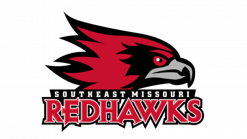
The SE Missouri State Redhawks logo introduced in 2012 is totally different. Here, you can see the side view of a hawk with a pretty determined expression on his face. The creature has red and black feathers, while his beak is grey with black trim.
2020 – Today
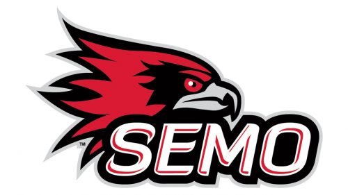
They kept a hawk’s head, adopted in 2005. The words beneath it were swapped for just ‘SEMO’, written in tilted white letters with a slight red tint and thick black shadows.


