In the United States and Canada, the word “Scrabble,” which is the name of a popular word game, is a trademark of the multinational conglomerate Hasbro. In other countries, the name is a trademark of the toy manufacturing company Mattel. Each of the two companies uses a different Scrabble logo.
Meaning and history
Scrabble can truly be considered a classic of board games. Its history began in the thirties of the last century in the United States. It was then that the unemployed architect Alfred Mosher Butts decided to create his own board game.
The history of Scrabble began in the United States in 1938, when Alfred Butts created a prototype game called Criss-Cross Words. Ten years later the work of Scrabble’s founding father was continued by James Bruno. It was he who gave the game its current name and rules.
Already in the 1950s, national versions of the game and other varieties of Scrabblebegan to appear. There is a version for children, and travelers, a modification of Twists & Turns, and a mathematical version.
And yet the most popular is still the classic Scrabble. It is played by millions of people in different countries, and by its rules held local tournaments and world championships with an impressive prize pool.
Hasbro (the United States and Canada)
Scrabble, the iconic word game, was created by Alfred Mosher Butts, an architect, in 1938. Initially named “Lexiko” and later “Criss-Crosswords,” Butts meticulously analyzed frequency of letter usage in English to assign different point values to each letter. The game struggled to gain traction until James Brunot, a game-loving entrepreneur, acquired the rights and renamed it “Scrabble.” This marked a turning point, with Scrabble becoming a household name.
By the 1950s, Scrabble had achieved remarkable success, particularly after Macy’s, the renowned department store, began to stock it, boosting its popularity. The game’s appeal transcended generations, blending educational value with entertainment. It became a staple in homes and schools, known for enriching vocabulary and spelling skills. Scrabble’s influence extended beyond leisure, inspiring competitive tournaments and clubs worldwide. Its cultural impact was profound, featuring in numerous literary and media references.
Today, Scrabble holds a prestigious position as a beloved classic in board games. Owned by Hasbro, the game continues to captivate millions of players globally. Its digital versions and translations into over 30 languages demonstrate its enduring appeal and adaptability in the ever-changing landscape of games and entertainment. Scrabble remains a testament to the power of simple yet engaging gameplay, illustrating the timeless charm of wordplay and strategy.
What is Scrabble?
Scrabble is a word game where players use lettered tiles to create words on a game board. It combines elements of language skills, strategy, and chance.
1938 – 1948
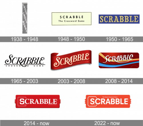
The original logo of this famous table game was created in 1938, for the name “Criss Cross Words”. It was a narrow vertically-oriented rectangular banner with the three keys of the game’s name written on it diagonally one above another. The inscription was set in the uppercase of a bold serif typeface.
1948 – 1950
In 1948 the board game was officially renamed Scrabble, and the new logo was introduced. It was a light-yellow horizontally-oriented rectangular banner in a pretty bold black outline, with the two-leveled lettering in black. The top line featured an enlarged “Scrabble” inscription in the uppercase of a modern sans-serif font, while the bottom level was composed of a title case “The Crossword Game” lettering.
1950 – 1965
The Scrabble logo getsredesigned in 1950. Now the badge was made brighter and bolder, evoking a sense of fun and energy, as it is supposed to be with the board games. The new concept featured a solid blue rectangle withheavy yellow lettering in the uppercase of a bold serif font. This version of the logo stayed in use by the Hasbro company for almost fifteen years.
1965 – 2003

The oldest logo on the list is black and white and is performed in an artistic script. While it appears to be a cursive script, in fact, the majority of the letters aren’t connected with each other. Nevertheless, all the glyphs have that elegant quality characteristic to the cursive handwriting. The swirls and curls on the “S,” “R,” and “E” not only add a touch of refinement but also make the logos stand out.
2003 – 2008
The designers used the old wordmark as a basis to create a new version. They preserved the recognizable swirly script but rotated it several degrees counterclockwise. Also, they placed them onto a scarlet banner and, to fit the waving shape, the proportions of the letters were slightly changed. As a result, the wordmark looks like part of a moving textile or paper banner rather than something written on a flat and still surface.
2008 – 2014
The design grew flatter without sacrificing its implied motion. While the banner was replaced by a rectangle with rounded top corners, the dynamic effect has been preserved due to the swooshes.
The design looks more vivid, too, due to the addition of blue and yellow.
The type was slightly updated. On the one hand, it has preserved the recognizable “R” with the extended lower end. On the other hand, the serifs have almost disappeared, as did the swirls on the “S” and “E.” The curved parts in the “A” were replaced by a combination of straight lines and angles.
2014 – Today
While the pronounced serifs returned to the wordmark, it looks totally different. All the glyphs were redrawn in a simpler way. They are straighter, heavier, and more generic. This version is more meaningful, though. The initial letter “S” is placed inside a red square frame and has the number “1” below, which makes it resemble a piece from the game.
2022 – Today
The Scrabble logo redesign, held by Hasbro in 2022, has lightened up the shade of red on the game’s badge and switched the typeface of the wordmark to a bold sans-serif one, which made the joke logo look more progressive and up-to-date. As for the composition in general, it remained the same, as in the previous version of the badge.
Mattel (International)
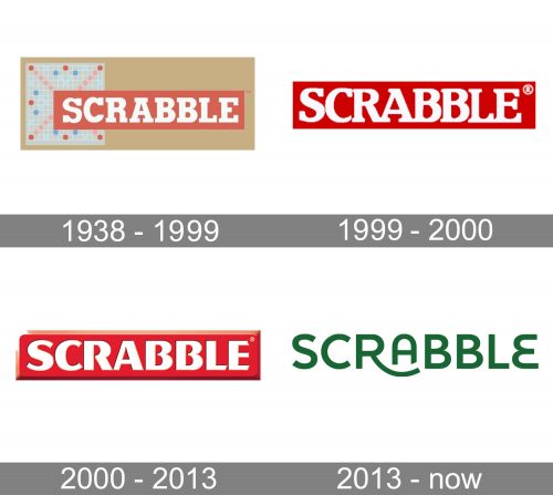
While the Scrabble logo on the products introduced by Mattel has gone through several modifications, the package has always featured elements in dark green. Sometimes, these elements have belonged to the logo itself (like, for instance, in the 2013 version), but more often, the dark green has belonged to the background, while the wordmark has been white in a red box.
1938 – 1999
The old logo already showcased the iconic combination of the white letters placed inside a red rectangular box and a dark green field in the background.
Originally, the letters were pretty heavy and had bold serifs.
1999 – 2000
While the overall structure remains unchanged, the type has been redrawn. The glyphs are sleeker now. Many angular parts have been replaced by curved and rounded ones (note, for instance, the “back” of the “C” or the right end of the “L”).
2000 – 2013
The glyphs have grown bolder and simpler. Plump letters are typically associated with friendliness, which makes perfect sense as the game is often seen as a way friends can spend time together.
2013 – now
The logo was redrawn from scratch. Now, there is only the wordmark in dark green. The letters are smoother, more rounded. Some of the most characteristic glyphs are the “A” with the rounded top and the “E,” which also consists of two rounded elements (similar to the mirror reflection of the “B”).
Font
The most curious detail about the Scrabble logo is probably the way how the Mattel version adopted the “R” with an extended end in 2013, which was similar to the old Hasbro version of the logo. And just a year later, the Hasbro version dropped the “R” with an extended end.
Colors
Dark green and various shades of red have been used in the majority of the historic variations of the logo.


