Schweppes is a brand of sparkling mineral and sweetened waters, established in 1783 in Switzerland. The most famous beverage of the label is Schweppes Tonic, which is recognizable and loves all over the world.
Meaning and history
The brand Schweppes was named after its founder, Johann Jacob Schweppe, Who started producing carbonated water in 1783. Schweppes’ visual identity is bright and fresh, making the brand stand out.
The Schweppes logo was always composed of a wordmark, which went through several modifications during its history. Today the wordmark is executed in an italicized serif font with smooth elegant lines and stretched first “S”.
The wordmark is placed in a diagonally located rectangular with two corners rounded. The shape of the frame evokes a sense of movement and dynamics. The yellow color of the background represents freshness and young energy.
On the top of the emblem, a red oval crest is located. It contains a white symbol, looking like stylized letters “M” or a fountain of mineral water. The symbol is underlined and the “1783” mark is written under the line.
The Schweppes logo is simple yet bright and instantly recognizable. The color palette of the brand resembles of sun and hot summer days, making you want to taste the famous brand’s drinks.
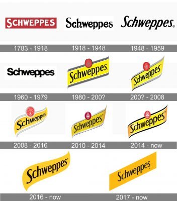
1783 – 1918

The very first emblem for Schweppes was created at the end of the 18th century and stayed with the brand for more than three decades. It was a bright yet laconic badge, composed of a red rectangular banner with a bold white sans-serif lettering on it. The uppercase inscription had its edges slightly uneven, and the first “S” enlarged.
1918 – 1948
The redesign of 1918 introduced another style of the logotype. The black title case inscription from the 1920s was executed in a fancy custom serif typeface with tails of some letters curved and diagonally cut. The serifs were small and almost invisible, placed on the ends of bold letter lines.
1948 – 1959

In 1948 the black logotype was redrawn again. This time its elegant serif typeface was italicized and a bit narrower, which made the logo look friendly and evoke a sense of movement and progress. This inscription became a basis for the current Schweppes insignia.
1960 – 1979

In 1960 the nameplate used a simple sans-serif font for its wide rounded letters. Black was still the main and only color of the wordmark, Addis a touch of power and professionalism to a laconic and stable composition. The letters in the inscription were glued to each other, but due to enough space inside each letter, the logotype didn’t look heavy.
1980 – 200s
The redesign of 1980 brought an intense color palette to the brand. Now the black logotype, resembling the one, created in 1948, was placed on a diagonally oriented yellow banner with a dark gray frame and an oval red seal on top. The red medallion was outlined in gray and black and featured a very elegant gray symbol on it with a “1783” datemark.
200s – 2008

At the beginning of the 2000s, the logo was refined and made sleeker, by cleaning its contours and adding a white accent to its silver frame. The red medallion was enlarged and got its color palette enlightened, which added better visibility, and showed the link of the brand to its roots and legacy. The typeface of the inscription became more elegant and thin, looking timeless and sharp.
2008 – 2016

The badge was redrawn again in 2008, keeping the idea of the composition, but changing its style and execution. Now the letters of an emboldened black logotype were getting smaller to the right, as well as the smooth yellow badge in a thick gray and white outline. The red oval seal gained a thick gradient silver framing and got the fountain symbol redrawn in white and accompanied with an arched white “Pleasure Of Mixing” lettering.
2010 – 2014
In 2010 the brand decides to come back to the logo from the beginning of the 2000s, adding gradient shades to it. The fountain and datemark on the seal were drawn in white, while the red background got darker. The gray frame turned silver and became a bit thicker and colder than it was. The main yellow shade was also switched to a more intense one.
2014 – Today

In 2014 the silver frame was replaced by a black one, which made the elegant serif lettering look brighter and bolder. Some gradient shades were added to the body of the banner and lettering, but the red medallion used plain shades and looked flat. The serifs on the letters were made smaller, making the typeface more modern and progressive.
2016 – Today
The simplified version of the iconic yellow banner was introduced by the brand in 2016. The framing and the red seal were completely removed from the emblem, leaving only the black serif lettering and its diagonally oriented intense yellow background with the smoothly curved edges.
2017 – Today
The smooth yellow banner was replaced by a diagonally placed gold rectangular in 2017. The gradient gold shades made the whole logo look chic and luxurious, and the new sans-serif typeface of the black inscription added a touch of modernity and energy, showing the young and progressive spirit of the brand.
Font and color
Today Schweppes uses three different logos, which feature a black diagonal inscription in three different typefaces. The wordmark, designed in 2014, is executed in a custom serif typeface, which is close to Formica Bold Italic but only in terms of small sharp serifs. As for the logo, created in 2016, it uses a very strong and traditional serif font, the one similar to Columbia Serial ExtraBold Italic. And, finally, the wordmark from the 2017 emblem, which is written in a sans-serif type, resembling Castle TS Medium Italic.
As for the color palette, there are also three options: black, yellow and red, black and yellow, and gold and black. And all of them make the badge bright and memorable, representing dynamics and evoking a sense of freshness and happiness.


