Schuco is a German company, which specializes in the design and production of window and door systems. The company was established in 1951 and in the middle of the 1960s already expanded to the European market. Today the corporation operates across the globe and has a perfect reputation.
Brand Overview
Shuco is one of the world’s leaders in the design and manufacturing of various building products, including window and door profiles and facade systems. Today the company, founded in 1951, has its offices and production facilities in more than 80 countries across the globe, where almost 6 thousand of the group’s employees work.
The company has more than 10 thousand partners worldwide, including leading construction businesses, famous architects and designers, as well as developing companies and big investors.
The company has metal and uPVC divisions, which manufacture products according to the highest requirements in terms of quality and design, as well as durability and sustainability. Schüco designs solutions for both commercial and residential sites, tailored products for new constructions and renovations, designed to meet all the possible architectural needs in all climate zones.
The company also pays a lot of attention to eco-friendliness and efficiency of its window and door systems, using the technologies, which enable the reduction of CO2 emissions through energy efficiency, and conservation of natural resources.
Meaning and history
The Schuco visual identity is an example of a luxury minimalist design. With its text-based logo, the brand looks confident and progressive, reflecting the precise German quality and style.
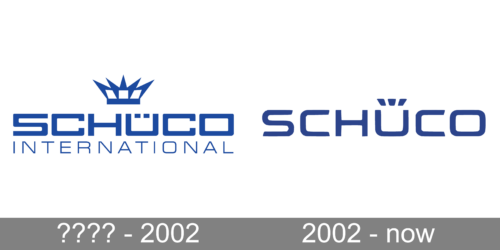
???? – 2002
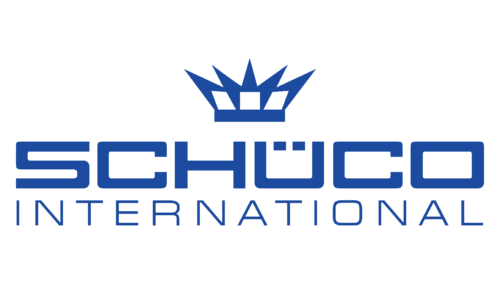
The original Schuco logo was composed of a heavy geometric inscription set its the “International” tagline, and a sharp minimalistic emblem, set above the lettering. All three elements were set in the same shade of blue — a medium dark and very tender, but due to the straight and edgy contours of the elements and sharp peaks of the crown in the emblem, the tenderness of the shade was not that obvious.
2002 – now
The logotype has only one unique detail in it, three delicate petals above the letter “U”, which reflect the German letter “Ü”, transcribed as “ue”. This element adds individuality and shows the company’s roots and legacy.
The monochrome palette of the brand’s visual identity is a reflection of professionalism and confidence of a powerful European Group, whose main value is quality and design.
Font
The wordmark in all capitals is executed in a modern sans-serif typeface, which is close to Bitsumishi Pro Medium, a sleek contemporary font with clean and neat lines and wide spacing.
The cuts of “S” and “C” horizontal bars have a slight inclination, which adds uniqueness and balanced the smooth lines and softened angles of the nameplate. The elegant typeface shows the brand as confident and progressive, accenting on the values of beauty and design.


