Schneider Electric is the name of the electrical-equipment manufacturing company, which was established in 1836 in France. Today the company distributes its products all over the world and has a yearly revenue of about 25 billion euros.
Meaning and history
The Schneider Electric visual identity is based on a bright green color and uses an uncommon to the brand placing of the emblem. It is simple yet recognizable insignia, which reflects the nature of the company.
1902 – 1938
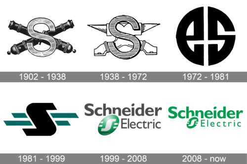
The original Schneider Electric logo, created in 1902, featured a composition with the two black crossed canons overlapped by an enlarged capital “S” in a traditional sans-serif typeface. The letter has a black outline andthinly-striped patternson the body. This logo stayed with the brand for more than thirty years.
1938 – 1972
The redesign of 1938replaced the crossed cannons with an anvil in white, outlined in thin black. The letter itself was enlarged, with the stripes getting thicker and gaining more space between each other. This badge stayed with Schneider Electric till the beginning of the 1970s.
1972 – 1981
In 1972 the company started using a modern logo with the two stylized letters, “E” and “S”, drawn in thick lines making up a roundel. The badge looked very stylish and progressive for its times. The logo was executed in a black-and-white palette.
1981 – 1999
The redesign of 1981 has introduced a completely rethought concept of the Schneider Electric logo. It was based on a stylized capital “S” in black, overlapping the two dark green horizontal lines of different lengths, with the ends cut diagonally. The letter was outlined in white, bringing in more light.
1999 – 2008
The Schneider “S” was redrawn in white and placed on a glossy green oval with light gradients, after the redesign of 1999. The three-dimensional emblem was placed under the gray “Schneider” wordmark and followed by the “Electric” in a smaller size, and with thinner lines.
2008 – now
The Schneider Electric wordmark is written in two levels, with “Schneider” on top in a bold sans-serif typeface and “Electric” under it in a thinner font.
The Schneider emblem is placed on the left of the “Electric” lettering and overlaps “H” and “N” of the “Schneider” part of the nameplate. The emblem comprises a solid green oval that is slightly inclined to the right and features a white letter “S” with two white stripes on both sides.
The green and white color palette of the Schneider Electric logo is a symbol of energy, balance, and life. The calming and relaxing shade of green represents nature and its power. White accents of the emblem add a sense of reliability and transparency of the company, showing how much the brand values its customers.


