

![]() Schindler Logo PNG
Schindler Logo PNG
Schindler is a European lifts and escalator manufacturing company, which was established in 1874 in Switzerland. At the end of the 1970s, Schindler entered the North American market. Today the company operates in more than 100 countries across the globe with production facilities on almost all the continents.
Meaning and history
![]()
The Schindler visual identity is based on the main company’s principles, that were put in the original brand’s logo, designed in 1910. Schindler is the company with a very rich history and it values its heritage and tradition, which can be seen not only in its visual identity concept but in its attention to details at all the stages of the manufacturing process.
1910 – 1925
![]()
Though the company was founded in 1874, Schindler got its first logo only in 36 years after the establishment. The original emblem was designed by one of the members of the Schindler’s family and a young artist Maxime Chatel.
The circular emblem was composed of a wordmark, placed on its upper part around the perimeter and an open compass in its bottom part. The emblem was meaningful from the very beginning, as the circle is a symbol of perfection and compass reflected the company’s nature — architectural segment.
Under the compass “1874” was written, as a tribute to the company’s root, a year of the label’s foundation.
1925 – 1974
![]()
The corporate logo was officially registered only in 1925 and by that time it gained more modern and simple lines. The compass was now an abstract part of the inner emblem’s circle. And the wordmark is drawn in bolder and more confident lines.
The thin inner circle of the label’s emblem had a triangular cut in its bottom part, forming a Pac-Man-like shape.
1974 – 1985
![]()
To celebrate the 100s anniversary of the company, Schindler redesigns its logo in 1974. The shape and concept remain the same, but the lines became thicker and more distinct, so did the inscription.
Both parts of the nameplate — the company’s name and the date of the establishment — now feature bold strong lines and are executed in a modern sans-serif typeface, which looks elegant and powerful.
1985 – 2006
![]()
The new era for the Schindler visual identity started in 1985 and lasted for more than twenty years. It was a completely different approach to the company’s logo design, which still kept the original symbol and business’s legacy.
The wordmark is a sans-serif typeface that was vertically placed along with the symbol, consisting of three vertical lines, each of different lengths.
The circular emblem was modernized and placed on the right of the wordmark, looking like a bold black ring with a triangle in its bottom part.
As hidden meaning and symbolism have always been important for the company, the three red lines were put on the Schindler logo, not by occasion. There were meant to show the company’s growth and progress.
The red and black color palette of the new trademark logo symbolizes power, passion and professional authority.
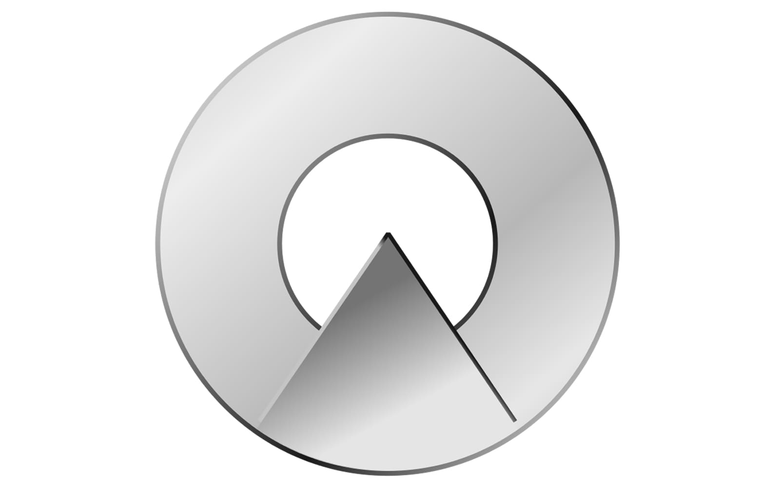
2006 – Today
![]()
The redesign of 2006 brought back the original shape of the corporate logo, but also kept the abstract circular symbol from the previous version. Now the wordmark was placed not inside the emblem, but under it. The Schindler insignia gained sleek refined lines and a new color palette, which made it look vivid and three-dimensional.
The gray and red palette of the new logo was a reflection of elegance and style, alongside the high quality and a strong connection of the company to its roots.
Font
The red wordmark, placed under the iconic logo, is executed in a simple year one of the most elegant sans-serif typefaces ever created — Frutiger. Its bold neat lines evoke a sense of harmony and strength, reflecting the reputable company, with its unique philosophy and focus on quality and safety.
Review
Schindler was established in 1874 in Switzerland, and by today the company became one of the world’s leaders in manufacturing elevators, escalators, and moving walks. The company also provides maintenance and modernization services for its products installed all over the globe.
Today the company has over one thousand operating offices in more than a hundred countries in Europe, the USA, Latin America, and Asia. The company also has its production facilities in all these areas, which makes the logistics and maintenance process faster and easier.
After the first electric elevator was built in 1892, Schindler was in constant development and research. The company pays a lot of attention to innovations and is very technologically-centered, trying to modernize and improve its product line in order to provide its customers with more safety, comfort, and reliability.


