Matchbox is a British brand of the toy manufacturing company, which was established in 1953. Today the brand is a part of Mattel and has its products distributed all over the world.
Meaning and history
Matchbox is a brand of molded toys created in 1953 by Lesney Products and is now owned by the famous American Mattel Corporation. The brand name comes from the original packaging of the company’s toys. In the first models, the packaging strongly resembled matchboxes in both form and style. A series of toys in “matchboxes” became so popular that customers began to call all molded toys 6.5 cm long, regardless of the brand, the Matchbox.
In the 1970s, Matchbox changed its packaging to a more traditional one: plastic with cardboard backing used by other molded car toy manufacturers. But the design of packaging in the form of a matchbox was recently revived again. So, in 2004, a series dedicated to the 35th Anniversary of Superfast models were successfully released in this packaging, especially for collectors.
Over the past half-century, the company has undergone fire, floods, many moves, and bankruptcy. In the mid-90s, it was bought by competitor Mattel Toys. The new owner expanded the range: fantasy models, gift sets, Jurassic Parklicensed series, and other franchises appeared in the catalog.
What is Matchbox?
Matchbox is the name of an English toy brand, whose history begins in 1953. Currently, it belongs to the Mattel concern. Matchbox toy cars have gained popularity due to their non-standard small size and unusual cardboard box, resembling a matchbox.
1953 – 2001
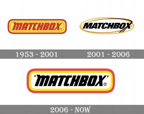
The very first version of the Matchbox logo looked pretty much the same as the emblem introduced in 2006, though it was executed in a different color palette. The stylized lowercase logotype was set in dark red on an intense yellow background and enclosed into a double red frame with rounded angles. The inner framing was were thin, while the outer one was drawn in an extra thick line, balancing the bold lettering in the center of the badge.
2001 – 2006
The redesign of 2001 kept the composition of the bold logotype enclosed into a double frame but changed the style and the color palette. Now the wordmark was set in the uppercase, written in an italicized sans-serif typeface in black. As for the framing, it was a double oval in yellow and red, with two outlines overlapping each other. The letter “X” had its bar elongated and forked, with the two black lines merging into the lines of the frame. The logo looked modern and bright and stayed with the brand for five years.
2006 – Today
The Matchbox logo is strong and eye-catching. Composed of a framed wordmark, it uses a classic color palette, which makes it look remarkable on any placement.
The all-caps lettering of the wordmark is executed in an italicized sans-serif typeface with the letter “M” reminding a lowercase one. The black color of the inscription features gradient tones, which adds volume and gloss to the logo.
The frame of the nameplate is a horizontally placed rectangle with rounded angles. Featuring two of the outline, red and yellow, the frame creates a good contrast with white background and black letters.
The Matchbox logo is timeless and recognizable. It makes the brand’s products stand out and represent the company, which values the quality and safety of its young audience. While red and yellow colors evoke a happy and friendly feeling, making you smile and enjoy playing with the Matchbox toys.
Font and Color
The heavy italicized lettering from the primary logo of the Matchbox brand is set in the lowercase of a stylized sans-serif font with some unique details, making the inscription recognizable and interesting. The closest typefaces to the one, used in this insignia, are, probably, Futura Now Display Black Italic, or Blunt Semi Condensed Italic, but with some significant modifications of the characters’ contours.
As for the color palette of the Matchbox visual identity, it is based on a combination of red, yellow, and white, accompanied by solid black for the lettering. It was a tribute to the historical design of matchboxes, which used the same shades for their products.


