Savage is an American firearms manufacturing company, which was established in 1894. The company is mostly known for its rifles and operates all over the United States and Canada.
Meaning and history

Savage was created in 1894 to produce original rifles and ammo. The company was named after its founder, Arthur Savage, who led the company until 1938. One of the manufacturer’s early (and most famous) successes was the Savage Model 99, a lever action rifle created in 1899 and produced as late as 1997.
Old

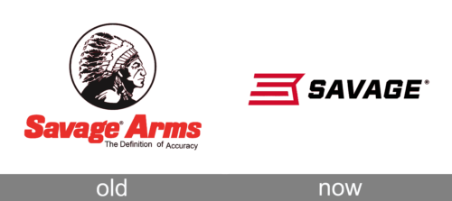
The company’s older logotype plays off the brand’s own name, which in turn derives from the name of its founder. The centerpiece of the logo is a roundlet featuring the head and shoulders of a Native American chief, in profile. It’s a relatively detailed illustration, fully colored in black.
Beneath it, they’d usually place the name of the manufacturer, the ‘Savage Arms’, written in bold red letters. There would also be a motto, ‘The Definition of Accuracy’, written below the right half of this inscription. It typically came in more boring, thin black letters.
Today

The Savage visual identity was based on a portrait of a Native American since 1919. But the latest brand’s redesign brought new contemporary shape to the logo, making it simpler and more stylish.
The previous Savage logo was composed of a rounded emblem with a portrait of Chief Lame Deer, who allowed the use of his image in exchange for a special price on rifles and annual fee from Savage.
The wordmark was placed under the emblem and executed in a bold italicized font. The color palette of the Savage logo was red and black and it is the only thing, which remains untouched today.
The current Savage logo is completely different. The strong new nameplate in all the capitals is written in a slightly italicized geometric typeface with clean lines and balanced spacing.
The black of the wordmark is accompanied by a red abstract emblem, which consists of several lines, forming an “S” in the negative space.
The red and black Savage logo is a reflection of a powerful and progressive company, which is full of energy to move forward but values its roots and heritage. It is a modern visual identity design, which is still very recognizable.
Font
The newer logotype uses an angular, tilted font – an industrial-looking design with abrupt turns and square forms. They’ve been purposefully created to look like pieces of a mechanism. The previous logotype, however, uses a more relaxed bold style with round letters, big inflated forms and a generally more spontaneous appearance.
Color
Throughout its history, Savage arms mostly used the colors black and red. The red shade of the older emblem is a brighter, lighter design. The newer variant is noticeably darker by comparison.


