

![]() Santos Laguna Logo PNG
Santos Laguna Logo PNG
Santos Laguna is a Mexican sports club playing professional soccer. It was established in the early 1980s. The team’s home stadium is based in the city of Torreón. Now it’s one of the most successful Mexican soccer teams, participating in Liga MX (the first-tier soccer league in Mexico), as well as in the tournaments such as Copa MX or Campeón de Campeones. The team represents its home region in the Northern Mexico, La Comarca Lagunera. The club is owned by Grupo Orlegi, and managed by Eduardo Fentanes.
Meaning and history
![]()
Since 1970s, the Mexican Social Security Institute (MSSI) have been sponsoring and assisting national sports organizations in any way. It resulted in formation of Santos Laguna in 1983. Here’s how it was: in the early 1980s, Jose Dias Couder, then-head of MSSI public services, was invited to take part in the tournaments, disregarding the fact that he didn’t have any team. After this, he decided to gather a sports team from the players he had known and name it Santos Laguna (Saints’ Lagoon). A bit later (in 1987) Saints would receive its home Estadio Corona in Torreón. The next year, the team would win its first match with the score of 2-0.
What is Santos Laguna?
Santos Laguna is a Mexican professional soccer franchise, one of the most popular soccer teams in the country. With the home stadium in Torreón, Santos Laguna competes in Liga MX, the top league in Mexico, with 6 tournaments won. In matches, it represents its home area – La Comarca Lagunera. Along with Liga MX, Santos Laguna also plays in Copa MX and Campeón de Campeones, winning 1 competition in every championship. The club’s owner is Grupo Orlegi, and it’s managed by Eduardo Fentanes.
1997 – 2001
![]()
The team’s first logotype appeared only 14 years after the foundation. It was a soccer ball with five hexagons, all joined to a thin contour of the whole ball. On the ball, there was an inscription with the brand’s name written in three lines. In the lower part of the ball, they’ve depicted a star. Above the ball, they placed a crown. In the future, they would add more stars to the crest. Every star means a won tournament.
2001 – 2008
![]()
In the following ball, they’ve placed the second star next to the original one. Also, they’ve lessened and narrowed the crown, deleting the side extensions.
2008 – 2012
![]()
The redesign of 2008 reflected another success of the club by adding a third gold star to the badge. Another change was made to the contouring: the outline of the circular badge got thicker, the fancy crown on top now looked more dramatic, and all of the negative spaces between its details were also filled with black paint. This version of the logo stayed with Santos Laguna for four seasons.
2012 – 2015
![]()
In 2012, the three gold stars moved out of the roundel and were now placed in an arched line under the badge. Inside the medallion, everything else remained untouched, but hence, there was now more free space, the black three-leveled lettering started looking smaller and more delicate.
2015 – 2018
![]()
Another star was added to mark a new winning of the team. The stars themselves now were united in pairs and placed separately on the opposite sides under the ball.
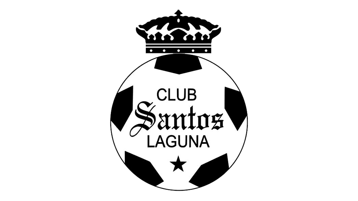
2018 – today
![]()
With the redesign of 2018, not much has changed in the Santos Laguna visual identity, just another golden five-pointed star was added to the underline of the emblem, signifying another big win for the club. With six stars, the arched line became longer and more massive, and now this golden “chain” became the most visible element of the whole composition.
Color
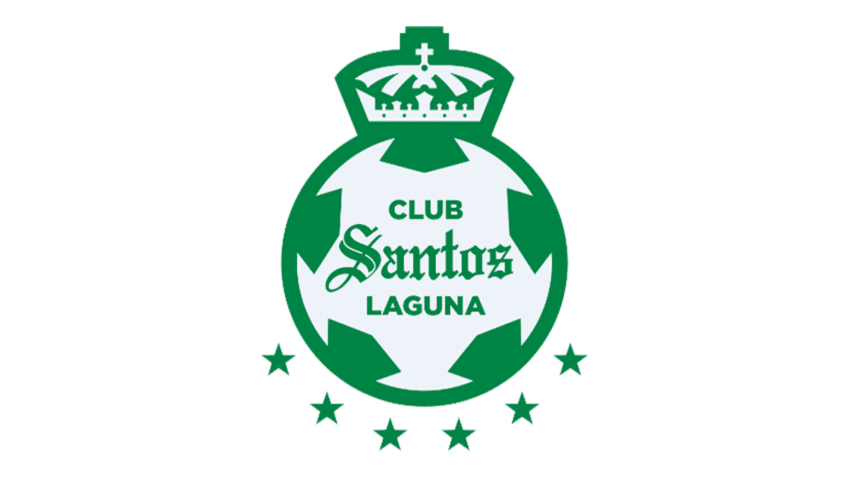
The official colors of Santos Laguna are white, black and green. These shades are used in the badge as well – the green hexagons are drawn on a white ball. The badge has a fat black contour, as well as a golden yellow crown located above.
Font
With the font scheme, the brand has quite a short story. They’ve changed it only once throughout its history – in 2001. Before that time, the team’s nameplate had two scripts: the ‘club’ and ‘laguna’ words had a capitalized sans-serif style with lightened letters, and the ‘santos’ word had a gothic script with the first ‘s’ capitalized. With the 2001 logo, the brand designers brought bolder typefaces for both portions of the name without any major changes.


