The Santa Cruz Skateboards brand is distributed by NHS, Inc. It is the world’s oldest continuous skateboard company. It was established in 1973.
Meaning and history
The original Santa Cruz logo was designed by a graphic artist and Santa Cruz High surfer Jim Phillips in 1978. His creative and often monstrous designs are an indispensable part of the NHS imprint today.
He drew the memorable slanted typeface by hand. The most distinctive feature of the type is probably the “A” formed by a closed triangle. He also enriched the logo with a second color in the form of a drop shadow. Eventually, he placed a large red circle behind the wordmark. The circle was soon nicknamed “the dot.”
The way the name of the brand looks in the current logo is almost the same as in the original logo. According to Phillips, the dot was suggested by Jay Shuirman, the company co-founder. As Phillips explained, Shuirman placed the original linear design on the wall, sat back considering something, and eventually claimed: “I see a big red dot.”
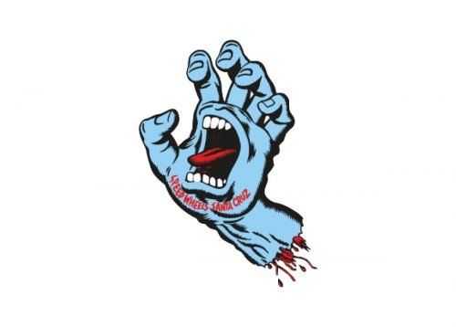
Screaming Hand emblem
The iconic emblem features an amputated hand with a screaming mouth in its palm. The hand is blue with red and black nuances. The design was also created by Jim Phillips. While originally it was supposed to promote only the Speed Wheels line, it is today synonymous with the brand.
Alternative symbol
Some products bear an additional Santa Cruz Skateboards logo showcasing a yellow roundel on the black background. The roundel is made up of three elaborate yellow shapes.


