The football club Unione Calcio Sampdoria was created in 1946 out of rather successful and old teams, Sampierdarenese and Andrea Doria.
Meaning and history
The original Sampdoria logo featured the iconic red cross on a white field. Also known as St. George’s Cross, it has been a long-time symbol of the club’s home city, Genoa. The cross is placed in a blue shield.
1946 — 1947
 The Sampdoria logo, designed in 1946, only stayed with the club for a few months. It was a light and simple white crest with a thin Red Cross and a blue outline of the same width as the red lines of the main logo element. Some corners of the shield were rounded, while the middle ones were pointed both from the top and bottom parts. This elevated the look of the plain composition and added style and elegance to it.
1947 — 1949

The redesign of 1947 made the club’s badge look stronger and bolder. The contours of the crest were refined and the upper part was now widened and colored in blue, being a background for a narrowed white sans-serif lettering. As for the Red Cross, it was also redrawn in thicker lines, which now looked massive and created a right geometric balance between the elements. The frame of the white crest remained in blue but became thinner.
1949 — 1953

Even a simple that the original version was introduced by the club in 1949. It was the same white crest with a Red Cross as the main element, but the blue color was now gone, and the framing was now barely visible. Although the lettering remained and was still placed on the top, “crown”, part of the logo, written in small capitals of a traditional sans-serif typeface, with the use of light blue shade.
1953 — 1961
 Something completely different was used by the club as their logo from 1953 to 1961. A more square shape of the crest was now colored in light blue and had a horizontal striped pattern in its central part. The stripes were executed in white, red, and black colors and outlines in gold. The frame of the entire logo was also drawn in the same shade of gold, as well as the strong and elegant sans-serif lettering, placed on the white background of the crest’s top part.
1961 — 1962
After almost eight years of using the new badge, the club decides to come back to its roots in 1961. The white smooth crest with the Red Cross and blue outline was used as the official Sampdoria logo for a few months again. It was simple and bright, with no additional lettering on it, and with the Red Cross enlarged and emboldened.
1962 — 1965
 With the redesign of 1962 the logo, created in 1953 becomes official again. Although the contours and color palette were refined and smooth gold shade was replaced by an intense orange one, the square shield of the Sampdoria sports club looked light and elegant. The horizontal stripes on this version were a bit wider than on the original one, and the framing — thinner. As for the lettering, it was also set in orange now and got its sans-serif typeface refined and modernized.
1965 — 1966
The Sampdoria logo version from 1965 was a combination of two main team badges. The new concept featured a square blue crest in a gold outline, with white, red, and black horizontal striped crossing its middle part, and a small white shield with a Red Cross placed right on the striped element. The wordmark in all capitals was executed in bold sans-serif, in light gold, and written over a white rectangular banner, set on the upper part of the blue badge.
1966 — 1971
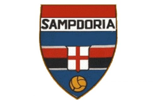
The redesign of 1966 switched the shapes of the two Sampdoria crests and now the main shield was smooth and elongated, while the smaller ones in the center were drawn as a square. The concept didn’t change much, but the red and black stripes became wider, while two white ones — thinner. The gold framing was changed to a thin black one, and the inscription was now also set in black, with its capital letters getting wider and more massive. On the very bottom of the shield, there was a gold football drawn now, to show the affiliation of the club to this particular kind of sport.
1971 — 1977
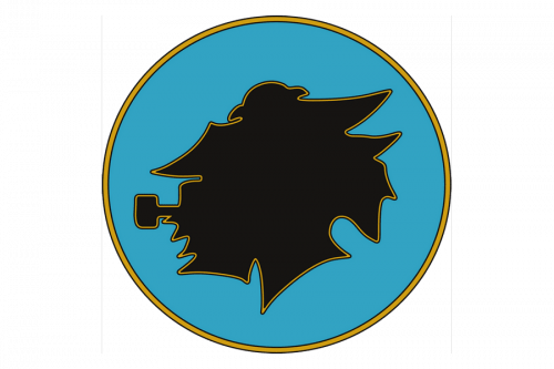
In the early 1970s, the team first introduced a badge featuring a side view of a sailor with a pipe. The character, which is called Baciccia (John-Baptist), looks pretty reasonable on the Sampdoria logo as the team is based in the port city.
1977 — 1980

The sky-blue crest, designed in 1953, comes back as the Sampdoria official logo in 1977 and stays for three more years. Not many changes were made to the logo, just the contours got cleaned and refined. The original color palette and all the elements remained untouched and stayed in their places.
1984 — 1997
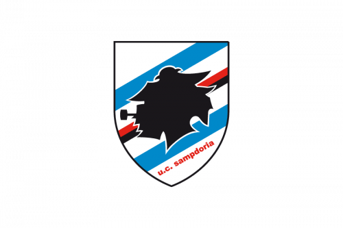
The Baciccia profile in solid black started being used by the club again in 1984. This time the element outlined in white was placed on a white crest with a diagonally striped pattern in blue red and black. The black and red stripes were thinner than the white and blue ones, which balanced the dark color of the sailor’s portrait. The delicate yet bold “U.C. Sampdoria” wordmark in the lowercase was set diagonally under the bottom blue line, executed in red.
1997 — Today
The redesign of 1997 kept the previous version of the Sampdoria logo but enlarged all of its components and made their contours cleaner and bolder. The same striped background, with the black silhouette of the sailor smoking a pipe, in a smooth white outline. The red inscription in the lowercase uses a wide and bold sans-serif typeface, which evokes a sense of stability and solidness.
Colors

The current palette – white, blue, red, and black – was first featured on the 1950s logo. It was inspired by the official colors of the two teams that merged to form the Sampdoria.
Sampdoria Colors
BLUE
PANTONE: 4152 C
HEX COLOR: #1B5497;
RGB: (27, 84, 151)
CMYK: (96, 74, 11, 1)
RED
PANTONE: 3517 CP
HEX COLOR: #C21718;
RGB: (194, 23, 24)
CMYK: (16, 100, 100, 7)
WHITE
PANTONE: P 1-1 C
HEX COLOR: #FFFFFF;
RGB: (255, 255, 255)
CMYK: (0, 0, 0, 0)
BLACK
PANTONE: BLACK 6 C
HEX COLOR: #000000;
RGB: (0, 0, 0)
CMYK: (0, 0, 0, 100)


