

![]() Bayern München Logo PNG
Bayern München Logo PNG
The logo of the Football club Bayern München e.V., more often called FC Bayern München, has gone through multiple modifications throughout its almost 120-year history.
Meaning and history
![]()
The visual identity of one of the most famous Spanish football teams has a pretty intense history. It has been a really long and colorful way from the very first logo, designed in 1903, to the one we all know today.
Though for the most part of the times the club has been using the emblem, based on the one, created in 1917, there have been several experiments and redesign throughout the years.
The visual identity of the Bayern Munchen football club has been redesigned about eight times during the team’s history, but the style and concept of the logo haven’t changed much since the beginning of the 1960s. However, the first two versions of the club’s badge design were different but pretty good and actual for their times.
1923 — 1954
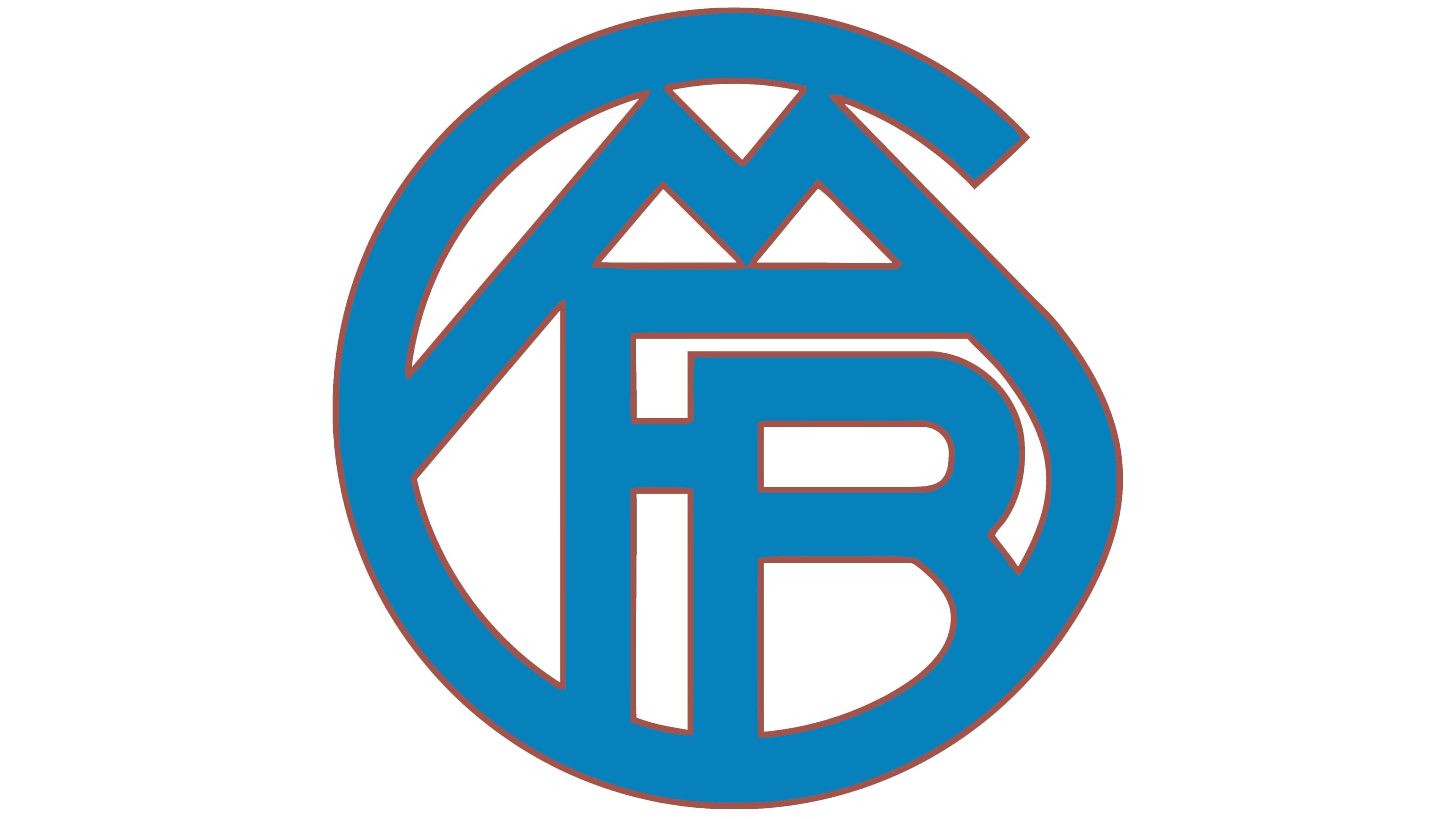
The original version of the logo was designed in 1923 and stayed with the club for more than thirty years, which is a lot. It was a blue circular badge, composed of four stylized letters “FCBM”, where the “C” replaced the frame, and “M” was placed under it, with its right bar merging into the bottom part of the “C”.
The badge had a thin and delicate golden-brown outline, which made it possible to place in on various backgrounds, though white was the one that was use more often.
1954 — 1961

In 1954 the logo was completely changed. It was a pretty minimalist yet bright version, where the white “FC Bayern” lettering was placed on a solid red circle in a double white and red outline.
The color palette of the new logo symbolizes energy and patroon, while the clean and simple lines of the inscription pointed on the professional and fundamental approach of the team.
1961 — 1965
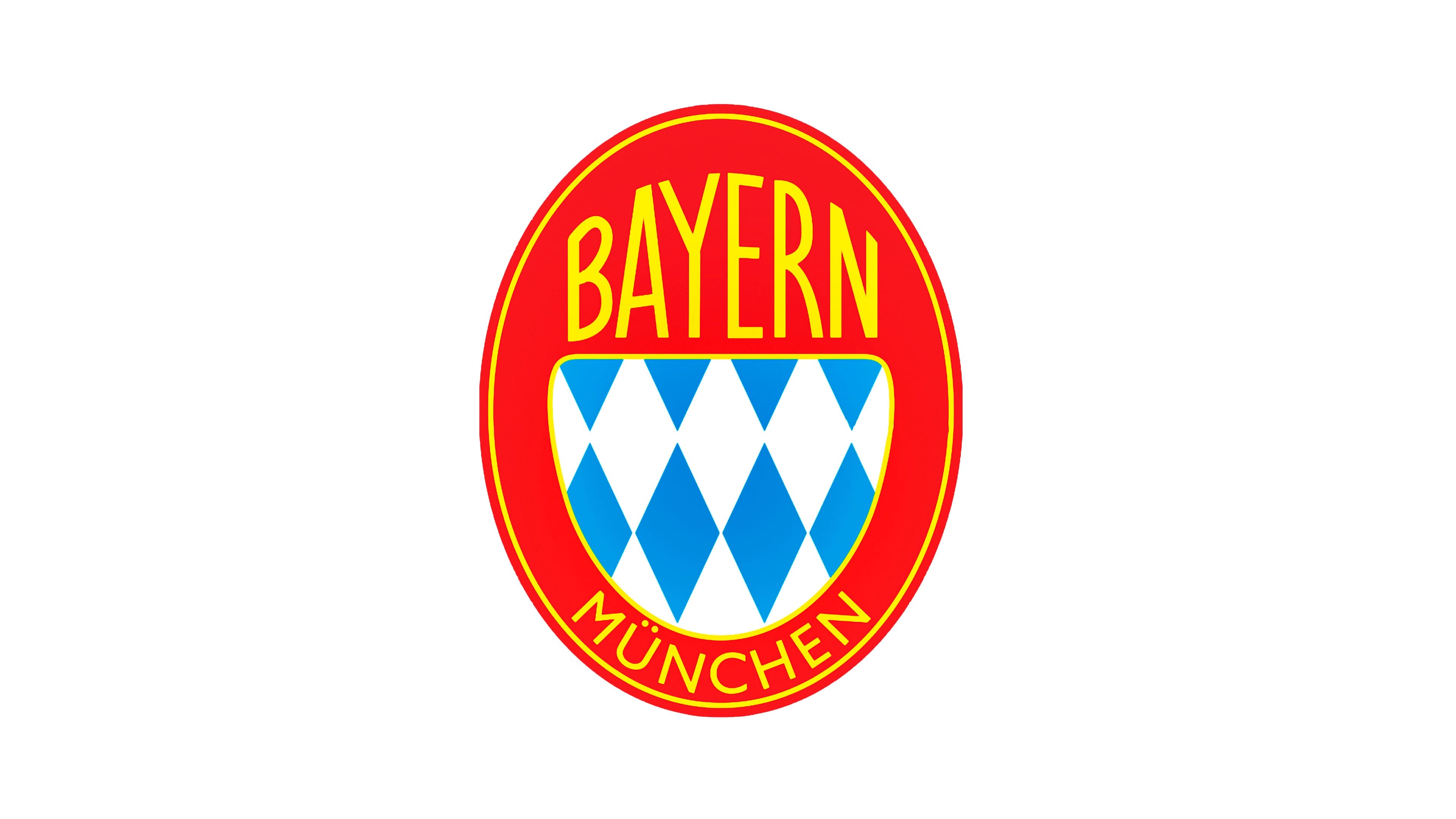
The new era of the Bayern Munchen visual identity started in the 1960s, with the first logo drawn in 1961. It was a bright red vertically placed oval with golden lettering and a blue and white half-circle in the middle.
The blue and white part featured a rhombus heraldic pattern and was balanced by a modern sans-serif typeface of the “Bayern Munchen” inscription. The logo stayed with the club for only four years but became a base for all the following designs.
1965 — 1970
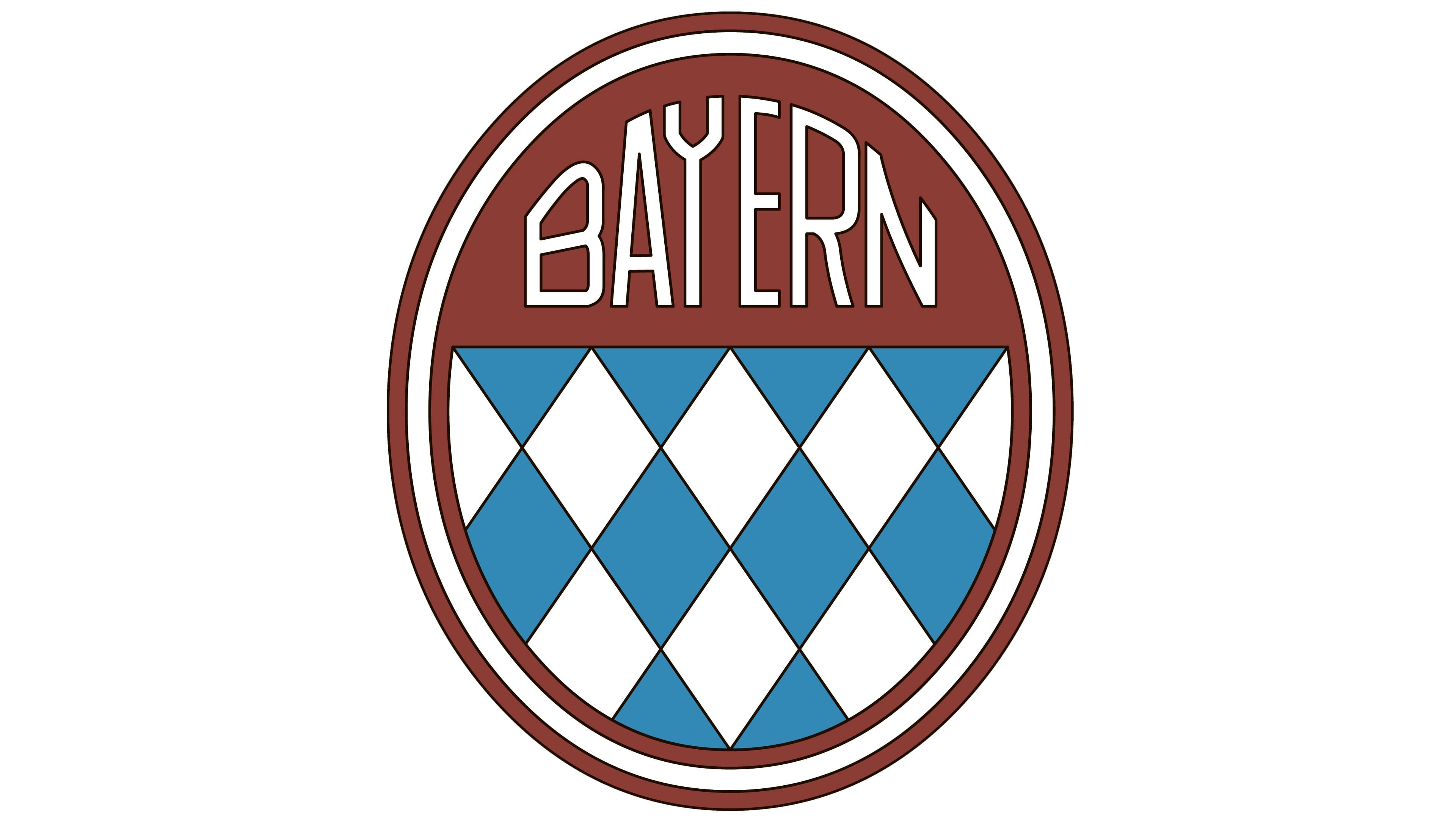
In 1965 a very stylish logo was presented: the same oval and rhombus pattern, but the color palette was more interesting — the blue and white were replaced by two shades of blue, and the classic red — by a burgundy brown, a royal, and sleek color. The “Munchen” part of the wordmark was removed, and the “Bayern” was now executed in a unique and custom sans-serif with an art-deco mood.
1970 — 1979
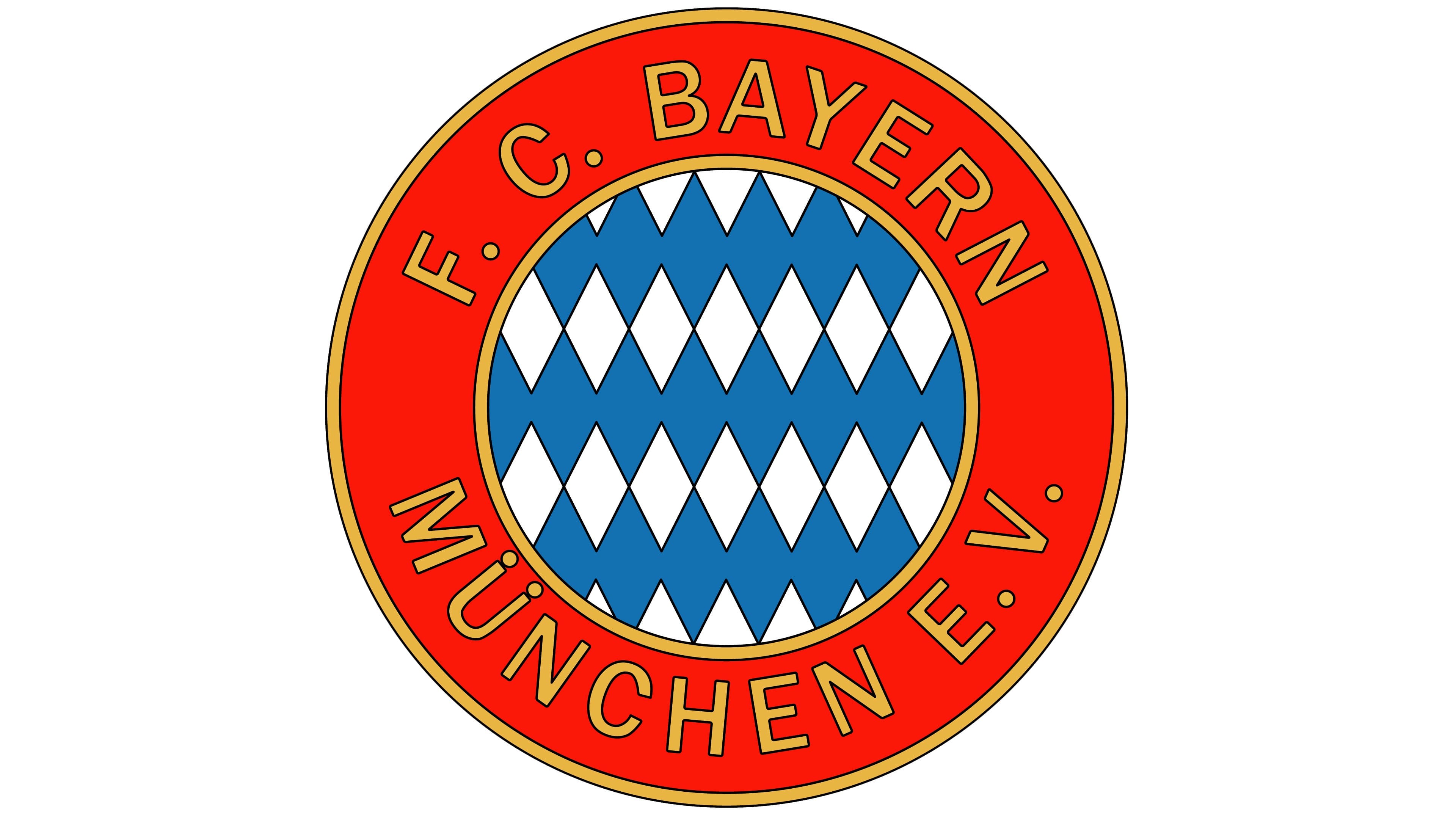
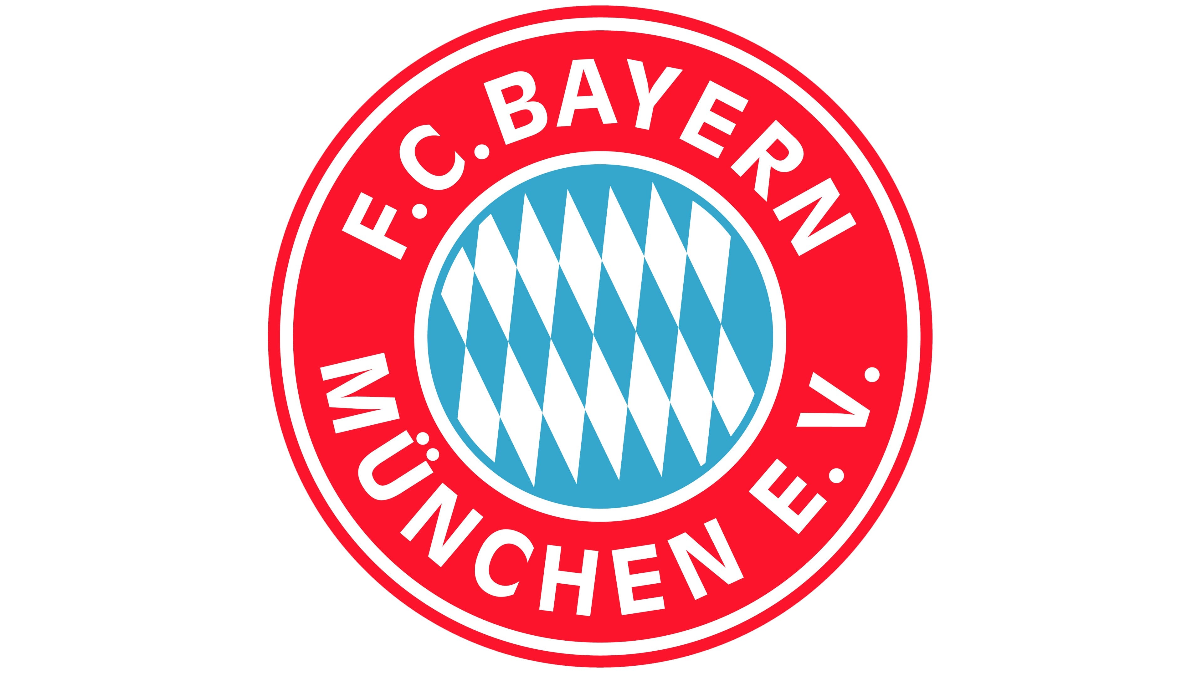
The prototype of the logo we all know today was created for FC Bayern Munchen EV in 1970. A circle with a white and blue rhombus pattern was placed inside a bigger red circle with a thin yellow outline. The nameplate was written in yellow sans-serif and placed around the perimeter of the emblem, on its red part.
1979 — 1996
In 1979 the yellow elements of the logo were changed to white, and the badge became brighter and gained a more professional look. The white and okie part of the emblem became smaller now, and the red one featured a double white and red outline.
As for the inscription, it was executed in a traditional sans-serif typeface with clean lines and distinct contours of slightly extended letters.
1996 — 2002
The redesign of 1996 brought a new shade of blue to the rhombus pattern. It became lighter and added more freshness and a sense of freedom and speed to the whole image. Another night change was made to the nameplate — the typeface was switched to a bolder and come solid one. The whole badge is now outlined in blue.
2002 — 2017

The blue outline became a bit thicker and the color palette — calmer and lighter, as for the lettering, it remained the same, but the “EV” part was removed.
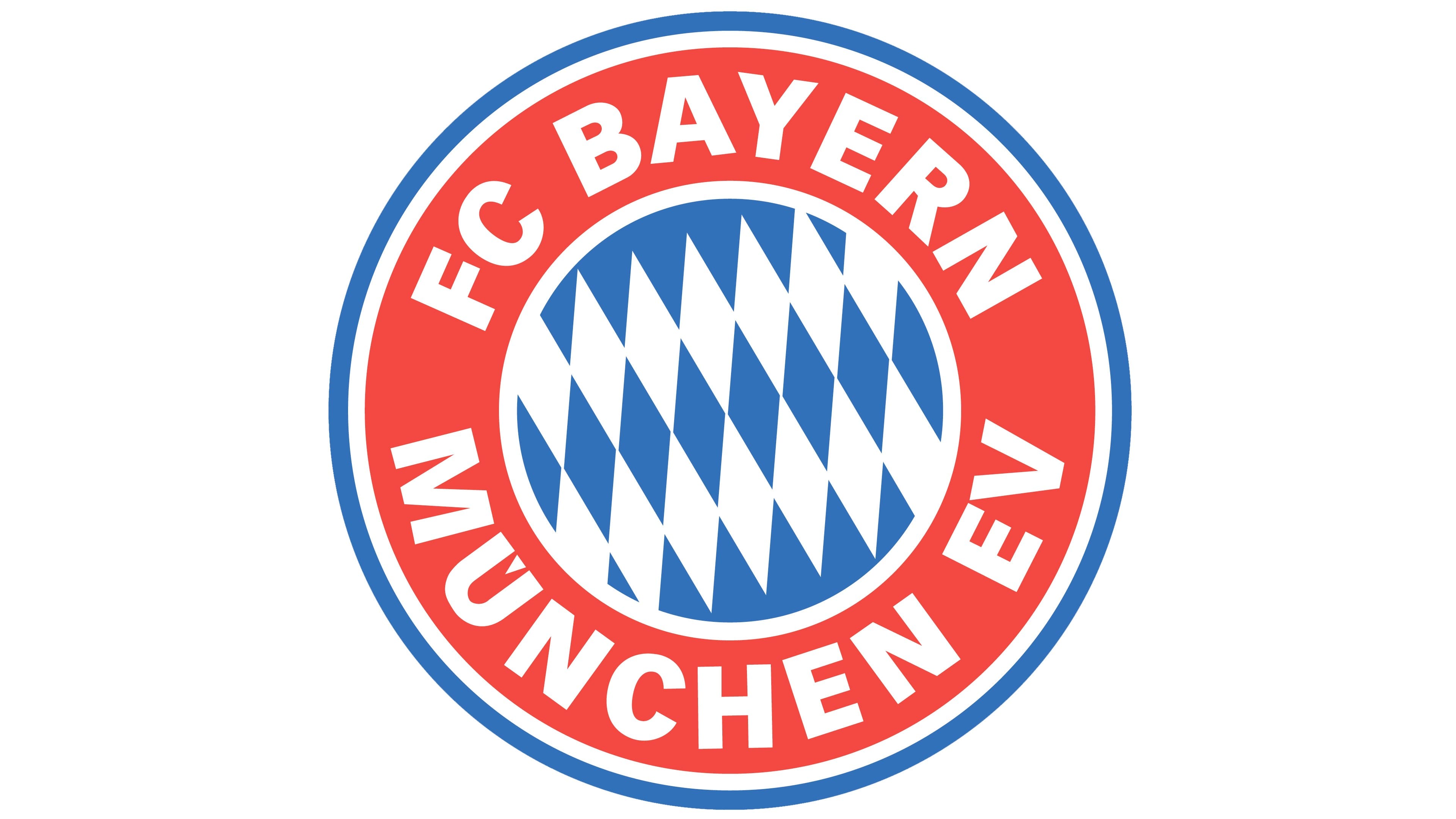
2017 — Today
![]()
The current version of the Bayern Munchen visual identity was created in 2017 and it basically repeats the previous version but has it is color palette brighter and more distinct.
The red, blue, and white combination show the football club as a powerful and professional one, with rich experience and authority.
Emblem size
The emblem can be reproduced in a variety of size provided the proportions remain unchanged. In other words, the crest should retain its circular shape. Some of the examples of the sizes available can be the 512×512 logo or the 256×256 logo.
Font
The letters featured on the Bayern Munich logo seem to belong to the Vectora Black font, which was developed in 1990 by Adrian Frutiger.
Color
![]()
The palette comprises only three colors: red, blue, and white. Blue and white are the colors of Bavaria, the club’s native land, blue is the color of the team’s original crest.
Bayern Munchen Colors
BLUE
PANTONE: PMS 4151 C
HEX COLOR: #0066B2;
RGB: (0,102,178)
CMYK: (91,61,0,0)
RED
PANTONE: PMS 185 C
HEX COLOR: #DC052D;
RGB: (220,5,45)
CMYK: (7,100,91,1)


