

![]() New York Red Bulls Logo PNG
New York Red Bulls Logo PNG
New York Red Bulls is the name of a football club from the United States which was established in 1994 and is considered to be one of the most famous soccer teams across the country. Today the club from Major League Soccer is owned by Red Bull company and has Chris Amras as the head coach.
Meaning and history
![]()
The visual identity history of the American soccer club can be divided into two peri-ods — from 1995 to 2006, and from 2006 until today. The first part was about the MetroStars, the original name of the club from New Jersey, and the second is all about the Red Bulls after the team was acquired by a famous company.
1995 — 2002
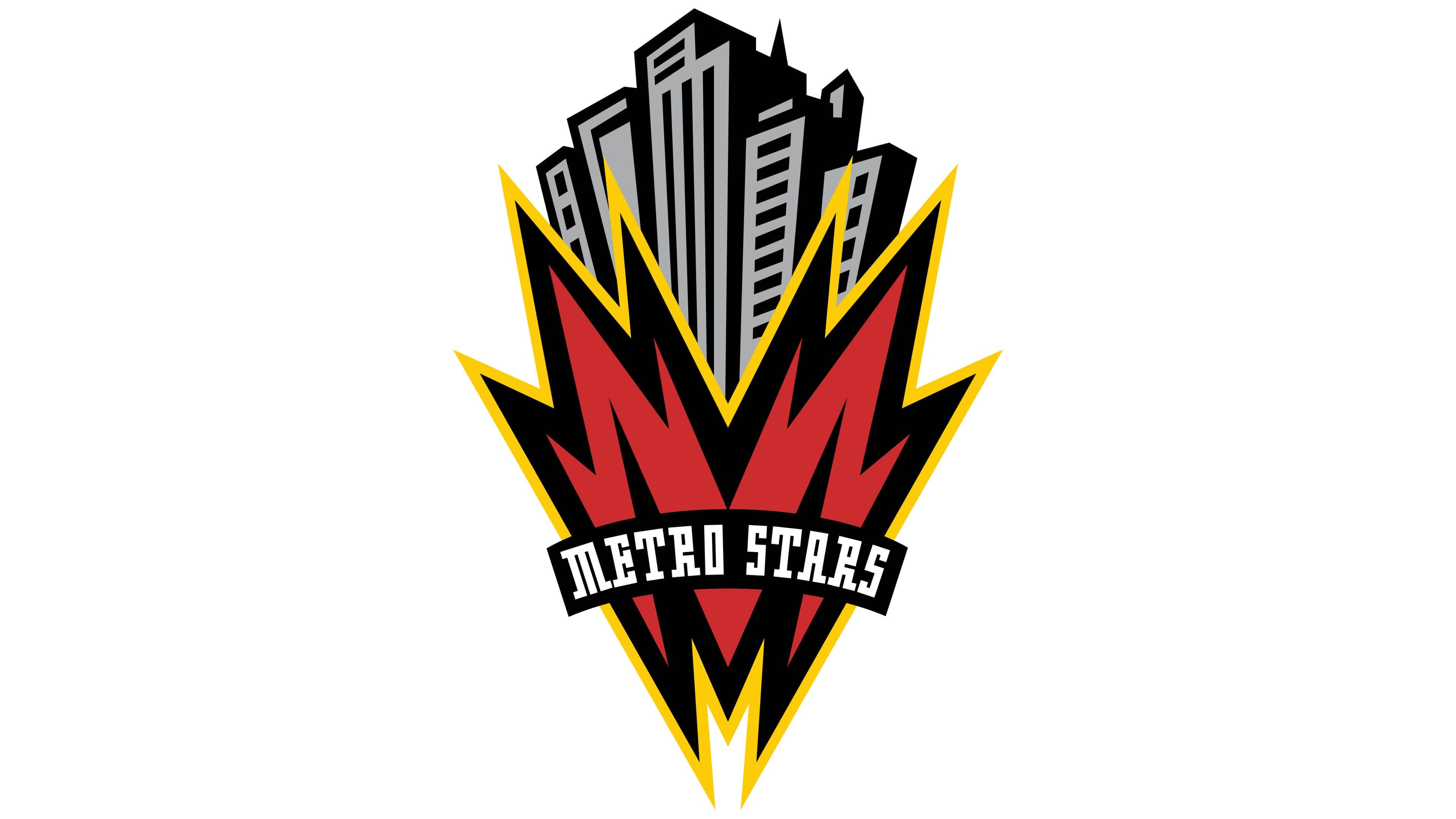
The original MetroStars logo was composed of a very strong and modern image of the skyscrapers with a stylized letter “M” on the bottom. The gray buildings were like exploding from the red yellow and black letter, which was drawn resembling a flame or a lightning bolt. The sharp angles and straight lines on the badge were softened and balanced by an arched “Metro Stars” inscription in white, placed over the red “M”. The wordmark was executed in a custom serif typeface with bold playful contours.
2003 — 2005

In 2003 the funny and contemporary badge was replaced by a more traditional version in the same color palette. The MetroStars logo from 2003 featured a red and black crest, outlined in yellow and black. The crest was divided into four segments —black with a white star and striped black and red on the top level, solid red and black with a football — in the bottom.
The “Metro Stars” nameplate in white was placed horizontally in the middle of the crest. Both the star and the football were drawn in white, balancing the inscription, and outlined in black and yellow, harmonizing the look of the whole shield.
2006 — 2007
The main rebranding was made in 2006 after the club was acquired by Red Bull and the name was changed. The logo from 2006 only stayed with the team for two years but was instantly recognizable all over the globe due to the use of the famous bull symbol.
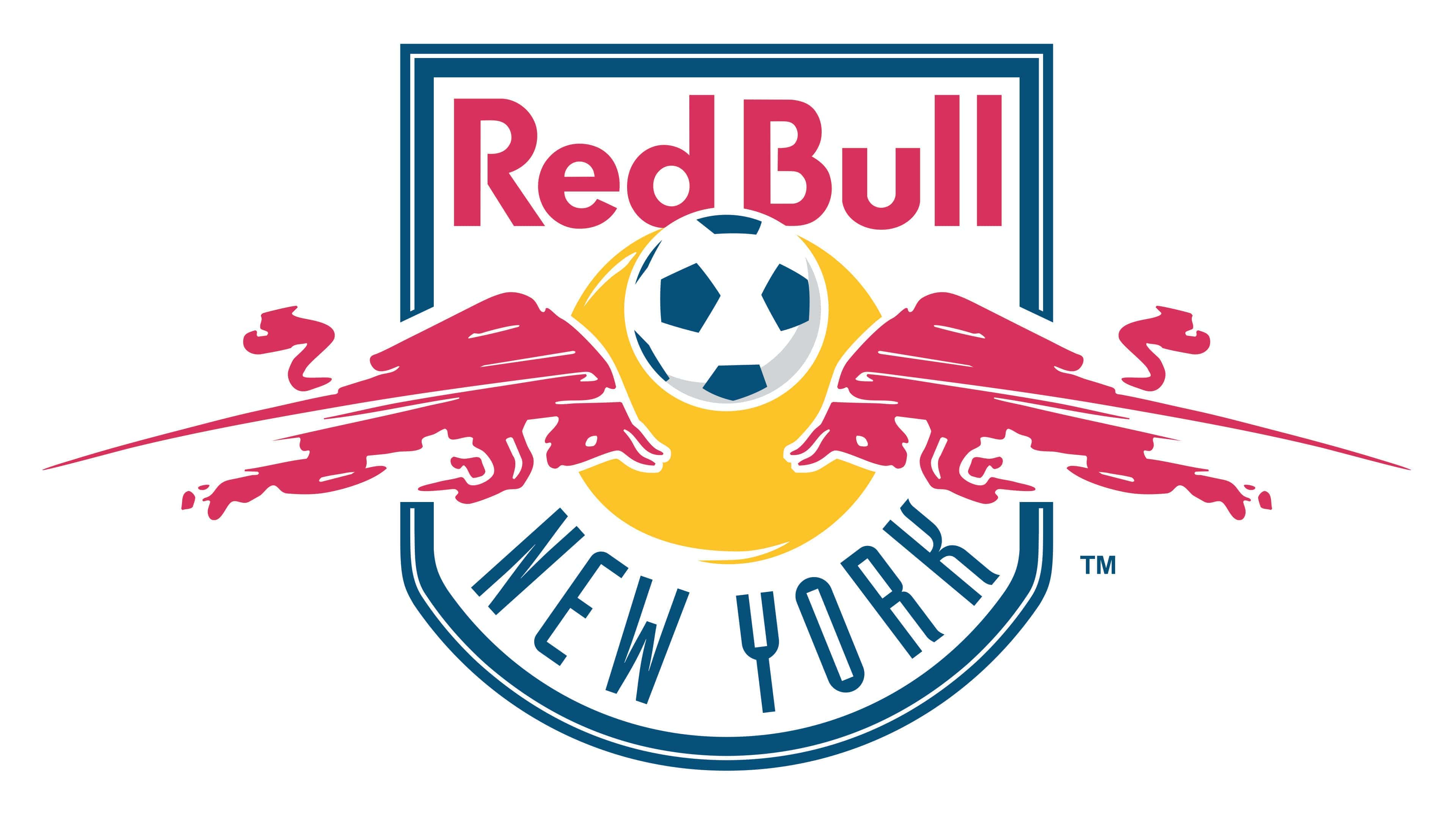
The logo featured a white rounded crest with a double blue outline. Two red bulls were running from left and right to the center of the badge, where the solid yellow circle with a football on top was placed.
The wordmark was located inside the crest, from above and under the yellow dot. The “Red Bull” in red was written on the upper part, using the iconic official typeface of the company, white the “New York” in blue was arched along the bottom part of the shield and executed in a thin modern sans-serif with clean lines and rounded yet narrowed contours.
2008 — Today
![]()
The logo was redesigned again in 1008, but the composition and the color palette remained untouched. The bulls’ contours were simplified and refined, so now they look smoother and sleeker. All lines got cleaned and more white space appeared inside the crest, making it look lighter and fresher.
The New York Red Bulls’ logo is cool, colorful, and remarkable. It shows the affiliation of the team with the famous beverage company, yet reflects the strong football spirit and willingness of the club to grow and win.
New York Red Bulls Colors
RED
HEX COLOR: #E31351;
RGB: (227,19,81)
CMYK: (5,100,59,1)
BLUE
HEX COLOR: #002F65;
RGB: (0,47,101)
CMYK: (100,89,33,23)
YELLOW
HEX COLOR: #FFC425;
RGB: (255,196,37)
CMYK: (0,24,93,0)


