Salewa is the name of a famous sportswear brand, which was established in 1935 by Josef Liebhart. Today it is one of the most well-known and reputable labels of equipment and apparel for hiking and mountain climbing, which distributes its high-quality product worldwide.
Meaning and history
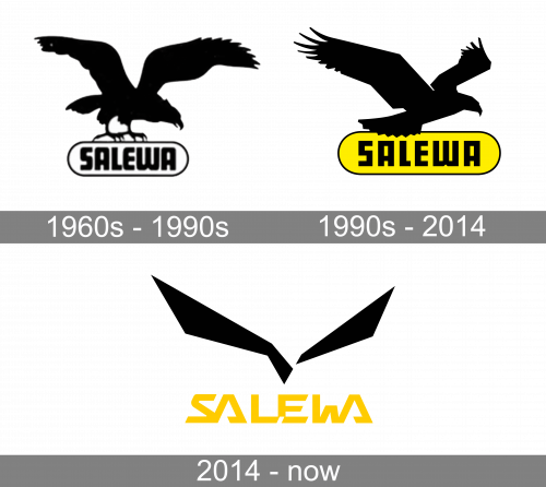
The visual identity of Salewa has always been based on an image of an Eagle, a symbol of freedom and power. This strong and graceful bird has been sitting on the company’s logotype for years, being redrawn throughout the brand’s history, and finally turning into the iconic emblem we all can see today.
What is Salewa?
Salewa is a famous European brand of clothing and equipment for outdoor activities, which was established in the 1930s in Germany, and today its products are distributed all over the globe. Salewa is one of the world’s leading brands in its segment.
1960s — 1990s
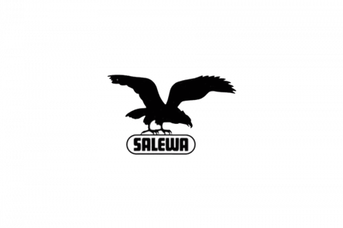
The earliest versions of the Salewa logo featured a bold inscription in a geometric sans-serif typeface, which was enclosed in a horizontally stretched oval frame, and the black eagle, sitting on it with its wings spread up. The bird’s silhouette was drawn very detailed so that you could see its beach feathers and even claws.
1990s — 2014
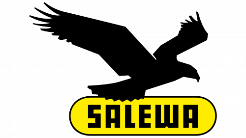
In the 1990s the logo gained some color — the background of the wordmark became yellow, while the black eagle got a delicate white outline, and had its contours redrawn. Now the bird looked like it was taking off, ready for a long flight.
2014 — Today
The redesign of the 2014 brought a completely new, contemporary approach to the label’s logo, keeping two main elements on its places, but making them sharper and more progressive.
The black eagle turned into an abstract geometrical image of a flying burg with its wings spread to the sides. Executed in white, it is placed on a black background, flying above the yellow wordmark.
Font and color
The Salewa lettering in all capitals is executed in a custom geometric typeface with bold straight lines and diagonal cuts of the letter-ends. The stylized inscription has both “A” connected to the nearby letters, they also have their contours open and look like unfinished triangles. As for the “L” and “E” in the middle of the nameplate, they only slightly touch each other and have some space dividing them from “Al and “W” on the sides.
The white, yellow, and black color palette was adopted by the brand in the early 1990s and stayed until today. This combination symbolizes energy and passion, showing the professionalism of the brand and its loyalty to the customers.


