Saab is a famous Swedish brand of one of the most respected and well-known European car manufacturers. The brand was established in 1937 as an aerospace company and changed its profile in 1945.
Meaning and history

Saab is an iconic brand, which is synonymous with reliability and trust. The brand’s visual identity has always been pretty simple and modest, except for 25 years, which started from the Saab and Scania merger. That was a period when the brand used a famous Red Griffin for its emblem.
1891 – 1900
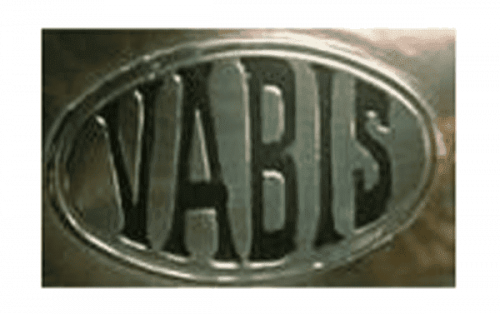
The very first logo used on the cars of the brand, which is today known as Saab, featured a horizontally stretched oval with an uppercase “Vabis” lettering, executed in a bold geometric serif typeface and embossed on a silver metallic background. It was a simple and usual, yet strong and masculine logo.
1900 – 1911
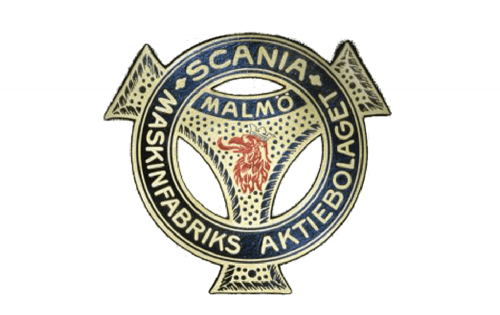
The first ref Griffin appeared on the logo in 1900. It was a small head drawn on the fancy gold and blue badge with a three-pointed star enclosed into a thick circular frame with the uppercase sans-serif lettering written around its perimeter.
1911 – 1937
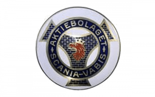
The redesign of 1911 made the colors more intense and the red Griffin head bigger, thus it started being more visible and became the main element of the badge. The contours of both geometric figures of the badge were cleaned and emboldened, with the golden framing getting thicker.
1937 – 1946
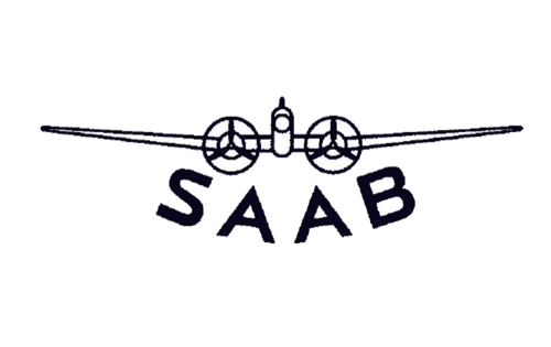
The “Saab” wordmark was first introduced on the badge in 1937. It was a very simple logo with the schematic image of a plane drawn in thin black lines on a plain background, and the logotype arched under it. The lettering was executed in the uppercase of a modern and bold sans-serif typeface with a pretty recognizable letter “S” and a lot of space between the symbols.
1946 – 1947
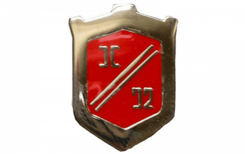
The logo used by the brand in 1946 stayed only for a few months. It was a completely different go sept with a classy gold and scarlet-red crest in glossy enamel. The thick framing was balanced by two thin gold diagonal lines crossing the shield from the bottom left corner to the upper right one.
1949 – 1963
The first Saab logo was created in 1949 and featured a simple blue square with rounded angles of the silver framing and wordmark in all caps, which was sitting on two elongated wings.
The brand used two versions of the logo — the traditional one, blue and silver, and the one, that featured only silver-gray color.
1963 – 1965

The new logo from 1963 featured silver “Saab” lettering above the airplane emblem executed in the same color. It was a stylish and unique emblem, which made the brand stand out.
1965 – 1967

The logo from 1937 was modernized and brought back in 1965. The lettering mover to the upper part of the badge, getting bolder and changing its typeface to a more confident and solid narrowed sans-serif. As for the plane, it has also been redrawn, with more black color, which added power and professionalism to the whole composition.
1967 – 1969
The previous logo was modernized in 1967. Now it is enclosed in a square silver frame with rounded angles and resembles the very first Saab badge. The lettering of the wordmark is arched and looks dynamic and confident.
1969 – 1974

Starting in 1969 the brand took the name “Scania” and used it on its official logo. It was a simple yet modern and cool uppercase logotype in an extra-bold sans-serif typeface with clean distinct shapes. Executed in a dark blue color, it looked fresh and evoked a sense of excellence and safety.
1974 – 1996

For 13 years, starting in 1974, Saab uses a minimalist and laconic wordmark as its logo. The traditional sans-serif typeface of the capital letters looks bold and masculine. The letters are placed as close to each other as possible, but the nameplate doesn’t look heavy, it is perfectly balanced. The monochrome palette adds power and authority.
The Griffin era of the Saab visual identity starts in 1987 after the merger of Saab and Scania. The emblem, designed by Carl Frederik Reutersward, was introduced in 1984 but became official only three years later.
The Saab emblem now features a dark blue circle with a Red Griffin head in the center and two thin silver circles, which add movement to the logo. The Saab wordmark is placed on the top part of the emblem, above Griffin’s head, while the Scania nameplate is placed underneath it.
1995 – 2000
In 2000 the logo is simplified. Two circles are replaced by one, and the Scania wordmark is removed from the logo. The Griffin’s head is enlarged, as well as Saab lettering, which is now located beyond it.
2000 – 2012
The emblem is now three-dimensional due to the use of the gradient color. It looks vivid and dynamic, with the glossy surface. The badge stays with the brand for almost ten years.
2013 – Today
In 2013 Saab decides to come back to the minimalist version of 1974, removing the Griffin from its visual identity image. The Saab logo snow is composed of a bold and strict wordmark with thick lines of the letters, executed in a light gray color. It is a timeless and elegant logo, which shows that “the less the better”.


