S7 JSC Siberia Airlines, branded as S7 Airlines, is one of Russia’s biggest domestic airlines. Its main bases are located at Domodedovo International Airport and Tolmachevo Airport.
Meaning and history
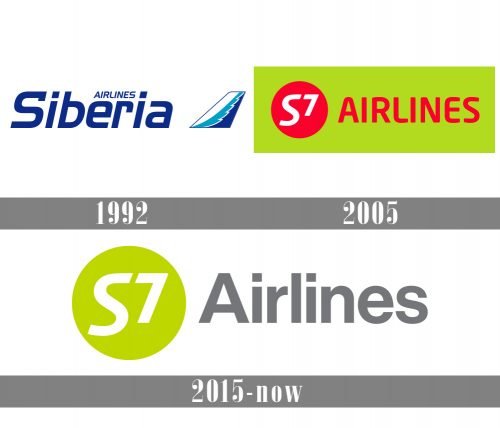
Sibir (the original name of the air carrier) was founded as a state-owned enterprise on May 6, 1992, and in this status it existed for only two years. Already in 1994 it passed into the ownership of private shareholders.
In 2001 the air carrier performed more than 15 thousand flights and over 2 million people used its services. Such a rapid takeoff immediately made it the main competitor of the national carrier Aeroflot.
In 2005, during rebranding, the company changed its name to S7 Airlines, and in the same year the S7 Group was formed.
S7 Airlines is a leader in the use of new technologies and services on the Russian passenger airline market. At the beginning of 2005, S7 Airlines was the first airline in Russia to launch an online ticket sales system through its own website. S7 Airlines was one of the first airlines in Russia to use the Departure Control System (DCS). S7 Airlines was also the first airline in Russia to start selling e-tickets in April 2007.
What is S7 Airlines?
S7 Airlines is the name of one of the largest air carrier in Russia, the second only to Aeroflot in terms of the number of passengers carried on domestic airlines. The company was established in Novosibirsk in the beginning of the 1990s, and initially was called Sibir’ (Siberia).
1992 – 2005
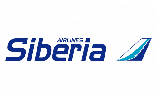
The air carrier company was established under the name “Siberia Airlines” and this is what the logo, designed in 1992, was about. The blue and white color palette, resembling the Siberian winters, and a pretty simple combination of a logotype and an emblem. The logotype was set in a smooth sans-serif typeface, with the title-case “Siberia” covered by a small and lightweight “Airlines” in the middle. As for the emblem, it was usual for any airline’s image of the plane wing with an ornament in two shades of blue.
2005 – 2015
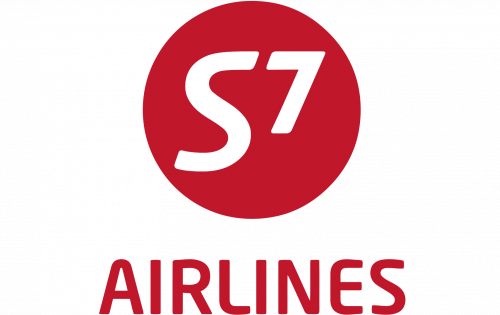
The company was renamed S7 Airlines in 2005, and this is when the new logo was introduced. A red and white color palette made the solid geometric emblem look powerful and evoke a sense of confidence and trustworthiness. It was a burgundy circle with the bold white “S7” on it, underlined by the burgundy “Airlines” in all capitals of a modern and smooth sans-serif typeface. The badge looked bright and stylish, and the clean contours of all elements made it look professional and strong.
2015 – Today
While there are no indications on the “airline” topic in the S7 Airlines logo, we can still mention something that gives a hint about the industry. The number “7” is placed higher than the letter “S,” while the “S” has a slightly unusual shape of its lower end. As a result, there is an upward movement in the logo, which symbolizes a plane going up.
We should also point out the design is somewhat similar to the logo of the soft drink 7 Up –both feature a prominent “7” and imply upward movement.
Font and Color
The bold title case lettering from the primary logo of S7 Airlines is set in a simple geometric sans-serif typeface with stable contours of the characters. The closest fonts to the one, used in this insignia, are, probably, Europa Grotesk Nr 2 SH Bold, or Neue Haas Grotesk Display 65 Medium.
As for the color palette of the S7 visual identity, it is based on a combination of gray, white and lime-green, a very fresh and cool scheme, which makes the badge of the company stand out in the list of its competitors. Gray here symbolized quality and stability, while white represents trustworthiness and professionalism, and lime green stands for progressiveness and developement.


