AECOM is the name of an American company, which was established in 1990 and specializes in engineering and construction segments. One of the world’s largest service providers in its area, today AECOM has a yearly revenue of about 20 billion USD and is headquartered in Los Angeles.
Meaning and history
AECOMis a global corporation providing project management services to a variety of construction markets, including transportation, environment, and energy.
The company’s activities cover many market sectors, among which are transportation, real estate, environmental protection, energy, water systems, and government projects. AECOM, with more than 45 thousand employees worldwide, holds a leading position in all key markets where it operates.
AECOM is ranked by Fortune magazine as one of the Fortune 500 companies. The projects of the company have been completed in more than 125 countries.
What is AECOM?
AECOM is an international company providing professional services in the field of engineering and management. Established in the United States in 2012, today the company works on projects in more than 100 countries across the globe.
Before 2009

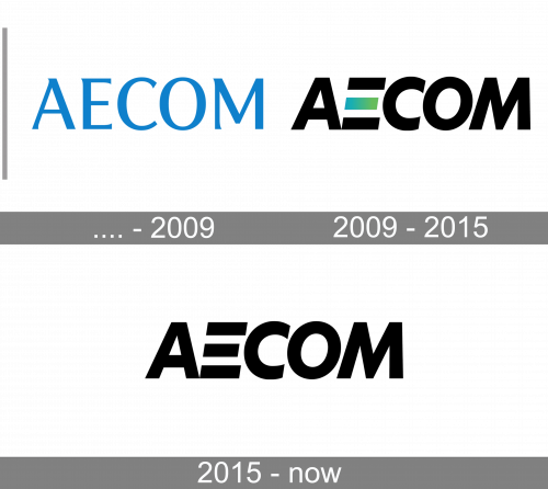
The first logo by Aecom was made of the blue inscription with elegant serif letters.
2009 – 2015

The 2009 redesign depicts the black inscription with bold black sans-serif symbols. The letter ‘E’ was curious – it consisted of three separated lines, one of which was colored gradient blue & green.
2015 – Today
The AECOM visual identity is laconic and solid. The text-based logo has one unique detail, which makes it instantly recognizable and stylish. Though it is executed in a monochrome palette, the logo looks modern and intense, with thick clean lines, reflecting the company’s professionalism and fundamental approach. A perfect reflection of the business purpose, evoking a sense of reliability and seriousness.
The AECOM wordmark in all capitals is executed in a bold and italicized geometric sans-serif typeface with the letter “E” modified. Being the most remarkable part of the whole logo, the AECOM “E” is composed of only three horizontal bars, with the vertical one missing. The letter makes the whole inscription look progressive and dynamic.
The nameplate of the company reflects power and movement, evoking a sense of authority and huge experience, AECOM has in engineering and construction management.
The monochrome color palette makes the logo look strong and solid on any placement, staying timeless and always actual.
It is one of the very simple yet very powerful logotypes, which points to the company’s strongest points, showing it as a reliable and professional one.
Font and Color
The bold geometric lettering from the primary AECOM logo is set in a heavy modern sans-serif font with the massive uppercase characters slanted to the right and the “E” drawn in three thick parallel lines. The closest font to the one, used in this insignia, is, probably, Futura No 2 Bold Italic or Twentieth Century Pro Extra Bold Italic, with the “E” customized.
As for the color palette of the AECOM visual identity, it is based on a minimalistic yet strong combination of black and white, which creates an image of a professional, stable, and confident company.


