RuneScape is the name of a popular MMORPG, which was launched in 2001 and has its versions available for almost all operating systems, including iOS and Android. RuneScape is considered to be the largest game of this kind and has its place in the Guinness Records list.
Meaning and history
The today famous game was first released in 1998 under the name Devious MUD, where MUD stood for “Multi User Dungeon”. It was designed by the shower brothers and later bought by Jagex, being renamed RuneScape.
1998 — 2001
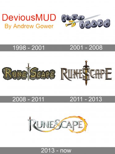
The very first logo for the MMORPG was designed in 1998 and featured a very simple and modest Badgers which stayed untouched for three years, until the acquisition of the game by Jagex. It was a two-leveled logotype with the redesign sans-serif “DeviousMUD” inscription placed above the orange “By Andrew Gower” written in the same style but smaller letters.
2001 — 2008
After the game got a new owner and name, its logo was redesigned. The new concept was built around runes. Each letter of the nameplate was located on a separate gray stone, and the two words were separated by a diagonally placed sword with a golden handle.
2008 — 2011
The logo was refreshed in 2008, keeping the original concept, but getting all the elements redrawn. Now the runes got brown shade and got placed in one line with the sword as a separating element again, but this time located vertically and pointing down. The letters were also changed to bolder and sharper ones and the black color was replaced by voluminous and slightly gradient gold.
2011 — 2013
The runes were removed from the RuneScape visual identity only in 2011. Elegant and slightly gothic lettering replaced the stone banner. Elongated and sharp horizontal bars of some letters were balanced by the letter “S”, which was enlarged and placed over the redrawn and emboldened sword. The color palette was also refined and intensified, the brown and gold from the previous version turned more copper.
2013 — Today
In 2013 the RuneScape visual identity gets redesigned again. Now the sword became a part of the lettering, being integrated as a vertical bar in the first letter, “R”. The tail of the “R” had been elongated and curved, forming a line, resembling the infinity sign. Another significant change was done to the color palette of the logo. The new scheme is based on light solver and orange, creating a pattern of metal and fire, cold and hot.


