

![]() Fall Guys Logo PNG
Fall Guys Logo PNG
Fall Guys is a mini online game, built in the genre of the battle royal, where the player needs to outrun his opponents. The entire game space is filled with various traps and obstacles that can prevent you from reaching the end at any moment.
Meaning and history
![]()
Fall Guys is a “battle royale” in which players must not shoot their opponents, but rather compete with them in dexterity, reaction speed, and map knowledge. The game offers several different modes with completely different conditions. The main goal is to stay as high as possible as all other players, which will bring the crown and win the round.
The game has 3 rounds, each round has an obstacle course or just some task, such as just not falling into an abyss during the round. In the obstacle course, your task is to come as fast as possible to the finish line, if you do not have time – you drop out.
You just need to overcome all obstacles to get to the finish line before the others, it is not necessary to be the first, to the right in the corner it is written how many players pass to the next level. The game allows up to 60 participants.
The most memorable thing about this game is the appearance of the characters. Funny colored people in huge costumes look cool and very touching.
What is Fall Guys?
Fall Guys: Ultimate Knockout (commonly abbreviated to Fall Guys) is an online multiplayer game released in August 2020 by the British company Mediatonic. The game combines several genres – a battle royale and a platformer. The goal of Fall Guys is to complete an obstacle race, where you need to outrun the 59 other participants and remain the only winner.
In terms of visual identity, Fall Boys is as bright, as in its gameplay. The colorful geometric logo, created for the game in 2020, has only been slightly refined throughout the years, keeping the original concept and intense shades untouched.
2020 – 2022
![]()
The first badge, designed for the Fall Guys online game in 2020, was composed of a two-leveled inscription in turquoise and pink, with the massive uppercase characters set in a geometric three-dimensional font, and a black handwritten “Ultimate Knockdown” tagline, set under the main part in small capitals. The negative space on the large turquoise “A” was replaced by a solid white circle with two black dots on it, looking like the faces of the game’s heroes.
2022
![]()
The redesign of 2022 was mainly about the style of the logo’s tagline, but also, the whole badge got slanted slightly to the left, so now was set diagonally. As for the tagline, the solid black lettering was replaced by an outline, with white bodies and turquoise contours of the characters. Although, the style of the typeface remained the same, as in the previous version. This logo stayed in use for just a few months.
2022 – Today
![]()
Later, in 2022 the Fall Guys badge was refined again. The two-leveled geometric inscription was now set in a straight line, and the tagline was completely removed. As for the elements, that were left on the logo, they all were taken from the original version of the game’s badge, with no changes or additions.
Font and color
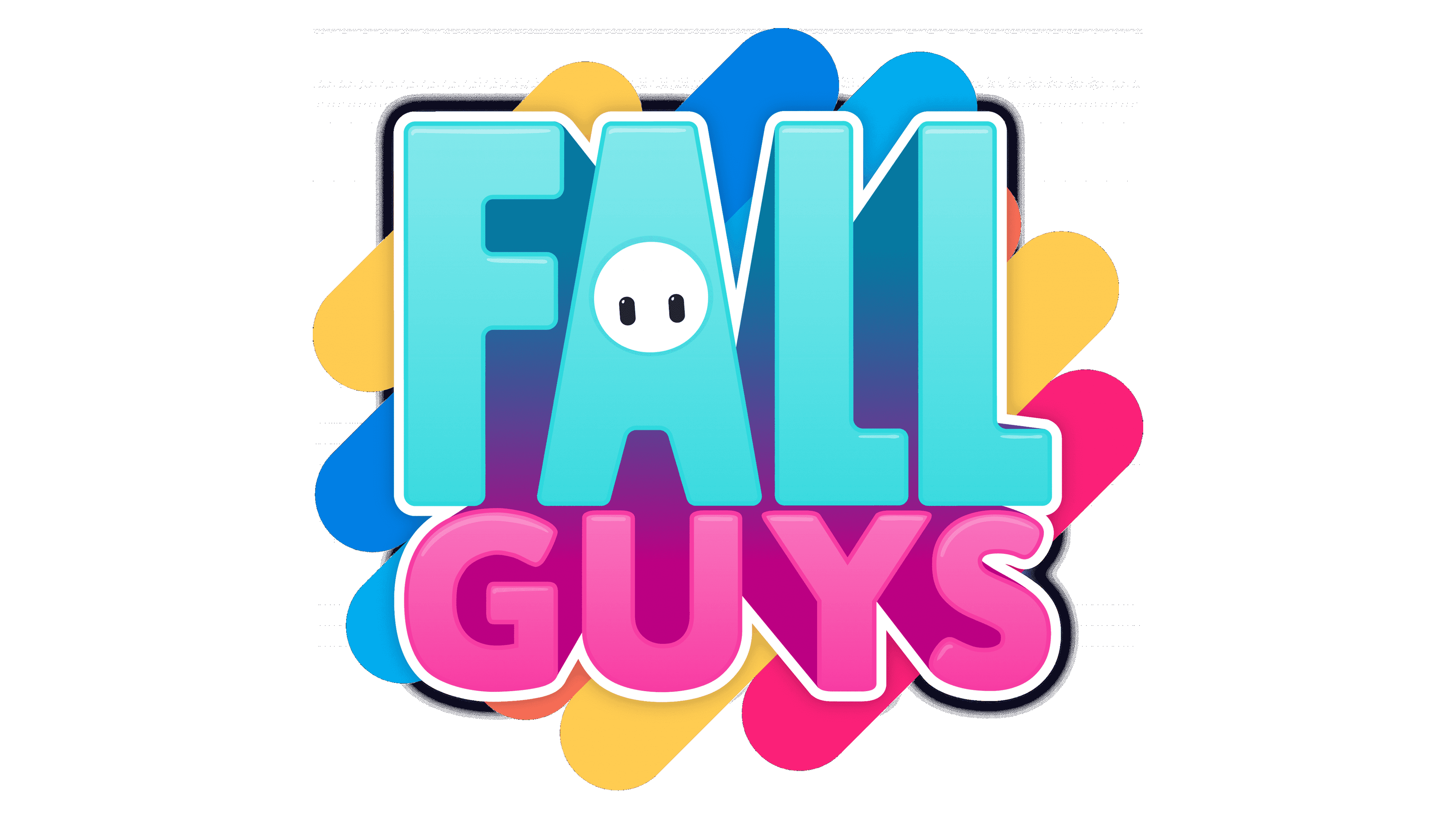
The geometric uppercase lettering from the primary logo of the Fall Guys online game is set in a designer font, which resembles Metcon Heavy typeface; but with an additional volume.
As for the color palette of the Fall Guys visual identity, it is based on the combination of pink and turquoise, which is not only bright and eye-catching, but also has a reference to the gameplay, as at the beginning of the round, all characters are pink, and the Clovis variety uses the same turquoise shade of blue.


